はじめに
機械学習で登場する確率分布について色々な角度から理解したいシリーズです。
この記事では、R言語で二項分布の乱数を生成します。
【前の内容】
【他の記事一覧】
【この記事の内容】
二項分布の乱数生成
二項分布(Binomial Distribution)の乱数を生成します。二項分布については「二項分布の定義式 - からっぽのしょこ」を参照してください。
利用するパッケージを読み込みます。
# 利用するパッケージ
library(tidyverse)
library(gganimate)
この記事では、基本的にパッケージ名::関数名()の記法を使うので、パッケージを読み込む必要はありません。ただし、作図コードがごちゃごちゃしないようにパッケージ名を省略しているため、ggplot2は読み込む必要があります。また、基本的にベースパイプ(ネイティブパイプ)演算子|>を使いますが、パイプ演算子%>%ででないと処理できない部分があるため、magrittrも読み込む必要があります。
分布の変化をアニメーション(gif画像)で確認するのにgganimateパッケージを利用します。不要であれば省略してください。
サンプリング
二項分布の乱数を生成します。
二項分布のパラメータ$\phi, M$とデータ数$N$を設定します。
# パラメータを指定
phi <- 0.35

# 試行回数を指定
M <- 10

# データ数を指定
N <- 1000
成功確率$0 < \phi < 1$、試行回数$M$とデータ数(サンプルサイズ)$N$を指定します。
二項分布に従う乱数を生成します。
# 二項分布に従う乱数を生成
x_n <- rbinom(n = N, size = M, prob = phi)
head(x_n)
## [1] 3 6 3 5 5 6
二項分布の乱数はrbinom()で生成できます。データ数の引数nにN、試行回数の引数sizeにM、成功確率の引数probにphiを指定します。
乱数の可視化
サンプルのヒストグラムを作成します。
サンプルの値を集計します。
# xがとり得る値を作成
x_vals <- 0:M

# サンプルを集計
freq_df <- tidyr::tibble(x = x_n) |> # 乱数を格納
  dplyr::count(x, name = "frequency") |> # 度数を集計
  dplyr::right_join(tidyr::tibble(x = x_vals), by = "x") |> # 全てのパターンに追加
  dplyr::mutate(frequency = tidyr::replace_na(frequency, 0)) # サンプルにない場合の欠損値を0に置換
freq_df
## # A tibble: 11 × 2
##        x frequency
##    <int>     <int>
##  1     0        22
##  2     1        75
##  3     2       173
##  4     3       241
##  5     4       229
##  6     5       148
##  7     6        83
##  8     7        27
##  9     8         2
## 10     9         0
## 11    10         0
サンプリングした値x_nをデータフレームに格納して、count()でサンプルの値ごとにカウントします。
サンプルx_nにない値はデータフレームに含まれないため、right_join()で0からMの整数を持つデータフレームに結合します。サンプルにない場合は、度数列frequencyが欠損値NAになるので、replace_na()で0に置換します。(この処理は、作図自体には影響しません。サブタイトルに度数を表示するのに必要な処理です。)
サンプルのヒストグラムを作成します。
# サンプルのヒストグラムを作成:度数
ggplot(data = freq_df, mapping = aes(x = x, y = frequency)) + # データ
  geom_bar(stat = "identity", fill = "#00A968") + # 度数
  scale_x_continuous(breaks = x_vals, labels = x_vals) + # x軸目盛
  labs(title = "Binomial Distribution",
       subtitle = paste0("phi=", phi, ", M=", M, ", N=", N),
       x = "x", y = "frequency") # ラベル

度数を高さとする棒グラフを作成します。
相対度数を分布と重ねて描画します。
# 二項分布を計算
prob_df <- tidyr::tibble(
  x = x_vals, # 確率変数
  probability = dbinom(x = x_vals, size = M, prob = phi) # 確率
)

# サンプルのヒストグラムを作成:相対度数
ggplot() +
  geom_bar(data = freq_df, mapping = aes(x = x, y = frequency/N),
           stat = "identity", fill = "#00A968") + # 相対度数
  geom_bar(data = prob_df, mapping = aes(x = x, y = probability),
           stat = "identity", alpha = 0, color = "darkgreen", linetype = "dashed") + # 元の分布
  scale_x_continuous(breaks = x_vals, labels = x_vals) + # x軸目盛
  labs(
    title = "Binomial Distribution",
    subtitle = parse(
      text = paste0(
        "list(phi==", phi, ", M==", M, ", N==", "(list(", paste0(freq_df[["frequency"]], collapse = ", "), "))", ")")
    ),
    x = "x", y = "relative frequency"
  ) # ラベル
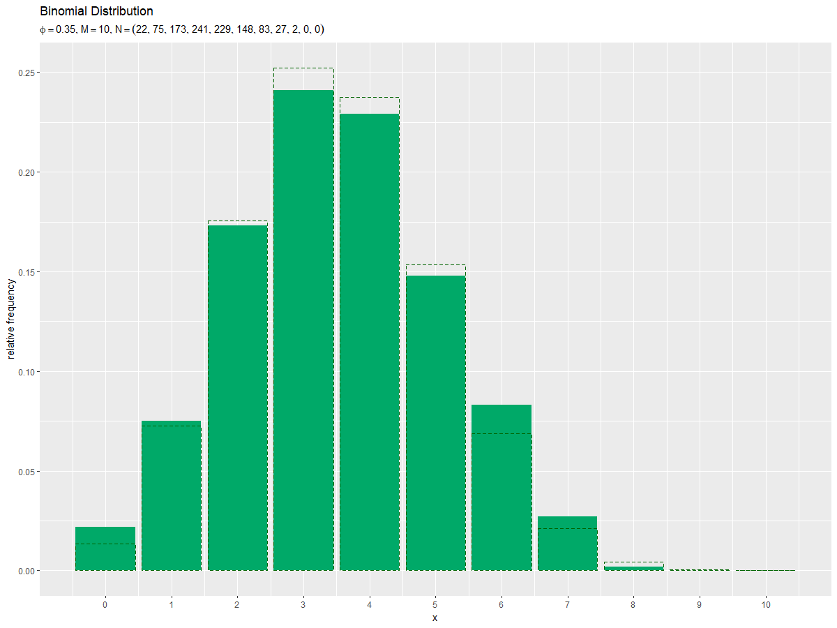
度数frequencyをデータ数Nで割った相対度数を高さとする棒グラフを作成します。
ギリシャ文字などの記号を使った数式を表示する場合は、expression()の記法を使います。等号は"=="、複数の(数式上の)変数を並べるには"list(変数1, 変数2)"とします。(プログラム上の)変数の値を使う場合は、parse()のtext引数に指定します。
データ数(サンプルサイズ)が十分に増えると、ヒストグラムの形が分布の形に近付きます。
乱数と分布の関係をアニメーションで可視化
サンプルサイズとヒストグラムの形状の関係をアニメーションで確認します。
・作図コード(クリックで展開)
パラメータ$\phi, M$とデータ数$N$を指定して、二項分布の乱数を生成します。
# パラメータを指定
phi <- 0.35

# 試行回数を指定
M <- 10

# データ数(フレーム数)を指定
N <- 300

# 二項分布に従う乱数を生成
x_n <- rbinom(n = N, size = M, prob = phi)
head(x_n)
## [1] 3 1 4 4 2 4
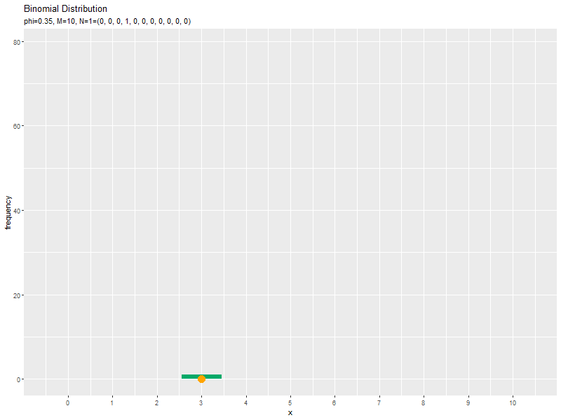
x_nのn番目の要素を、n回目にサンプリングされた値とみなします。アニメーションのn番目のフレームでは、n個のサンプルx_n[1:n]のヒストグラムを描画します。
サンプリング回数ごとに、$x$がとり得る値x_valsごとの度数を求めます。
# xがとり得る値を作成
x_vals <- 0:M

# サンプルを集計
freq_df <- tibble::tibble(
  x = x_n, # サンプル
  n = 1:N, # データ番号
  frequency = 1 # 集計用の値
) |>
  dplyr::right_join(tidyr::expand_grid(x = x_vals, n = 1:N), by = c("x", "n")) |> # 全てのパターンに結合
  dplyr::mutate(frequency = tidyr::replace_na(frequency, replace = 0)) |> # サンプルにない場合の欠損値を0に置換
  dplyr::arrange(n, x) |> # 集計用に昇順に並べ替え
  dplyr::group_by(x) |> # 集計用にグループ化
  dplyr::mutate(frequency = cumsum(frequency)) |> # 累積和を計算
  dplyr::ungroup() # グループ化を解除
freq_df
## # A tibble: 3,300 × 3
##        x     n frequency
##    <int> <int>     <dbl>
##  1     0     1         0
##  2     1     1         0
##  3     2     1         0
##  4     3     1         1
##  5     4     1         0
##  6     5     1         0
##  7     6     1         0
##  8     7     1         0
##  9     8     1         0
## 10     9     1         0
## # … with 3,290 more rows
サンプルx_n、データ番号(サンプリング回数)1:N、度数計算用の値1をデータフレームに格納します。各データ番号において、実際にサンプリングされた値がデータフレームに含まれます。
$x$の値とデータ番号の全ての組み合わせをexpand_grid()で作成して、そこにサンプルをright_join()で結合します。サンプルにない場合は、frequency列が欠損値NAになるので、replace_na()で0に置換します。
x列($x$の値)でグループ化して、frequency列(サンプルは1でそれ以外は0)の累積和をcumsum()で計算して、各試行回数までの度数を求めます。
ヒストグラムの作図に利用する集計結果が得られました。以降は、グラフの装飾のための処理です。
$x$がとり得る値(x_valseの各要素)ごと度数を使って、フレーム切替用のラベルを作成します。
# フレーム切替用のラベルを作成
label_vec <- freq_df |>
  tidyr::pivot_wider(
    id_cols = n,
    names_from = x,
    names_prefix = "x",
    values_from = frequency
  ) |> # 度数列を展開
  tidyr::unite(col = "label", dplyr::starts_with("x"), sep = ", ") |> # 度数情報をまとめて文字列化
  dplyr::mutate(
    label = paste0("phi=", phi, ", M=", M, ", N=", n, "=(", label, ")") %>%
      factor(., levels = .)
  ) |> # パラメータ情報をまとめて因子化
  dplyr::pull(label) # ベクトルとして取得
head(label_vec)
## [1] phi=0.35, M=10, N=1=(0, 0, 0, 1, 0, 0, 0, 0, 0, 0, 0)
## [2] phi=0.35, M=10, N=2=(0, 1, 0, 1, 0, 0, 0, 0, 0, 0, 0)
## [3] phi=0.35, M=10, N=3=(0, 1, 0, 1, 1, 0, 0, 0, 0, 0, 0)
## [4] phi=0.35, M=10, N=4=(0, 1, 0, 1, 2, 0, 0, 0, 0, 0, 0)
## [5] phi=0.35, M=10, N=5=(0, 1, 1, 1, 2, 0, 0, 0, 0, 0, 0)
## [6] phi=0.35, M=10, N=6=(0, 1, 1, 1, 3, 0, 0, 0, 0, 0, 0)
## 300 Levels: phi=0.35, M=10, N=1=(0, 0, 0, 1, 0, 0, 0, 0, 0, 0, 0) ...
pivot_wider()で、x列(x_vals)の値ごとの度数列に展開します。データ番号(サンプリング回数)の列nとx_valsに対応したM+1個の列になります。
度数列の値をunite()で文字列としてまとめて、さらにpaste0()でパラメータの値と結合し、因子型に変換します。
作成したラベル列をpull()でベクトルとして取り出します。
集計結果のデータフレームにフレーム切替用のラベル列を追加します。
# フレーム切替用のラベルを追加
anime_freq_df <- freq_df |>
  tibble::add_column(parameter = rep(label_vec, each = M+1))
anime_freq_df
## # A tibble: 3,300 × 4
##        x     n frequency parameter
##    <int> <int>     <dbl> <fct>
##  1     0     1         0 phi=0.35, M=10, N=1=(0, 0, 0, 1, 0, 0, 0, 0, 0, 0, 0)
##  2     1     1         0 phi=0.35, M=10, N=1=(0, 0, 0, 1, 0, 0, 0, 0, 0, 0, 0)
##  3     2     1         0 phi=0.35, M=10, N=1=(0, 0, 0, 1, 0, 0, 0, 0, 0, 0, 0)
##  4     3     1         1 phi=0.35, M=10, N=1=(0, 0, 0, 1, 0, 0, 0, 0, 0, 0, 0)
##  5     4     1         0 phi=0.35, M=10, N=1=(0, 0, 0, 1, 0, 0, 0, 0, 0, 0, 0)
##  6     5     1         0 phi=0.35, M=10, N=1=(0, 0, 0, 1, 0, 0, 0, 0, 0, 0, 0)
##  7     6     1         0 phi=0.35, M=10, N=1=(0, 0, 0, 1, 0, 0, 0, 0, 0, 0, 0)
##  8     7     1         0 phi=0.35, M=10, N=1=(0, 0, 0, 1, 0, 0, 0, 0, 0, 0, 0)
##  9     8     1         0 phi=0.35, M=10, N=1=(0, 0, 0, 1, 0, 0, 0, 0, 0, 0, 0)
## 10     9     1         0 phi=0.35, M=10, N=1=(0, 0, 0, 1, 0, 0, 0, 0, 0, 0, 0)
## # … with 3,290 more rows
label_vecの各要素をM+1個(x_valsの要素数)に複製して、add_column()で列として追加します。
(M+1)*N行のデータフレームになります。これをヒストグラムの描画に使います。
サンプルと対応するラベルをデータフレームに格納します。
# サンプルを格納
anime_data_df <- tibble::tibble(
  x = x_n, # サンプル
  parameter = label_vec # フレーム切替用ラベルを追加
)
anime_data_df
## # A tibble: 300 × 2
##        x parameter
##    <int> <fct>
##  1     3 phi=0.35, M=10, N=1=(0, 0, 0, 1, 0, 0, 0, 0, 0, 0, 0)
##  2     1 phi=0.35, M=10, N=2=(0, 1, 0, 1, 0, 0, 0, 0, 0, 0, 0)
##  3     4 phi=0.35, M=10, N=3=(0, 1, 0, 1, 1, 0, 0, 0, 0, 0, 0)
##  4     4 phi=0.35, M=10, N=4=(0, 1, 0, 1, 2, 0, 0, 0, 0, 0, 0)
##  5     2 phi=0.35, M=10, N=5=(0, 1, 1, 1, 2, 0, 0, 0, 0, 0, 0)
##  6     4 phi=0.35, M=10, N=6=(0, 1, 1, 1, 3, 0, 0, 0, 0, 0, 0)
##  7     4 phi=0.35, M=10, N=7=(0, 1, 1, 1, 4, 0, 0, 0, 0, 0, 0)
##  8     3 phi=0.35, M=10, N=8=(0, 1, 1, 2, 4, 0, 0, 0, 0, 0, 0)
##  9     4 phi=0.35, M=10, N=9=(0, 1, 1, 2, 5, 0, 0, 0, 0, 0, 0)
## 10     3 phi=0.35, M=10, N=10=(0, 1, 1, 3, 5, 0, 0, 0, 0, 0, 0)
## # … with 290 more rows
N行のデータフレームになります。各サンプリングにおけるサンプルの値を描画するのに使います。
二項分布を計算して、データ数分に複製し、対応するラベルを追加します。
anime_prob_df <- tibble::tibble(
  x = x_vals, # 確率変数
  probability = dbinom(x = x_vals, size = M, prob = phi), # 確率
  num = N # 複製数
) |>
  tidyr::uncount(num) |> # データ数分に複製
  tibble::add_column(parameter = rep(label_vec, times = length(x_vals))) |> # フレーム切替用ラベルを追加
  dplyr::arrange(parameter) # サンプリング回数ごとに並べ替え
anime_prob_df
## # A tibble: 3,300 × 3
##        x probability parameter
##    <int>       <dbl> <fct>
##  1     0    0.0135   phi=0.35, M=10, N=1=(0, 0, 0, 1, 0, 0, 0, 0, 0, 0, 0)
##  2     1    0.0725   phi=0.35, M=10, N=1=(0, 0, 0, 1, 0, 0, 0, 0, 0, 0, 0)
##  3     2    0.176    phi=0.35, M=10, N=1=(0, 0, 0, 1, 0, 0, 0, 0, 0, 0, 0)
##  4     3    0.252    phi=0.35, M=10, N=1=(0, 0, 0, 1, 0, 0, 0, 0, 0, 0, 0)
##  5     4    0.238    phi=0.35, M=10, N=1=(0, 0, 0, 1, 0, 0, 0, 0, 0, 0, 0)
##  6     5    0.154    phi=0.35, M=10, N=1=(0, 0, 0, 1, 0, 0, 0, 0, 0, 0, 0)
##  7     6    0.0689   phi=0.35, M=10, N=1=(0, 0, 0, 1, 0, 0, 0, 0, 0, 0, 0)
##  8     7    0.0212   phi=0.35, M=10, N=1=(0, 0, 0, 1, 0, 0, 0, 0, 0, 0, 0)
##  9     8    0.00428  phi=0.35, M=10, N=1=(0, 0, 0, 1, 0, 0, 0, 0, 0, 0, 0)
## 10     9    0.000512 phi=0.35, M=10, N=1=(0, 0, 0, 1, 0, 0, 0, 0, 0, 0, 0)
## # … with 3,290 more rows
確率分布の情報とデータ数Nをデータフレームに格納して、uncount()で複製します。
(M+1)*N行のデータフレームになります。これを二項分布の棒グラフを描画するのに使います。
サンプルのヒストグラムのアニメーションを作成します。
# 二項乱数のヒストグラムのアニメーションを作図:度数
anime_hist_graph <- ggplot() +
  geom_bar(data = anime_freq_df, mapping = aes(x = x, y = frequency),
           stat = "identity", fill = "#00A968") + # 度数
  geom_point(data = anime_data_df, mapping = aes(x = x, y = 0),
             color = "orange", size = 5) + # サンプル
  gganimate::transition_manual(parameter) + # フレーム
  scale_x_continuous(breaks = x_vals, labels = x_vals) + # x軸目盛
  labs(title = "Binomial Distribution",
       subtitle = "{current_frame}",
       x = "x", y = "frequency") # ラベル

# gif画像を作成
gganimate::animate(anime_hist_graph, nframes = N, fps = 100, width = 800, height = 600)
transition_manual()にフレームの順序を表す列を指定します。
animate()のフレーム数の引数にnframesにデータ数(サンプルサイズ)、フレームレートの引数fpsに1秒当たりのフレーム数を指定します。fps引数の値が大きいほどフレームが早く切り替わります。
相対度数を分布と重ねたアニメーションを作成します。
# 二項乱数のヒストグラムのアニメーションを作図:相対度数
anime_hist_graph <- ggplot() +
  geom_bar(data = anime_freq_df, mapping = aes(x = x, y = frequency/n),
           stat = "identity", fill = "#00A968") + # 相対度数
  geom_bar(data = anime_prob_df, mapping = aes(x = x, y = probability),
           stat = "identity", alpha = 0, color = "darkgreen", linetype = "dashed") + # 元の分布
  geom_point(data = anime_data_df, mapping = aes(x = x, y = 0),
             color = "orange", size = 5) + # サンプル
  gganimate::transition_manual(parameter) + # フレーム
  scale_x_continuous(breaks = x_vals, labels = x_vals) + # x軸目盛
  coord_cartesian(ylim = c(-0.01, 0.5)) + # 軸の表示範囲
  labs(title = "Binomial Distribution",
       subtitle = "{current_frame}",
       x = "x", y = "relative frequency") # ラベル

# gif画像を作成
gganimate::animate(anime_hist_graph, nframes = N, fps = 100, width = 800, height = 600)
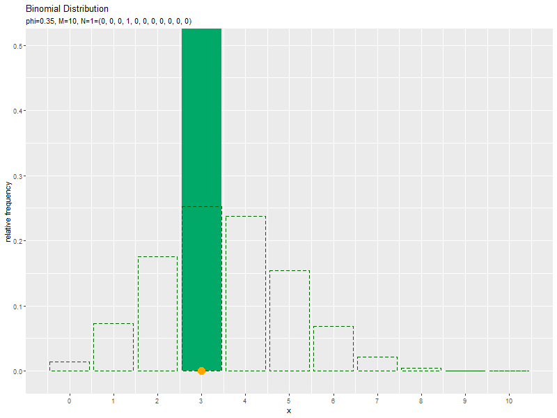
サンプルが増えるに従って、ヒストグラムが元の分布に近付くのを確認できます。
この記事では、二項分布の乱数を確認しました。
参考文献
- 岩田具治『トピックモデル』(機械学習プロフェッショナルシリーズ)講談社,2015年.
おわりに
記事を分割しました。
- 2022.06.23:加筆修正しました。
【次の内容】