はじめに
gganimateパッケージについて理解したいシリーズです。
この記事では、ease_aes関数の機能を確認します。
【他の内容】
【目次】
ease_aes
gganimateパッケージの関数ease_aes()について解説します。ease_aes()は、アニメーション(gif画像)の緩急を制御します。
利用するパッケージを読み込みます。
# 利用パッケージ
library(gganimate)
library(ggplot2)
基本的に、パッケージ名::関数名()の記法で書きます。ただし作図コードに関してはごちゃごちゃしてしまうので、ggplot2パッケージの関数は関数名のみで、gganimateパッケージの関数はパッケージ名を明示して書きます。
データフレームの作成
まずは、作図に利用するデータフレームを作成します。
# データフレームを作成
df <- tibble::tibble(
  x = 0:1,
  y = 0:1,
  frame = 0:1
)
df
## # A tibble: 2 x 3
##       x     y frame
##   <int> <int> <int>
## 1     0     0     0
## 2     1     1     1
分かりやすい値を作成しておきます。tibble::tibble()を使ってデータフレームを作成していますが、data.frame()を使っても問題ありません。
フレーム切り替え関数transition_***()の第1引数に、フレームの順序を示すframe列を指定します。
作成したデータをグラフで確認しておきます。
# 散布図を作成
ggplot(df, aes(x = x, y = y)) +
  geom_point(size = 5, color = "hotpink") + # 散布図
  scale_x_continuous(breaks = df[["x"]], minor_breaks = FALSE) + # x軸目盛
  scale_y_continuous(breaks = df[["y"]], minor_breaks = FALSE) + # y軸目盛
  coord_fixed(ratio = 1) + # アスペクト比
  labs(title = "geom_point()") # ラベル

# 棒グラフを作成
ggplot(df, aes(x = 1, y = y, group = y)) +
  geom_bar(stat = "identity", position = "dodge", fill = "hotpink", color = "hotpink") + # 棒グラフ
  scale_x_continuous(breaks = 1, minor_breaks = FALSE) + # x軸目盛
  coord_flip() + # 軸の反転
  labs(title = "geom_bar()") # ラベル

このデータを用いた散布図と棒グラフのアニメーションを通じて、ease_aes()の機能を確認していきます。
引数
ease_aes()の引数を確認します。
実際のデータの位置(値)の目印を表示するためのデータフレームを作成しておきます。
# 始点と終点用のデータフレームを作成
mark_df <- df %>%
  dplyr::select(!frame) # フレーム列を削除
フレーム切り替えの影響を受けなくするために、フレーム列を削除します。
イージング関数(Easing functions)と変化のタイプ(Modifiers)を指定します。
# イージング関数を指定
ef <- "quadratic"
ef <- "cubic"
ef <- "quartic"
ef <- "quintic"
ef <- "sine"
ef <- "circular"
ef <- "exponential"
ef <- "elastic"
ef <- "back"
ef <- "bounce"

# 変化のスタイルを指定
em <- "-in"
em <- "-out"
em <- "-in-out"
イージング関数は、データ間の補完(イージング処理・Tweening)をどのように行うかを決める(計算する)関数です。指定する際の文字列は(数学的な意味の)関数名を表します。
また、イージング関数ごとにIn・Out・InOutの3つの変化の仕方があります。Inタイプは、始めの変化が小さく、時間が進むにつれて変化が大きくなります。Outタイプは、始めの変化が大きく、時間が進むにつれて変化が小さくなります。InOutタイプは、始めと終わりの変化が小さく、中盤の変化が大きくなります。
詳しくは後ほどまたは別記事で確認します。
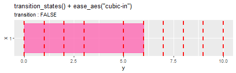
解説用に複雑な作図コードになっていますが、ease_aes("cubic-in")のように指定してください。
・散布図の場合
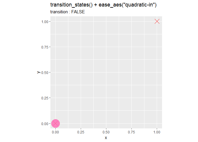
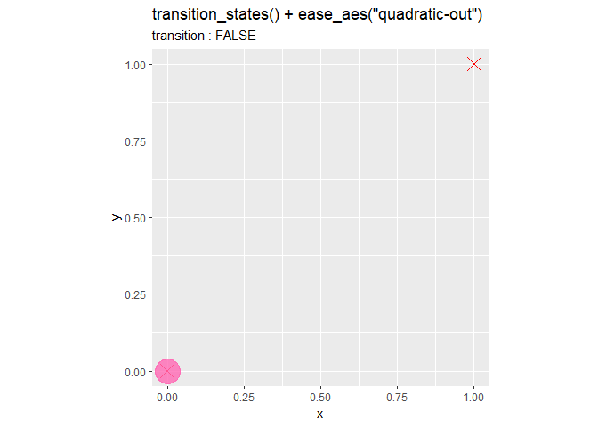
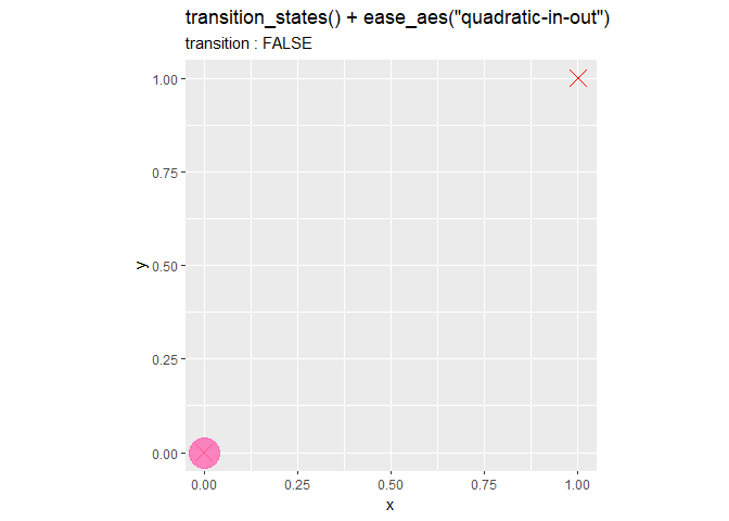
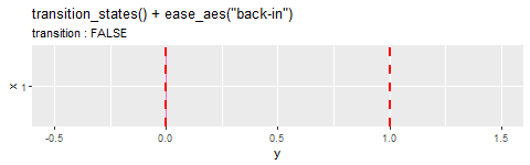
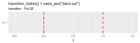
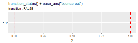
# イージング関数を指定
ef <- "linear"

# 変化のスタイルを指定
em <- ""

# イージングの設定:散布図
anim <- ggplot() +
  geom_point(data = mark_df, mapping = aes(x = x, y = y),
             size = 5, shape = 4, color = "red") + # 始点と終点
  geom_point(data = df, mapping = aes(x = x, y = y),
             size = 10, alpha = 0.8, color = "hotpink") + # 移動点
  gganimate::transition_states(states = frame, transition_length = 9, state_length = 1) + # フレーム
  gganimate::ease_aes(paste0(ef, em)) + # 変化の緩急
  #xlim(c(-0.5, 1.5)) + # x軸の描画範囲
  #ylim(c(-0.5, 1.5)) + # y軸の描画範囲
  coord_fixed(ratio = 1) + # アスペクト比
  labs(title = paste0('transition_states() + ease_aes("', ef, em, '")'),
       subtitle = "transition : {transitioning}") # ラベル

# gif画像を作成
gganimate::animate(plot = anim, nframes = 40, fps = 10)

デフォルトは"linear"で、一定のスピードで変化(データ間を等間隔で補完)します。linearにはIn・Out・InOutはありません(3つのタイプの定義に従って計算しても全て同じ値になります)。また、linearはease_aes()を使わない場合の設定でもあります。
現在のフレームでプロットされている点(データ)が、遷移中(データ間の値)なのか実データ上(実際の値)なのかをサブタイトルに表示しています。これはtransition_states()の機能です。
・棒グラフの場合
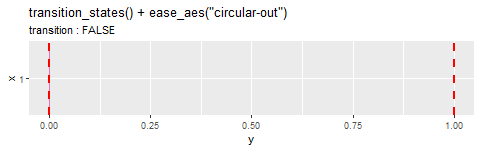
# イージング関数を指定
ef <- "circular"

# 変化のスタイルを指定
em <- "-out"

# イージングの設定:棒グラフ
anim <- ggplot() +
  geom_bar(data = df, mapping = aes(x = 1, y = y),
           stat = "identity", width = 0.9, alpha = 0.8, fill = "hotpink", color = "hotpink") + # 伸縮バー
  geom_hline(data = mark_df, mapping = aes(yintercept = y),
             size = 1, color = "red", linetype = "dashed") + # 始点と終点
  gganimate::transition_states(states = frame, transition_length = 9, state_length = 1) + # フレーム
  gganimate::ease_aes(paste0(ef, em)) + # 変化の緩急
  scale_x_continuous(breaks = 1, minor_breaks = FALSE, limits = c(0.5, 1.5)) + # x軸目盛
  #ylim(c(-0.5, 1.5)) + # y軸の描画範囲
  coord_flip() + # 軸の反転
  labs(title = paste0('transition_states() + ease_aes("', ef, em, '")'),
       subtitle = "transition : {transitioning}") # ラベル

# gif画像を作成
gganimate::animate(plot = anim, nframes = 40, fps = 10, height = 150)
棒グラフの場合も同様です。
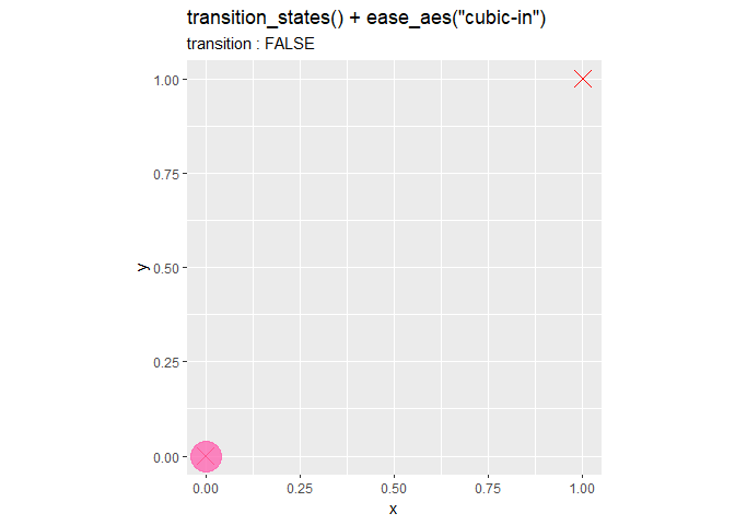
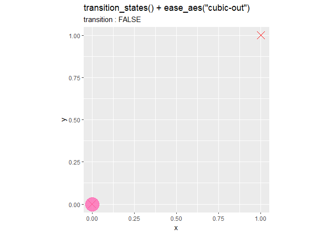
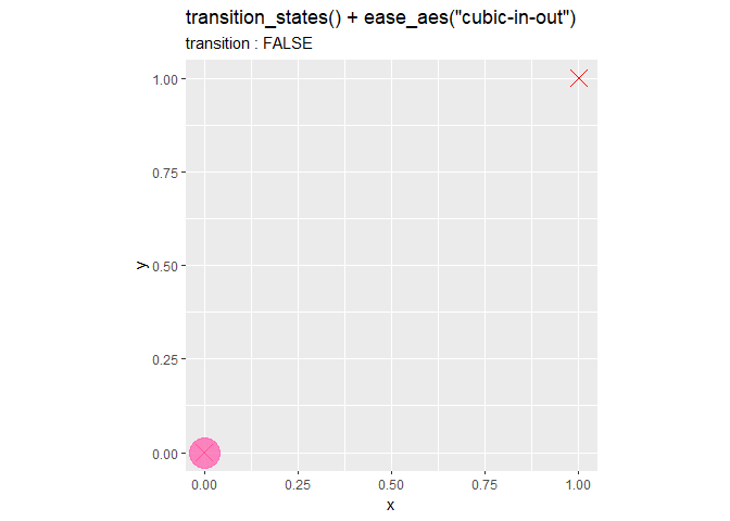
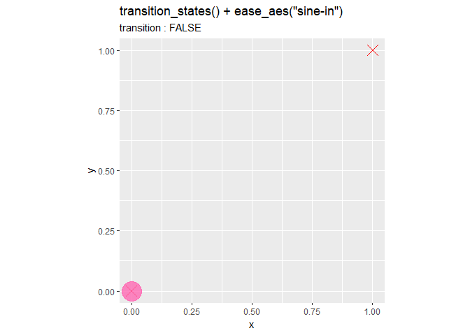
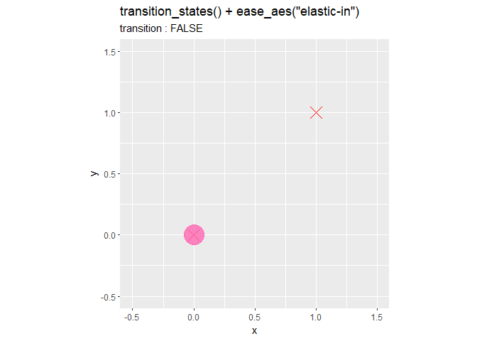
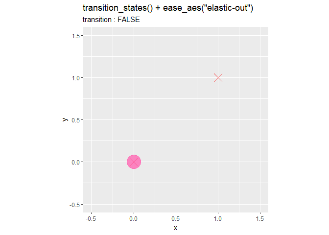
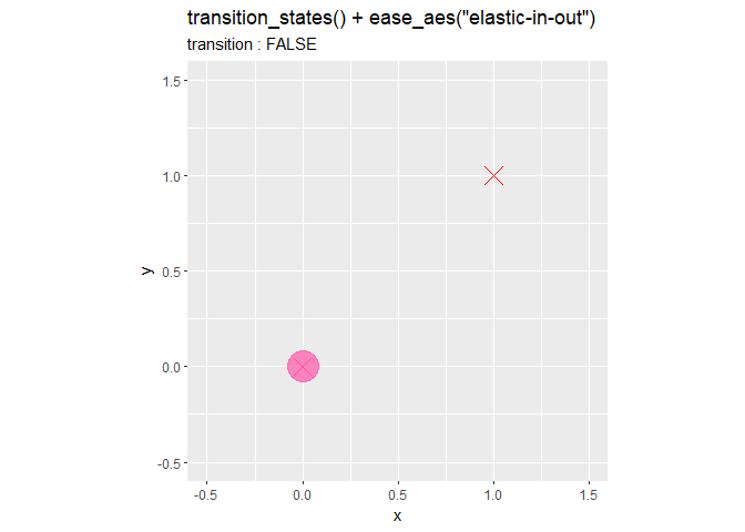
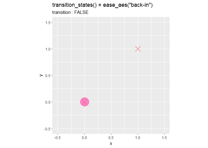
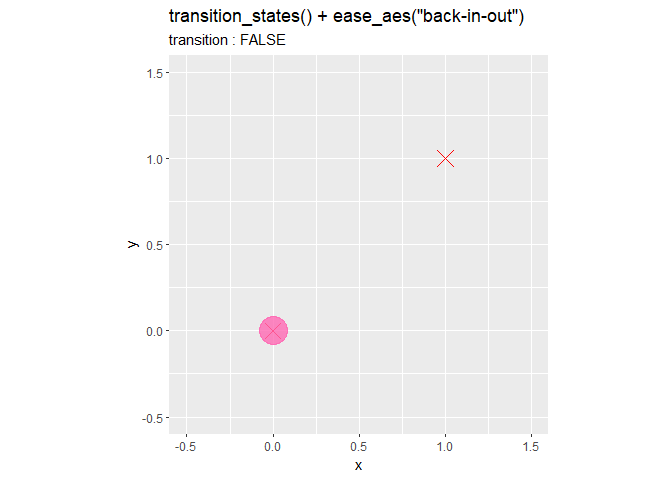
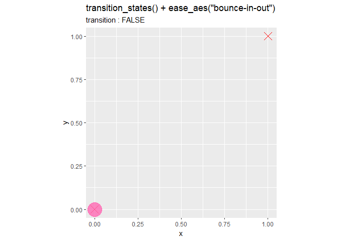
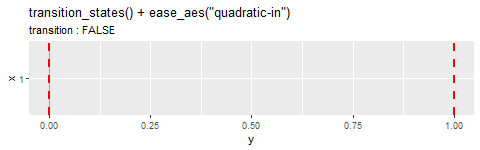
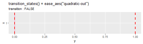
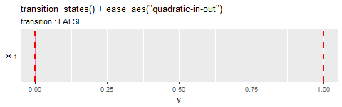
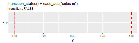
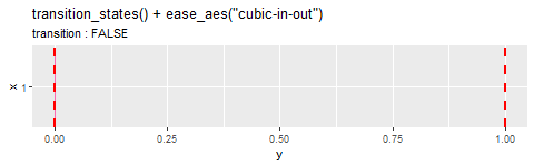
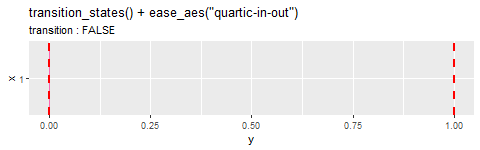
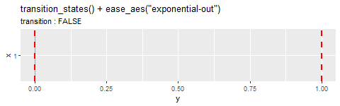
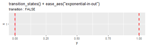
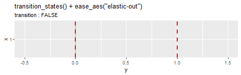
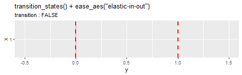
イージング関数と変化のタイプの全ての組み合わせを見ていきます。
イージング処理
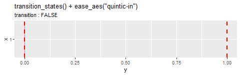
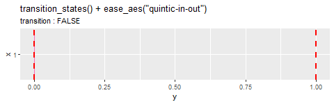
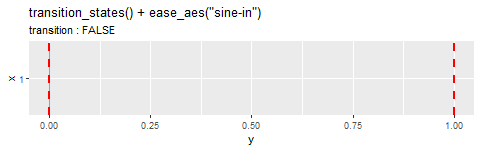
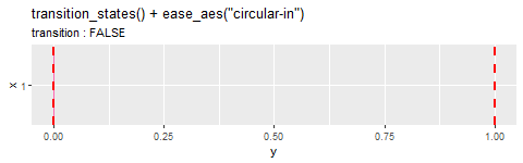
デフォルトのLinear(恒等関数)と10種類のイージング関数(quadratic(2次関数)・cubic(3次関数)・quartic(4次関数)・quintic(5次関数)・sine(正弦波)・circular(円形)・exponential(指数関数)・elastic(弾性)・back(バック)・bounce(バウンド))によるアニメーション(データ間の補完)を確認します。
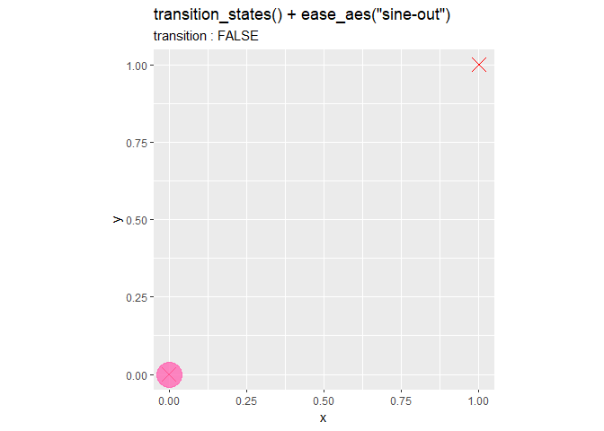
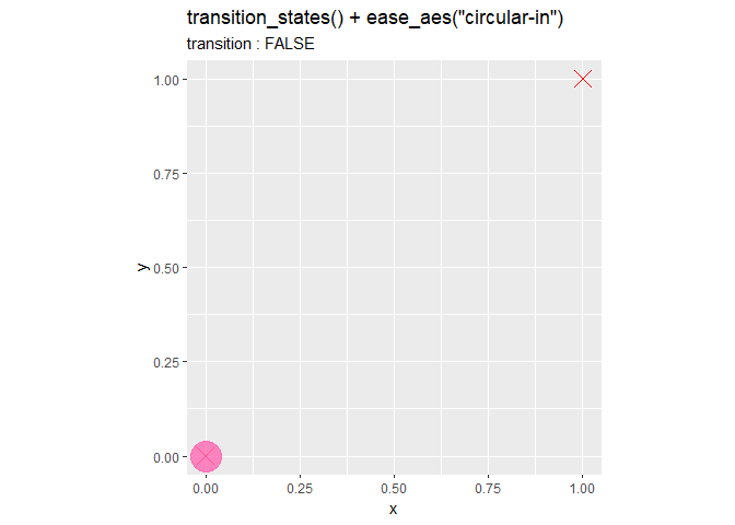
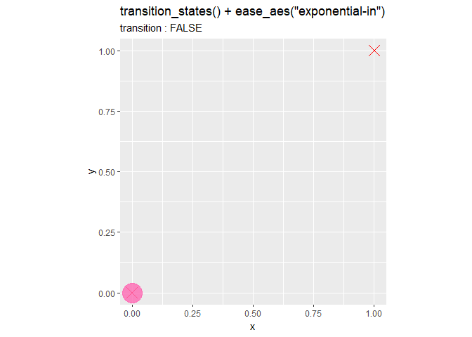
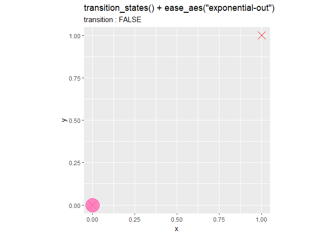
散布図の場合


棒グラフの場合


イージング関数
イージングの仕組みについて確認します。ease_aes()の使い方の話からは逸れるので、不要であれば飛ばしてください。また、ease_aes()の内部で計算される値と一致しているかは未確認です。
イージング関数は大きく分けて、単調増加する(値が下がらない)タイプと単調増加しない(値が上下する)タイプがあります。
また、それぞれInタイプを基本形として、OutタイプはInを反転させたもの、InOutタイプはInとOutを繋げたものです。
各関数をグラフで比較します。
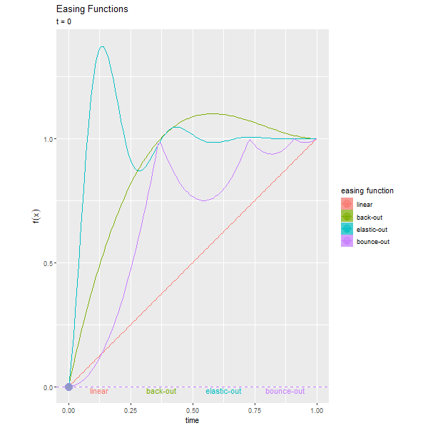
・単調増加するタイプ
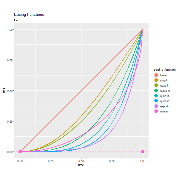
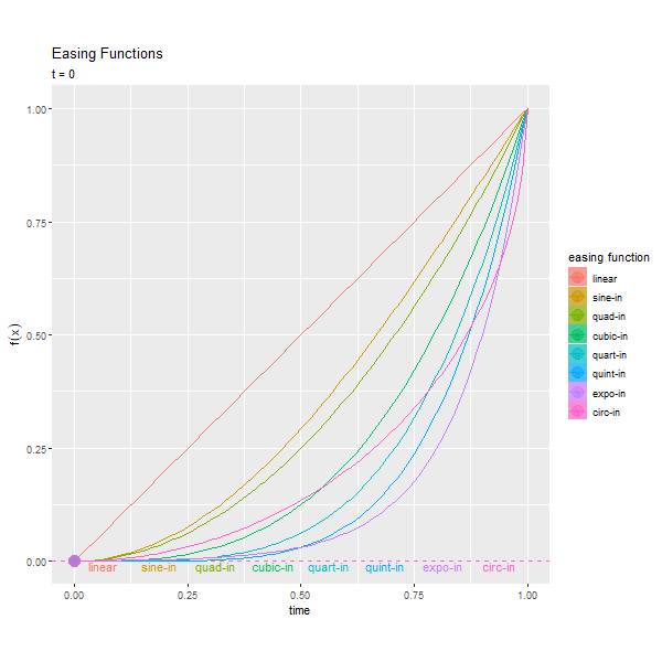
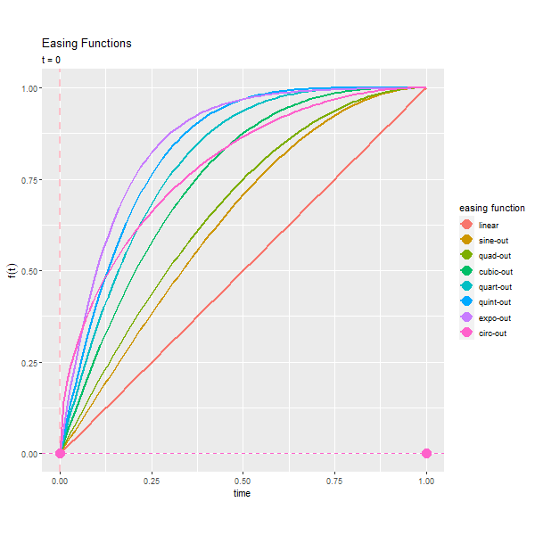
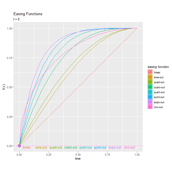
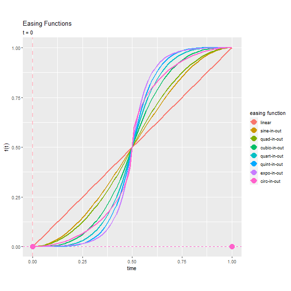
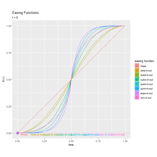
関数ごとに、時間と変化の度合(遷移率?)を曲線で表します。曲線上の点は、その時間における遷移の度合い(?)で、左図の右端で動く点と右図のバーの高さに対応します。曲線の形から各関数の特徴が分かります。
sine<quadratic<cubic<quartic<quintic<exponentialの順で変化が大きく(緩急がきつく)なります。circularは少し異なる変化になります。
・単調増加しないタイプ
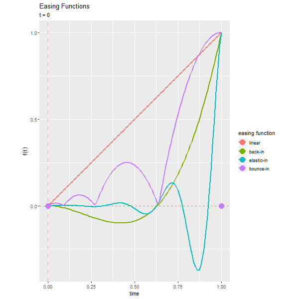
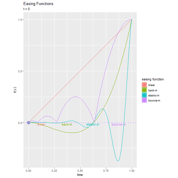
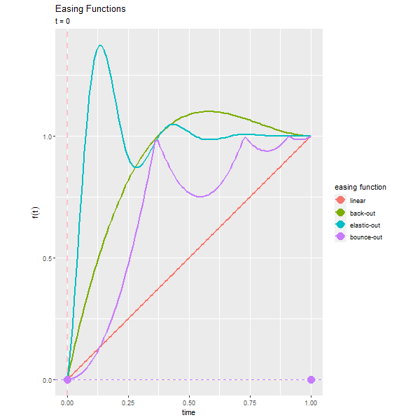
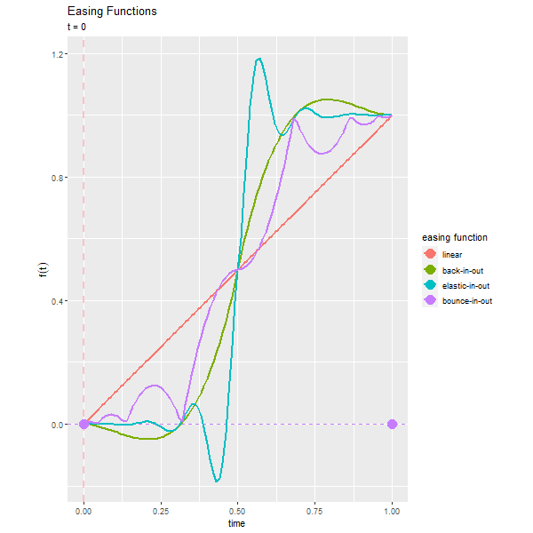
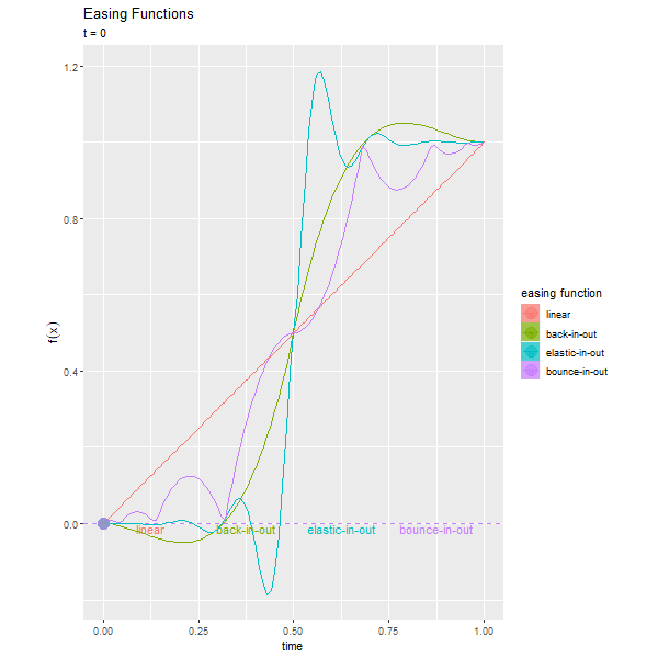
backとelasticは0または1の範囲を越えて変化します。
個々のイージング関数に興味があれば次の記事を参照してください。
複数データの場合
ここまでは、2点間の遷移を見てきました。次は、複数データの場合を確認します。
複数データ間を遷移するアニメーションを見てみましょう。
# データ数を指定
N <- 10

# ランダムに値を作成
df <- tibble::tibble(
  x = sample(x = 0:N, size = N, replace = FALSE), # x軸の値
  y = sample(x = 0:N, size = N, replace = FALSE), # y軸の値
  frame = 1:N # フレーム番号
)

# 目印用のデータフレームを作成
mark_df <- df %>%
  dplyr::select(!frame) # フレーム列を削除

# 確認
head(df)
## # A tibble: 6 x 3
##       x     y frame
##   <int> <int> <int>
## 1     2     6     1
## 2    10     9     2
## 3     6     3     3
## 4     7     8     4
## 5     0     1     5
## 6     4     5     6
x軸とy軸の値をランダムに決めます。フレーム番号は通し番号で割り当てます。
・散布図の場合
# イージング関数を指定
efm <- "cubic-in"

# 散布図を作成
anim <- ggplot() +
  geom_point(data = mark_df, mapping = aes(x = x, y = y),
             size = 5, shape = 4, color = "red") + # 実データの点
  geom_path(data = mark_df, mapping = aes(x = x, y = y),
            size = 1, color = "red", linetype = "dotted") + # 実データ間(軌道)の線
  geom_point(data = df, mapping = aes(x = x, y = y),
             size = 10, alpha = 0.8, color = "hotpink") + # 移動点
  gganimate::transition_states(states = frame, transition_length = 9, state_length = 1) + # フレーム
  gganimate::ease_aes(efm) + # 変化の緩急
  coord_fixed(ratio = 1) + # アスペクト比
  labs(title = paste0('transition_states() + ease_aes("', efm, '")'),
       subtitle = "transition : {transitioning}") # ラベル

# gif画像を作成
gganimate::animate(plot = anim, nframes = (N+1)*10, fps = 10)

・棒グラフの場合
# イージング関数を指定
efm <- "cubic-in"

# 棒グラフを作成
anim <- ggplot() +
  geom_bar(data = df, mapping = aes(x = 1, y = y),
           stat = "identity", width = 0.9, alpha = 0.8, fill = "hotpink", color = "hotpink") + # 伸縮バー
  geom_hline(data = mark_df, mapping = aes(yintercept = y),
             size = 1, color = "red", linetype = "dashed") + # 実データの線
  gganimate::transition_states(states = frame, transition_length = 9, state_length = 1) + # フレーム
  gganimate::ease_aes(efm) + # 変化の緩急
  scale_x_continuous(breaks = 1, minor_breaks = FALSE, limits = c(0.5, 1.5)) + # x軸目盛
  coord_flip() + # 軸の反転
  labs(title = paste0('transition_states() + ease_aes("', efm, '")'),
       subtitle = "transition : {transitioning}") # ラベル

# gif画像を作成
gganimate::animate(plot = anim, nframes = (N+1)*10, fps = 10, height = 150)
データ間ごとにイージングされます。変化が大きいほどイージング処理が分かりやすいかもしれません。
続いて、複数のデータが遷移する場合です。
# データ数を指定
N_data <- 10

# フレーム数を指定
N_frame <- 10

# ランダムに値を作成
df <- tibble::tibble(
  x = sample(x = 0:N_data, size = N_data*N_frame, replace = TRUE), # x軸の値
  y = sample(x = 0:N_data, size = N_data*N_frame, replace = TRUE), # y軸の値
  id = rep(1:N_data, times = N_frame) %>%
    as.factor(), # データ番号
  frame = rep(1:N_data, each = N_frame) # フレーム番号
)
head(df)
## # A tibble: 6 x 4
##       x     y id    frame
##   <int> <int> <fct> <int>
## 1     2    10 1         1
## 2     7     4 2         1
## 3     7     9 3         1
## 4     4     1 4         1
## 5    10     9 5         1
## 6     0     3 6         1
x軸とy軸の値をランダムに決め、データ番号とフレーム番号は通し番号で割り当てます。
・散布図の場合
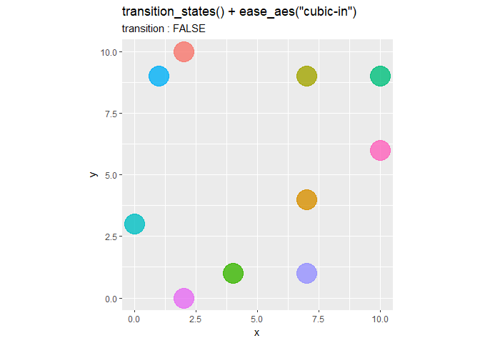
# イージング関数を指定
efm <- "cubic-in"

# 散布図を作成
anim <- ggplot() +
  geom_point(data = df, mapping = aes(x = x, y = y, color = id),
             size = 10, alpha = 0.8, show.legend = FALSE) + # 移動点
  gganimate::transition_states(states = frame, transition_length = 9, state_length = 1) + # フレーム
  gganimate::ease_aes(efm) + # 変化の緩急
  coord_fixed(ratio = 1) + # アスペクト比
  labs(title = paste0('transition_states() + ease_aes("', efm, '")'),
       subtitle = "transition : {transitioning}") # ラベル

# gif画像を作成
gganimate::animate(plot = anim, nframes = (N_frame+1)*10, fps = 10)
・棒グラフの場合
# イージング関数を指定
efm <- "cubic-in"

# 棒グラフを作成
anim <- ggplot() +
  geom_bar(data = df, mapping = aes(x = id, y = y, fill = id, color = id),
           stat = "identity", width = 0.9, alpha = 0.8, show.legend = FALSE) + # 伸縮バー
  gganimate::transition_states(states = frame, transition_length = 9, state_length = 1) + # フレーム
  gganimate::ease_aes(efm) + # 変化の緩急
  coord_flip() + # 軸の反転
  labs(title = paste0('transition_states() + ease_aes("', efm, '")'),
       subtitle = "transition : {transitioning}") # ラベル

# gif画像を作成
gganimate::animate(plot = anim, nframes = (N_frame+1)*10, fps = 10)
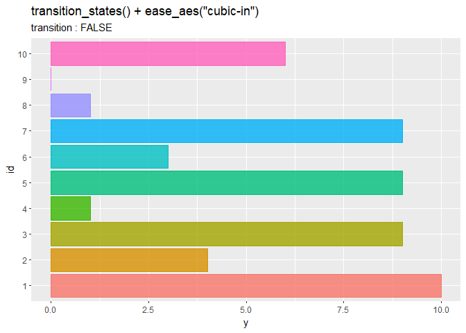
データごとに変化します。
利用例:データザウルス
ease_aes()の使用例として、データザウルスの各データを順番に描画するアニメーションを作成します。
利用するパッケージを読み込みます。
# 利用パッケージ
library(gganimate)
library(datasauRus)
library(tidyverse)
データザウルスのデータセットはdatasauRusパッケージで利用できます。
利用するデータフレームを用意します。
# 作図用のデータセットを作成
df <- datasauRus::datasaurus_dozen %>%
  tibble::add_column(
    n = rep(sample(x = 1:142, size = 142, replace = FALSE), times = 13),
    id = rep(1:13, each = 142)
  ) # データ番号とデータセット番号を追加
head(df)
## # A tibble: 6 x 5
##   dataset     x     y     n    id
##   <chr>   <dbl> <dbl> <int> <int>
## 1 dino     55.4  97.2   122     1
## 2 dino     51.5  96.0    23     1
## 3 dino     46.2  94.5   134     1
## 4 dino     42.8  91.4    50     1
## 5 dino     40.8  88.3    53     1
## 6 dino     38.7  84.9    62     1
13種類のデータがあり、それぞれ142個の値で構成されています。それぞれ通し番号を割り当てます。
13種類のデータを順番に散布図で描画します。
# アニメーションを作成
anim <- ggplot(df, aes(x = x, y = y, color = as.factor(n))) +
  geom_point(size = 3, show.legend = FALSE) + # 散布図
  gganimate::transition_states(states = id, transition_length = 9, state_length = 1, wrap = TRUE) + # フレーム
  gganimate::ease_aes("elastic-in") + # 変化の緩急
  coord_fixed(ratio = 1) + # アスペクト比
  xlim(c(0, 100)) + # x軸の表示範囲
  ylim(c(0, 100)) + # y軸の表示範囲
  labs(title = paste0('transition_states() + ease_aes("elastic-in")'),
       subtitle = "transition : {transitioning}",
       caption = "datasauRus")

# gif画像を作成
gganimate::animate(plot = anim, nframes = 140, fps = 10)
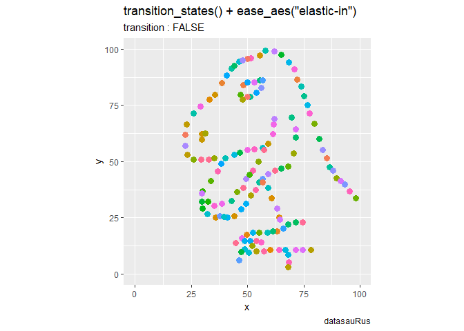
あくまで演出上の機能ですね。
利用例:バーチャートレース
バーチャートレースの作図については参照してください。
参考リンク
おわりに
この記事を書いてたら脱線して10記事も生えちゃった。