はじめに
gganimateパッケージについて理解したいシリーズです。
この記事では、view_follow関数の機能を確認します。
【他の内容】
【目次】
view_follow
gganimateパッケージの関数view_follow()について解説します。view_follow()は、グラフの描画範囲を制御します。
利用するパッケージを読み込みます。
# 利用パッケージ
library(gganimate)
library(ggplot2)
基本的に、パッケージ名::関数名()の記法で書きます。ただし作図コードに関してはごちゃごちゃしてしまうので、ggplot2パッケージの関数は関数名のみで、gganimateパッケージの関数はパッケージ名を明示して書きます。
データフレームの作成
まずは、作図に利用するデータフレームを作成します。
# データフレームを作成
df <- tibble::tibble(
  x = 0:5,
  y = 0:5,
  frame = 0:5
)
 # A tibble: 6 x 3
##       x     y frame
##   <int> <int> <int>
## 1     0     0     0
## 2     1     1     1
## 3     2     2     2
## 4     3     3     3
## 5     4     4     4
## 6     5     5     5
分かりやすい値を作成しておきます。tibble::tibble()を使ってデータフレームを作成していますが、data.frame()を使っても問題ありません。
フレーム切り替え関数transition_***()の第1引数に、フレームの順序を示すframe列を指定します。
作成したデータをグラフで確認しておきます。
# 散布図を作成
ggplot(df, aes(x = x, y = y)) +
  geom_point(size = 5, color = "hotpink") + # 散布図
  geom_path(color = "hotpink") + # 折れ線
  scale_x_continuous(breaks = df[["x"]], minor_breaks = FALSE) + # x軸目盛
  scale_y_continuous(breaks = df[["y"]], minor_breaks = FALSE) + # y軸目盛
  coord_fixed(ratio = 1) + # アスペクト比
  labs(title = "geom_point() + geom_path()")

このデータを用いた散布図と折れ線グラフのアニメーションを通じて、view_follow()の機能を確認していきます。
引数
view_follow()で利用できる3つの引数(fixed・exclude_layer・aspect_ratio)を確認します。
fixed
fixed_x引数は、x軸を固定する(可変にしない)かを論理値で指定します。fixed_y引数は、y軸の設定です。
・transition_manual()の場合
# 論理値を指定:(デフォルト:FALSE)
#fx <- TRUE
fx <- FALSE
#fy <- TRUE
fy <- FALSE

# fixed(描画範囲の固定)の設定
anim <- ggplot(df, aes(x = x, y = y)) +
  geom_point(size = 10, color = "hotpink") + # 散布図
  geom_path(size = 1, color = "hotpink") + # 折れ線
  gganimate::transition_manual(frame = frame, cumulative = TRUE) + # フレーム
  gganimate::view_follow(fixed_x = fx, fixed_y = fy) + # 描画範囲
  scale_x_continuous(breaks = df[["x"]], minor_breaks = FALSE) + # x軸目盛
  scale_y_continuous(breaks = df[["y"]], minor_breaks = FALSE) + # y軸目盛
  labs(title = paste0("transition_manual() + view_follow(fixed_x = ", fx, ", fixed_y = ", fy, ")"),
       subtitle = paste0("frame : {current_frame}"))

# gif画像を作成
gganimate::animate(plot = anim, nframes = 6, fps = 1)


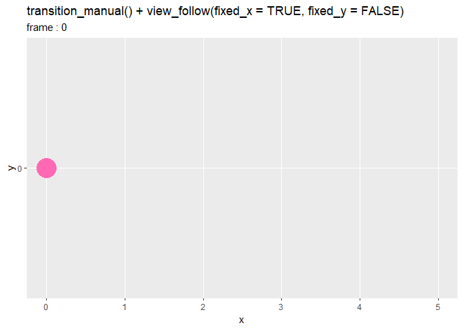

デフォルトは両方ともFALSEで、各フレームで描画するデータに応じて両軸の描画範囲が変わります。
fixed_xをTRUEにするとx軸が固定され、fixed_yをTRUEにするとy軸が固定されます。
どちらもTRUEにすると、全てのデータの最小値と最大値から描画範囲が固定されます。これは、view_follow()を使わない場合と同じ処理です。
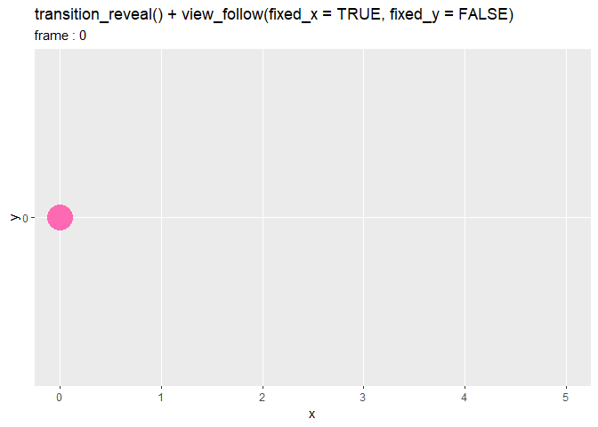
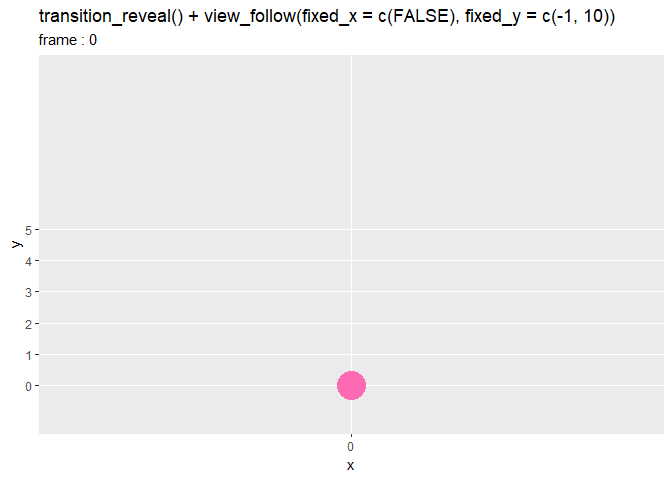
・transition_reveal()の場合
# 論理値を指定:(デフォルト:FALSE)
#fx <- TRUE
fx <- FALSE
#fy <- TRUE
fy <- FALSE

# fixed(描画範囲の固定)の設定
anim <- ggplot(df, aes(x = x, y = y)) +
  geom_point(size = 10, color = "hotpink") + # 散布図
  geom_path(size = 1, color = "hotpink") + # 折れ線
  gganimate::transition_reveal(along = frame) + # フレーム
  gganimate::view_follow(fixed_x = fx, fixed_y = fy) + # 描画範囲
  scale_x_continuous(breaks = df[["x"]], minor_breaks = FALSE) + # x軸目盛
  scale_y_continuous(breaks = df[["y"]], minor_breaks = FALSE) + # y軸目盛
  labs(title = paste0("transition_reveal() + view_follow(fixed_x = ", fx, ", fixed_y = ", fy, ")"),
       subtitle = paste0("frame : {frame_along}"))

# gif画像を作成
gganimate::animate(plot = anim, nframes = 60, fps = 10)


・transition_states()の場合
# 論理値を指定:(デフォルト:FALSE)
#fx <- TRUE
fx <- FALSE
#fy <- TRUE
fy <- FALSE

# fixed(描画範囲の固定)の設定
anim <- ggplot(df, aes(x = x, y = y)) +
  geom_point(size = 10, color = "hotpink") + # 散布図
  gganimate::transition_states(states = frame) + # フレーム
  gganimate::view_follow(fixed_x = fx, fixed_y = fy) + # 描画範囲
  scale_x_continuous(breaks = df[["x"]], minor_breaks = FALSE) + # x軸目盛
  scale_y_continuous(breaks = df[["y"]], minor_breaks = FALSE) + # y軸目盛
  labs(title = paste0("transition_states() + view_follow(fixed_x = ", fx, ", fixed_y = ", fy, ")"),
       subtitle = paste0("frame : {closest_state}"))

# gif画像を作成
gganimate::animate(plot = anim, nframes = 60, fps = 10)
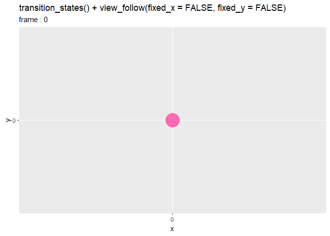


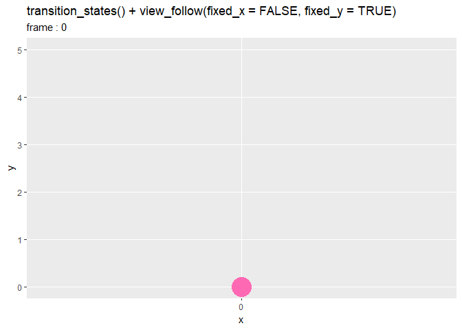
点が動いていないように見えますが、軸の値が変わっているのが分かります。
fixed_x引数に、2つの値を持つベクトルで描画範囲を指定することもできます。
# 値を指定:(デフォルト:FALSE)
#fx <- FALSE
fx <- c(2, 4)
fy <- FALSE
#fy <- c(2, 4)

# fixed(描画範囲の固定)の設定
anim <- ggplot(df, aes(x = x, y = y)) +
  geom_point(size = 10, color = "hotpink") + # 散布図
  geom_path(size = 1, color = "hotpink") + # 折れ線
  gganimate::transition_reveal(along = frame) + # フレーム
  gganimate::view_follow(fixed_x = fx, fixed_y = fy) + # 描画範囲
  scale_x_continuous(breaks = df[["x"]], minor_breaks = FALSE) + # x軸目盛
  scale_y_continuous(breaks = df[["y"]], minor_breaks = FALSE) + # y軸目盛
  labs(
    title = paste0(
      "transition_reveal() + ",
      "view_follow(fixed_x = c(", paste0(fx, collapse = ", "), "), fixed_y = c(", paste0(fy, collapse = ", "), "))"
    ),
    subtitle = paste0("frame : {frame_along}")
  )

# gif画像を作成
gganimate::animate(plot = anim, nframes = 60, fps = 10)

軸ごとにc(最小値, 最大値)の形で指定します。データの範囲内でも範囲外でも指定できます。最小値・最大値の片方だけを指定する場合は、指定しない方をNAにします。
軸目盛についてはscale_*_continuous()なので設定してください。
(coord_fixed()を使うとエラーになるけど理由が分からない。)
exclude_layer
exclude_layerは、対象外とするレイヤを指定できるはずなのですが
# 値を指定:(デフォルト:NULL)
el <- NULL
el <- 2

# exclude_layer(除外するレイヤ)の設定
anim <- ggplot(df, aes(x = x)) +
  geom_point(aes(y = y+1), size = 10, color = "hotpink") + # 散布図
  geom_point(aes(y = y*2), size = 10, color = "orange") + # 散布図
  gganimate::transition_manual(frame = frame, cumulative = TRUE) + # フレーム
  gganimate::view_follow(exclude_layer = el) + # 描画範囲
  scale_x_continuous(breaks = df[["x"]], minor_breaks = FALSE) + # x軸目盛
  scale_y_continuous(breaks = df[["y"]], minor_breaks = FALSE) + # y軸目盛
  coord_fixed(ratio = 1) + # アスペクト比
  labs(title = paste0("transition_manual() + view_follow(exclude_layer = c(", paste0(el, collapse = ", "), "))"),
       subtitle = paste0("frame : {current_frame}"))

# gif画像を作成
gganimate::animate(plot = anim, nframes = 6, fps = 1)
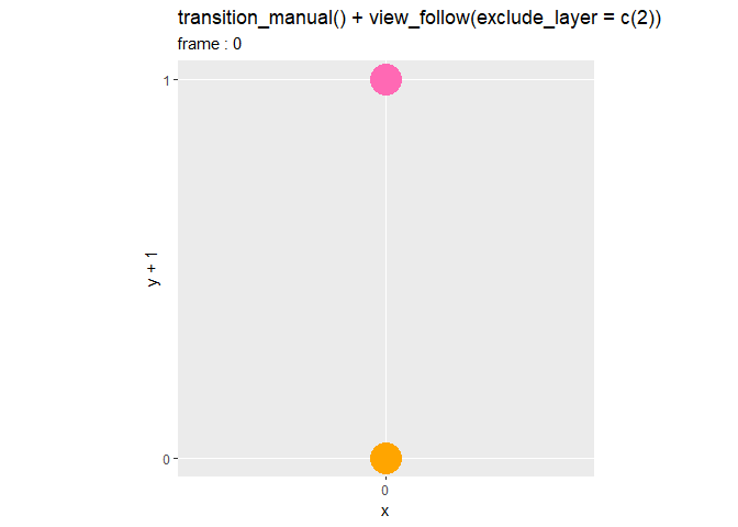
よく分かりませんでした。上のようにすると、2つ目(aes(y = y*2)の方)のgeom_point()のデータ(オレンジ色の点)の最小値と最大値が無視されるのかと思ったのですが、違うようです。(分かる方は教えてください。)
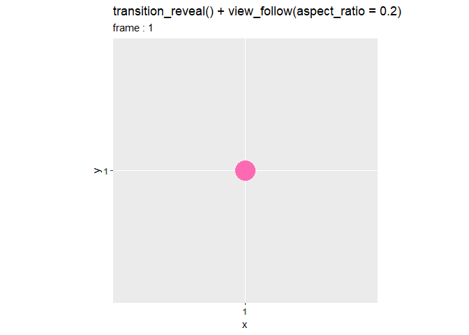
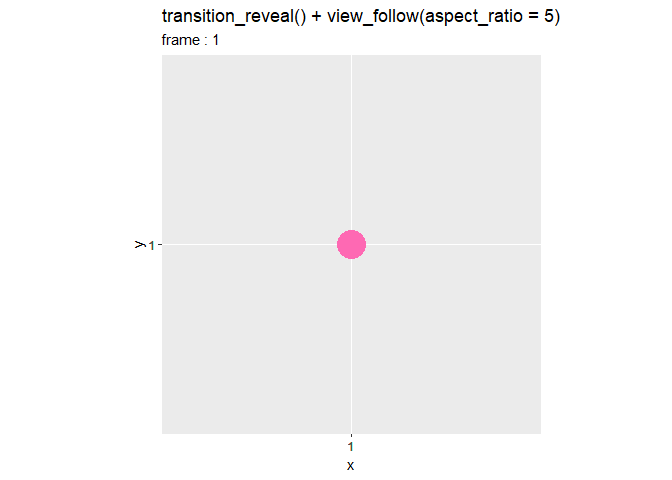
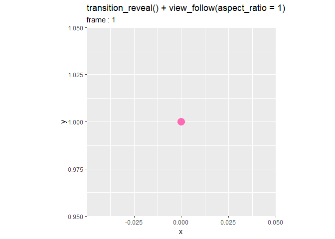
aspect_ratio
aspect_ratioは、アスペクト比を非負の数値で指定します。
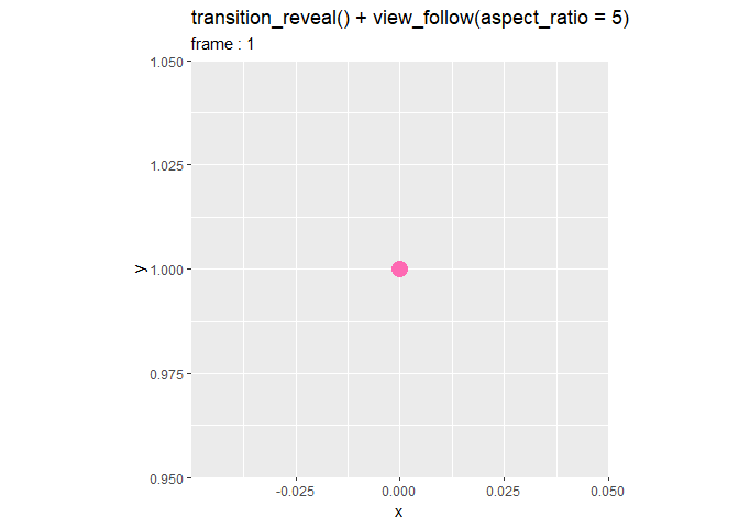
# 値を指定:(デフォルト:NULL)
ar <- 1

# aspect_ratio(アスペクト比)の設定
anim <- ggplot(df, aes(x = x, y = y)) +
  geom_point(size = 10, color = "hotpink") + # 棒グラフ
  geom_path(size = 1, color = "hotpink") + # 折れ線
  gganimate::transition_reveal(along = frame) + # フレーム
  gganimate::view_follow(aspect_ratio = ar) + # 描画範囲
  coord_fixed(ratio = 1) + # アスペクト比
  scale_x_continuous(breaks = df[["x"]], minor_breaks = FALSE) + # x軸目盛
  scale_y_continuous(breaks = df[["y"]], minor_breaks = FALSE) + # y軸目盛
  labs(title = paste0("transition_reveal() + view_follow(aspect_ratio = ", ar, ")"),
       subtitle = paste0("frame : {frame_along}"))

# gif画像を作成
gganimate::animate(plot = anim, nframes = 60, fps = 10)
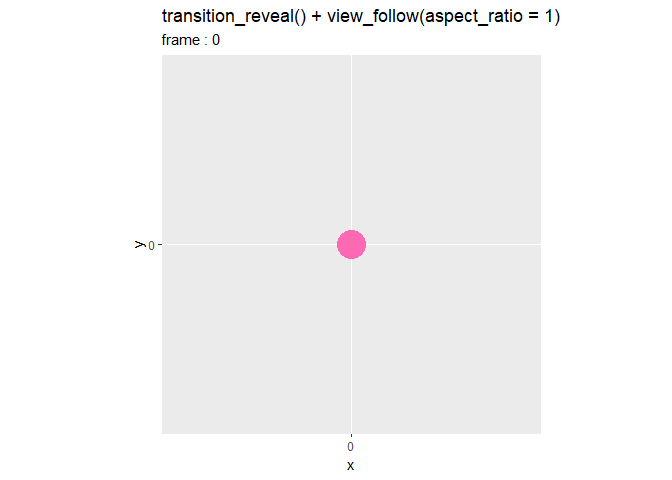

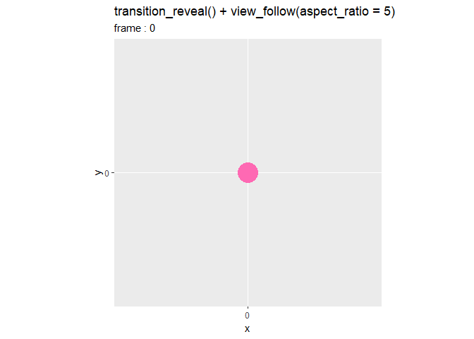
値に応じて軸の縮尺が調整されます。(図における「y軸の長さ」割る「x軸の長さ」がaspect_ratioになるように縮尺が変わると解釈していいのでしょうか?)
デフォルトは1で、x軸とy軸の比率が等倍です。0に近いほど横に、値が大きいほど縦に引き伸ばされたようなグラフになります。
分かりやすいように、正方形の頂点となる点を作成して試してみます。
# 正方形の点を作成
square_df <- tibble::tibble(
  x = c(1, 1, -1, -1, 1),
  y = c(1, -1, -1, 1, 1),
  frame = 1:5
)
head(square_df)
## # A tibble: 5 x 3
##       x     y frame
##   <dbl> <dbl> <int>
## 1     1     1     1
## 2     1    -1     2
## 3    -1    -1     3
## 4    -1     1     4
## 5     1     1     5
アニメーションを作成します。
# 値を指定:(デフォルト:NULL)
ar <- 1

# aspect_ratio(アスペクト比)の設定
anim <- ggplot(square_df, aes(x = x, y = y)) +
  geom_point(size = 10, color = "hotpink") + # 棒グラフ
  geom_path(size = 1, color = "hotpink") + # 折れ線
  gganimate::transition_reveal(along = frame) + # フレーム
  gganimate::view_follow(aspect_ratio = ar) + # 描画範囲
  coord_fixed(ratio = 1) + # アスペクト比
  scale_x_continuous(breaks = square_df[["x"]], minor_breaks = FALSE) + # x軸目盛
  scale_y_continuous(breaks = square_df[["y"]], minor_breaks = FALSE) + # y軸目盛
  labs(title = paste0("transition_reveal() + view_follow(aspect_ratio = ", ar, ")"),
       subtitle = paste0("frame : {frame_along}"))

# gif画像を作成
gganimate::animate(plot = anim, nframes = 40, fps = 10)

円形でも試してみます。
# フレーム数を指定
N <- 101

# 単位円の点を作成
circle_df <- tibble::tibble(
  r = seq(from = pi*2.5, to = pi*0.5, length.out = N),
  x = cos(r),
  y = sin(r),
  frame = 1:N
)
head(circle_df)
## # A tibble: 6 x 4
##       r        x     y frame
##   <dbl>    <dbl> <dbl> <int>
## 1  7.85 3.06e-16 1         1
## 2  7.79 6.28e- 2 0.998     2
## 3  7.73 1.25e- 1 0.992     3
## 4  7.67 1.87e- 1 0.982     4
## 5  7.60 2.49e- 1 0.969     5
## 6  7.54 3.09e- 1 0.951     6
0からの(ここでは開始位置を調整するために
から
としています)値を
として、x軸の値を
、y軸の値を
で計算します。
は円周率です。
アニメーションを作成します。
# 値を指定:(デフォルト:NULL)
ar <- 1

# aspect_ratio(アスペクト比)の設定
anim <- ggplot(circle_df, aes(x = x, y = y)) +
  geom_point(size = 5, color = "hotpink") + # 散布図
  geom_path(size = 1, color = "hotpink") + # 折れ線
  gganimate::transition_reveal(along = frame) + # フレーム
  gganimate::view_follow(aspect_ratio = ar) + # 描画範囲
  coord_fixed(ratio = 1) + # アスペクト比
  labs(title = paste0("transition_reveal() + view_follow(aspect_ratio = ", ar, ")"),
       subtitle = paste0("frame : {frame_along}"))

# gif画像を作成
gganimate::animate(plot = anim, nframes = N, fps = 10)
以上で、引数の機能を確認しました。次は、実用を想定してグラフを作成します。
利用例:確率分布
gganimateパッケージの使用例として、正規分布(ガウス分布)の標準偏差(パラメータ)とグラフの形状の関係をアニメーションで可視化します。詳しくは「transition_reveal関数【gganimate】 - からっぽのしょこ」を参照してください。
利用するパッケージを読み込みます。
# 利用パッケージ
library(gganimate)
library(ggplot2)
標準偏差の異なる正規分布を計算します。
# x軸の値を作成
x_vals <- seq(from = -5, to = 5, by = 0.1)

# 標準偏差として利用する値を作成
sd_vec <- seq(from = 0.5, to = 3, by = 0.2)

# 標準偏差ごとにガウス分布の計算
dens_df <- tibble::tibble()
for(sd in sd_vec) {
  # ガウス分布の確率密度を計算
  tmp_df <- tibble::tibble(
    x = x_vals,
    sigma = sd,
    density = dnorm(x = x_vals, mean = 0, sd = sd)
  )

  # 計算結果を結合
  dens_df <- rbind(dens_df, tmp_df)
}
head(dens_df)
## # A tibble: 6 x 3
##       x sigma  density
##   <dbl> <dbl>    <dbl>
## 1  -5     0.5 1.54e-22
## 2  -4.9   0.5 1.11e-21
## 3  -4.8   0.5 7.76e-21
## 4  -4.7   0.5 5.19e-20
## 5  -4.6   0.5 3.33e-19
## 6  -4.5   0.5 2.06e-18
for()を使って、複数の標準偏差sd_vecの要素ごとに正規分布の確率密度を計算します。
正規分布の確率密度関数dnorm()の確率変数の引数xにx軸の値x_vals、平均の引数meanにこの例では0、標準偏差の引数にsdを指定します。
アニメーションを作成します。
# ガウス分布のアニメーションを作成:折れ線グラフ
anim <- ggplot(dens_df, aes(x = x, y = density, color = as.factor(sigma), group = sigma)) +
  geom_point(show.legend = FALSE) + # 散布図
  geom_line(show.legend = FALSE) + # 折れ線グラフ
  gganimate::transition_reveal(along = x) + # フレーム
  gganimate::view_follow() + # 描画範囲
  labs(title = "transition_reveal() + view_follow()",
       subtitle = "x = {round(frame_along, 1)}")

# gif画像を作成
gganimate::animate(plot = anim, nframes = length(x_vals), fps = 10)
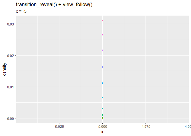
グラフに応じて描画範囲(x軸とy軸)が変化します。
利用例:ランダムウォーク
次は、2次元のランダムウォークのアニメーション(gif画像)を作成します。詳しくは「2次元ランダムウォークのアニメーションの作図:2方向移動【gganimate】 - からっぽのしょこ」を参照してください。
利用するパッケージを読み込みます。
# 利用パッケージ
library(gganimate)
library(tidyverse)
「-1か1の値」と「"x"か"y"の軸」をランダムに生成して、各試行までの合計を求めます。
# 試行回数を指定
max_iter <- 100

# ランダムに値を生成
random_val_vec <- sample(c(-1, 1), size = max_iter, replace = TRUE)

# ランダムに軸を生成
random_axis_vec <- sample(c("x", "y"), size = max_iter, replace = TRUE)

# 試行ごとに集計
random_df <- tibble::tibble(
  iteration = c(0, 0, 1:max_iter),
  random_val = c(0, 0, random_val_vec),
  axis = c("x", "y", random_axis_vec)
) %>%
  tidyr::pivot_wider(
    names_from = axis,
    values_from = random_val,
    values_fill = 0
  ) %>% # 横型に変形
  dplyr::mutate(
    x = cumsum(x),
    y = cumsum(y)
  ) # 各試行までの合計
head(random_df)
## # A tibble: 6 x 3
##   iteration     x     y
##       <dbl> <dbl> <dbl>
## 1         0     0     0
## 2         1    -1     0
## 3         2    -1    -1
## 4         3    -1     0
## 5         4    -2     0
## 6         5    -3     0
pivot_wider()で、axis列(移動する軸)とrandom_val列(移動する方向)を展開します。
追加されたx列とy列それぞれの累積和をcumsum()で計算します。
アニメーションを作成します。
# 2次元ランダムウォークを作図
anim <- ggplot(random_df, aes(x = x, y = y)) +
  geom_point(color = "hotpink", size = 5) + # 散布図
  geom_path(color = "hotpink", size = 1, alpha = 0.5) + # 折れ線
  geom_hline(yintercept = 0, color = "red", linetype = "dashed") + # 水平線
  geom_vline(xintercept = 0, color = "red", linetype = "dashed") + # 垂直線
  gganimate::transition_reveal(along = iteration) + # フレーム
  gganimate::view_follow() + # 描画範囲
  #coord_fixed(ratio = 1) + # アスペクト比
  labs(title = "transition_reveal() + view_follow()",
       subtitle = "iter : {frame_along}")

# gif画像を作成
gganimate::animate(plot = anim, nframes = max_iter+1, fps = 10)
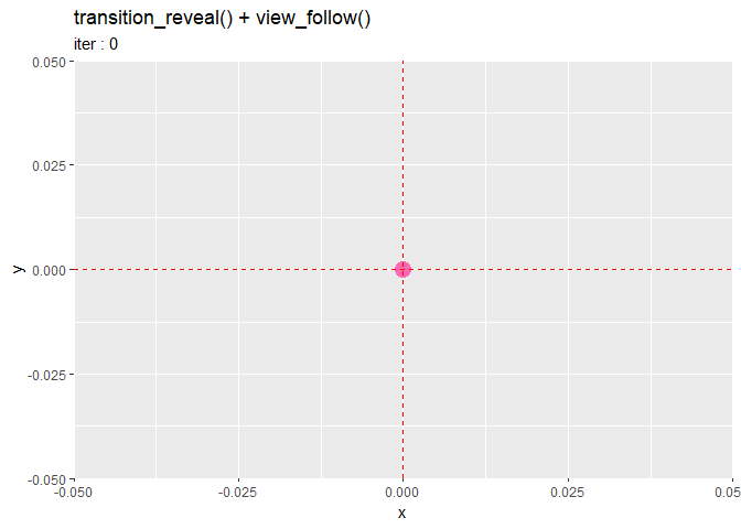
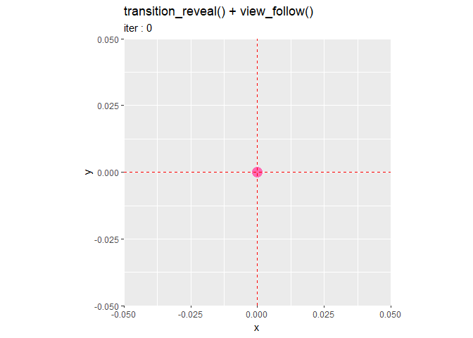
グラフ(ピンク色の点)が現在の描画範囲の外に出るタイミングでx軸またはy軸が変化します。
右の図は、coord_fixed()を含めて作図したものです。アスペクト比を保つためにx軸とy軸の両方が変化します。
おわりに
あとひとつやればバーチャートレースが完成するはず。