
はじめに
「統計検定2級」の独学時のまとめノートです。各種の統計手法について「数式・プログラム・図」を用いて解説します。
『統計学基礎』に沿って学習を進めます。本の補助として読んでください。
この記事では、正規分布の平均パラメータの差の信頼区間をPythonでスクラッチ実装して、計算過程を可視化します。
【前節の内容】
【この節の内容】
3.5.2 正規分布の母平均の差の区間推定の実装:対標本の場合
相関のある正規分布(2-dimensional Normal distribution・2次元ガウス分布・2-dimensional Gaussian distribution)の母平均の差(the difference in population means)に関する信頼区間(confidence interval)を実装して、人工的に生成したデータを用いて、パラメータの区間推定を行います。この記事では、母分布の分散パラメータが既知(known variance parameter)の場合を扱います。
正規分布については「多次元ガウス分布の定義式 - からっぽのしょこ」、母平均の信頼区間については「【Python】3.4.2:正規分布の母平均の信頼区間の実装:母分散が未知の場合【統計検定2級のノート】 - からっぽのしょこ」を参照してください。
利用するライブラリを読み込みます。
# ライブラリを読込
import numpy as np
from scipy.stats import multivariate_normal, norm, t
import matplotlib.pyplot as plt
import matplotlib.patches as mpatches
区間推定の実装
まずは、母分散が未知で相関のある2つの正規分布の母平均の差に関する信頼区間の計算における一連の処理を確認します。
母分布(2次元正規分布)を設定して、母分布に従う標本(トイデータ)を生成します。続いて、生成した標本を用いて、母平均の差の信頼区間の計算(パラメータの区間推定)を行います。
母集団の設定
母集団のデータが従う分布(母分布・population distribution・2次元正規分布) の母数(パラメータ)
を設定します。母分散
は未知とします。
ただし、個々の母集団に注目する際は(表記がゴチャゴチャするのでpopを省略して)、1つ目の母集団のパラメータを 、2つ目の母集団のパラメータを
で表します。
正規分布のグラフ作成については「【Python】2次元ガウス分布の作図 - からっぽのしょこ」「【Python】1次元ガウス分布の作図 - からっぽのしょこ」を参照してください。
対応のある母集団
2つの母集団に関して、母共分散 による依存関係を持つ1組の母集団(2次元正規分布)
として扱います。
母分布のパラメータ を設定します。
# 母平均ベクトルを指定
mu_pop_d = np.array(
    [10.0, 4.0]
)
print(mu_pop_d)

# 母分散共分散行列を指定
sigma2_pop_dd = np.array(
    [[9.0, -1.0],
     [-1.0, 4.0]]
)
print(sigma2_pop_dd)
[10.  4.]
[[ 9. -1.]
 [-1.  4.]]
2次元正規分布の平均ベクトル(母平均・実数値ベクトル) 、分散共分散行列(母分散・正定値行列)
を指定します。
番目の母集団の確率変数
の平均(母平均・実数値)
、
の分散(母分散・正の値)
、2つの母集団の確率変数
の共分散(母共分散)
を指定して、パラメータごとの配列に格納します。
が区間推定における真の値であり、この値の差が含まれる区間を求めるのがここでの目的(推定・推測)です。
母平均の差 を計算します。
# 母平均の差を計算
delta_pop = mu_pop_d[0] - mu_pop_d[1]
#delta_pop = np.subtract(*mu_pop_d)
print(delta_pop)
6.0
母平均の差 を、次の式で計算します。
母分布の確率変数 の作図範囲を設定します。
# x軸の範囲を設定
#x_min = -2.0
#x_max = 19.0
k = 3.0
u = 1.0
x_min = np.min([mu_pop_d[d] - k*np.sqrt(sigma2_pop_dd[d, d]) for d in range(2)]) # 基準値を指定
x_max = np.max([mu_pop_d[d] + k*np.sqrt(sigma2_pop_dd[d, d]) for d in range(2)]) # 基準値を指定
#x_min = np.min(x_nd) # 基準値を指定
#x_max = np.max(x_nd) # 基準値を指定
x_min = np.floor(x_min /u)*u # u単位で切り下げ
x_max = np.ceil(x_max /u)*u  # u単位で切り上げ
print(x_min, x_max)

# x軸の値を作成
x_vec = np.linspace(start=x_min, stop=x_max, num=1001)
print(x_vec[:5])

# x1,x2軸の格子点を作成
x_1_grid, x_2_grid = np.meshgrid(x_vec, x_vec)
print(x_1_grid[:5, :5])
print(x_2_grid[:5, :5])

# x1,x2軸の座標を整形
x_arr  = np.stack([x_1_grid.flatten(), x_2_grid.flatten()], axis=1)
x_dims = x_1_grid.shape
print(x_arr[:5])
-2.0 19.0
[-2.    -1.979 -1.958 -1.937 -1.916]
[[-2.    -1.979 -1.958 -1.937 -1.916]
 [-2.    -1.979 -1.958 -1.937 -1.916]
 [-2.    -1.979 -1.958 -1.937 -1.916]
 [-2.    -1.979 -1.958 -1.937 -1.916]
 [-2.    -1.979 -1.958 -1.937 -1.916]]
[[-2.    -2.    -2.    -2.    -2.   ]
 [-1.979 -1.979 -1.979 -1.979 -1.979]
 [-1.958 -1.958 -1.958 -1.958 -1.958]
 [-1.937 -1.937 -1.937 -1.937 -1.937]
 [-1.916 -1.916 -1.916 -1.916 -1.916]]
[[-2.    -2.   ]
 [-1.979 -2.   ]
 [-1.958 -2.   ]
 [-1.937 -2.   ]
 [-1.916 -2.   ]]
この例では、指定したパラメータ(または生成したサンプル)を使って、 軸の範囲を設定しています。また、グラフ間で対応させるため、
軸の範囲の最小値・最大値を使って、
軸の範囲を設定しています。
軸の値の全ての組み合わせ(格子状の点)を
np.meshgrid() で作成して、複製された軸ごとの値(作図用の配列) x_1_grid, x_2_grid と、2つの軸の値をまとめた座標(計算用の配列) x_arr を作成します。
より詳細に設定して計算する場合は「分布の作図」を参照してください。
母分布の確率密度を計算します。
# 母分布の確率密度を計算
pop_dens_vec = multivariate_normal.pdf(
    x=x_arr, mean=mu_pop_d, cov=sigma2_pop_dd
)
print(pop_dens_vec[:5])
[8.96590478e-09 9.26092398e-09 9.56516856e-09 9.87891043e-09
 1.02024290e-08]
軸の値の組み合わせごとに、2次元正規分布に従う確率密度
を計算します。
多次元正規分布の確率密度関数 sp.stats.multivariate_normal.pdf() の確率変数の引数 x に 、平均ベクトルの引数
mean に 、分散共分散行列の引数
cov に を指定します。
母分布のグラフを作成します。
・作図コード(クリックで展開)
# 母分布のラベルを作成
tmp_mu_str     = ', '.join([f'{mu:.2f}' for mu in mu_pop_d])
tmp_sgm2_1_str = ', '.join([f'{sgm2:.2f}' for sgm2 in sigma2_pop_dd[0, :]])
tmp_sgm2_2_str = ', '.join([f'{sgm2:.2f}' for sgm2 in sigma2_pop_dd[1, :]])
pop_param_lbl  = f'$\\mu_{{pop}} = ({tmp_mu_str}), '
pop_param_lbl += f'\\Sigma_{{pop}} = \\binom{{{tmp_sgm2_1_str}}}{{{tmp_sgm2_2_str}}}$'

# 母分布を作図
fig, ax = plt.subplots(
    figsize=(9, 8), dpi=100, facecolor='white',
    constrained_layout=True
)
fig.suptitle('2-dimensional Gaussian distribution', fontsize=20)
ax2x = ax.twiny() # 第2軸の設定用
ax2y = ax.twinx() # 第2軸の設定用

ax.plot(
    [], [],
    color='purple', linewidth=1.0,
    label='population distribution',
    zorder=10
) # (凡例表示用のダミー)
cs = ax.contour(
    x_1_grid, x_2_grid, pop_dens_vec.reshape(x_dims),
    linewidths=1.0,
    zorder=10
) # 母分布
ax.axvline(
    x=mu_pop_d[0],
    color='red', linewidth=1.0, linestyle='--',
    label='population means',
    zorder=11
) # 母平均
ax.axhline(
    y=mu_pop_d[1],
    color='red', linewidth=1.0, linestyle='--',
    zorder=11
) # 母平均

ax.set_xlabel('$x_1$')
ax2x.set_xticks(
    ticks =[mu_pop_d[0]],
    labels=['$\\mu_1$']
) # パラメータのラベル
ax.set_ylabel('$x_2$')
ax2y.set_yticks(
    ticks =[mu_pop_d[1]],
    labels=['$\\mu_2$']
) # パラメータのラベル
ax.set_title(pop_param_lbl, loc='left')
fig.colorbar(
    mappable=cs, ax=ax, shrink=1.0,
    label='$N(x \\mid \\mu_{pop}, \\Sigma_{pop})$'
) # 確率密度軸
ax.legend(loc='upper right', prop={'size': 8})
ax.grid()
ax.set_xlim(xmin=x_min, xmax=x_max)   # (目盛の共通化用)
ax2x.set_xlim(xmin=x_min, xmax=x_max) # (目盛の共通化用)
ax.set_ylim(ymin=x_min, ymax=x_max)   # (目盛の共通化用)
ax2y.set_ylim(ymin=x_min, ymax=x_max) # (目盛の共通化用)

plt.show()
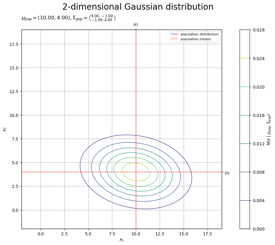
2つの母集団について、母分布(2次元正規分布)を等高線、母平均(平均パラメータ)を垂直線(赤色・破線)で示します。
共分散 が0に近いほど2つの標本
の相関が小さい、
が小さいほど負の相関が大きい、
が大きいほど相関が大きいことを表します。
2つの母集団
2つの母集団に関して、依存関係を考慮せずに、個々の母集団(1次元正規分布) として扱います。
母分布の確率密度を計算します。
# 母分布の確率密度を計算
pop_dens_lt = [
    norm.pdf(
        x=x_vec, loc=mu_pop_d[d], scale=np.sqrt(sigma2_pop_dd[d, d])
    ) for d in range(2)
]
print(pop_dens_lt[0][:5])
[4.46100753e-05 4.58756849e-05 4.71748889e-05 4.85085095e-05
 4.98773871e-05]
軸の値ごとに、1次元正規分布に従う確率密度
を計算します。
1次元正規分布の確率密度関数 sp.stats.norm.pdf() の確率変数の引数 x に 、平均の引数
loc に 、標準偏差の引数
scale に を指定します。
リスト内包表記を使って、母集団ごとに確率密度を計算してリストに格納します。
母分布のグラフを作成します。
・作図コード(クリックで展開)
# 母分布のラベルを作成
pop_param_lbl  = '$\\mu_1 = '+f'{mu_pop_d[0]:.2f}, '
pop_param_lbl += '\\sigma_1 = '+f'{np.sqrt(sigma2_pop_dd[0, 0]):.2f}$\n'
pop_param_lbl += '$\\mu_2 = '+f'{mu_pop_d[1]:.2f}, '
pop_param_lbl += '\\sigma_2 = '+f'{np.sqrt(sigma2_pop_dd[1, 1]):.2f}$\n'
pop_param_lbl += '$\\delta_{pop} = \\mu_2 - \\mu_2 = '+f'{delta_pop:.2f}$'

# 母分布を作図
fig, ax = plt.subplots(
    figsize=(9, 6), dpi=100, facecolor='white',
    constrained_layout=True
)
fig.suptitle('Normal distribution', fontsize=20)
ax2x = ax.twiny() # 第2軸の設定用

for d in range(2):
    ax.plot(
        x_vec, pop_dens_lt[d],
        color='black', linewidth=1.0,
        label='population distribution' if d == 0 else None,
        zorder=10
    ) # 母分布
    ax.axvline(
        x=mu_pop_d[d],
        color='red', linewidth=1.0, linestyle='--',
        label='population means' if d == 0 else None,
        zorder=11
    ) # 母平均
ax.hlines(
    y=0.0, xmin=mu_pop_d[0], xmax=mu_pop_d[1],
    color='red', linewidth=2.0,
    label='population mean difference',
    zorder=12
) # 母平均の差

ax.set_xlabel('$x$')
ax2x.set_xticks(
    ticks =mu_pop_d,
    labels=['$\\mu_1$', '$\\mu_2$']
) # パラメータのラベル
ax.set_ylabel('$N(x \\mid \\mu_{pop}, \\sigma_{pop}^2)$')
ax.set_title(pop_param_lbl, loc='left')
ax.legend(loc='upper right', prop={'size': 8})
ax.grid()
ax.set_xlim(xmin=x_min, xmax=x_max)   # (目盛の共通化用)
ax2x.set_xlim(xmin=x_min, xmax=x_max) # (目盛の共通化用)

plt.show()
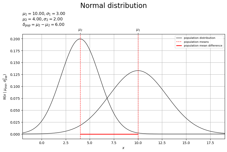
2つの母集団に関して、母分布(正規分布)を曲線、母平均(平均パラメータ)を垂直線(赤色・破線)で示します。また、2つの母平均の差を線分(赤色)で示します。
平均 ・分散
(標準偏差
)の正規分布
について、2つの母集団の真の値
の差
を区間で求めていきます。
差の母集団
2つの母集団に関して、対標本の差 を確率変数とする分布(差の母分布・1次元正規分布)
として扱います。
差の母分布のパラメータを計算します。
# 差の母分布の平均を計算
mu_diff = mu_pop_d[0] - mu_pop_d[1]
#mu_diff = np.subtract(*mu_pop_d)
print(mu_diff)

# 差の母分布の分散を計算
sigma2_diff  = sigma2_pop_dd[0, 0] + sigma2_pop_dd[1, 1]
sigma2_diff -= 2.0 * sigma2_pop_dd[0, 1]
#sigma2_diff  = np.sum(np.diag(sigma2_pop_dd)) - 2.0 * sigma2_pop_dd[0, 1]
print(sigma2_diff)

# 差の母分布の標準偏差を計算
sigma_diff = np.sqrt(sigma2_diff)
print(sigma_diff)
6.0
15.0
3.872983346207417
母数 を用いて、差の母分布の平均
、分散
、標準偏差
を、次の式で計算します。
母平均 は未知なので、
も未知の値です。そのため推定には使いませんが、作図(真の値の可視化)用に作成しておきます。
差の母分布の確率変数 の作図範囲を設定します。
# d軸の範囲を設定
d_min = x_min - mu_pop_d[1]
d_max = x_max - mu_pop_d[1]
print(d_min, d_max)

# d軸の値を作成
d_vec = np.linspace(start=d_min, stop=d_max, num=1001)
print(d_vec[:5])
-6.0 15.0
[-6.    -5.979 -5.958 -5.937 -5.916]
グラフ間で対応させるため、 軸の範囲を並行移動して、
軸の範囲を設定しています。
差の母分布の確率密度を計算します。
# 差の母分布の確率密度を計算
diff_dens_vec = norm.pdf(x=d_vec, loc=mu_diff, scale=sigma_diff)
print(pop_dens_vec[:5])
[8.96590478e-09 9.26092398e-09 9.56516856e-09 9.87891043e-09
 1.02024290e-08]
「2つの母集団」のときと同様にして、正規分布に従う確率密度 を計算します。
差の母分布のグラフを作成します。
・作図コード(クリックで展開)
# 差の母分布のラベルを作成
diff_param_lbl  = '$\\mu_{diff} = \\mu_1 - \\mu_2 = '+f'{mu_diff:.2f}, '
diff_param_lbl += '\\sigma_{diff} = \\sigma_1^2 + \\sigma_2^2 - 2 \\sigma_{1,2} = '+f'{sigma_diff:.2f}$'

# 差の母分布を作図
fig, ax = plt.subplots(
    figsize=(9, 6), dpi=100, facecolor='white',
    constrained_layout=True
)
fig.suptitle('Normal distribution', fontsize=20)
ax2x = ax.twiny() # 第2軸の設定用

ax.plot(
    d_vec, diff_dens_vec,
    color='black', linewidth=1.0,
    label='population distribution',
    zorder=10
) # 差の母分布
ax.axvline(
    x=delta_pop,
    color='red', linewidth=1.0, linestyle='--',
    label='population mean difference',
    zorder=11
) # 母平均の差

ax.set_xlabel('$d = x_1 - x_2$')
ax2x.set_xticks(
    ticks =[delta_pop],
    labels=['$\\delta_{pop}$']
) # パラメータのラベル
ax.set_ylabel('$N(d \\mid \\mu_{diff}, \\sigma_{diff}^2)$')
ax.set_title(diff_param_lbl, loc='left')
ax.legend(loc='upper right', prop={'size': 8})
ax.grid()
ax.set_xlim(xmin=d_min, xmax=d_max)   # (目盛の共通化用)
ax2x.set_xlim(xmin=d_min, xmax=d_max) # (目盛の共通化用)

plt.show()
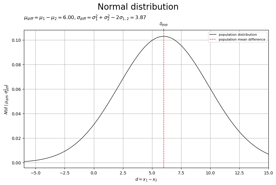
差の母分布(正規分布)を曲線、差の母平均(母平均の差)を垂直線(赤色・破線)で示します。
対標本の差 の理論分布は、正規分布の性質により、平均
・分散
(標準偏差
)の正規分布
になります。
母平均の差 と差の母平均
は一致します。つまり、差の母平均
を求めることで、2つの母集団の真の値
の差
が求まります。
よって、母分散が未知の2次元正規分布(2つの正規分布) に従う2標本
を用いた推定を、母分散が未知の1次元正規分布(1つの正規分布)
に従う1標本
を用いた推定として扱い、
を区間で求めていきます。
母分散が未知の正規分布の母平均の信頼区間については「母平均の信頼区間の実装」を参照してください。
標本の生成
設定した母分布(2次元正規分布) に従う標本(サンプル)
を作成します。
正規分布のサンプリングや集計については「【Python】多次元ガウス分布の乱数生成 - からっぽのしょこ」を参照してください。
対応のある標本
2つの母集団から得られた標本 に関して、母共分散
による依存関係を持つ1組の標本(対標本)
を1つの標本
として扱います。
母分布から標本 を生成します。
# サンプルサイズを指定
N = 16

# 標本を生成
x_nd = np.random.multivariate_normal(mean=mu_pop_d, cov=sigma2_pop_dd, size=N)
print(x_nd[:5])
[[11.19724969  5.21804559]
 [ 9.01973643  2.40218249]
 [17.74068175  4.32401693]
 [ 6.08578561  1.74513106]
 [ 4.96083949  4.11620551]]
サンプルサイズ を指定して、2次元正規分布に従う乱数(実現値ベクトル)
、
を生成します。
多次元正規分布の乱数生成関数 np.random.multivariate_normal() の平均ベクトルの引数 mean に 、分散共分散行列の引数
cov に 、サンプルサイズの引数
size に を指定します。
標本 を集計します。
# 階級幅を指定
class_x_size = 1.0

# 階級数を計算
class_x_num = ((x_max - x_min) // class_x_size).astype(dtype='int') + 1
print(class_x_num)

# 階級幅を再設定:(割り切れない場合)
class_x_size = (x_max - x_min) / (class_x_num-1)
print(class_x_size)

# 階級値を作成
center_x_vec = np.arange(start=x_min, stop=x_max+class_x_size, step=class_x_size)
print(center_x_vec[:5])

# 境界値の範囲を設定
bound_x_min = x_min - 0.5*class_x_size
bound_x_max = x_max + 0.5*class_x_size

# 境界値を作成
bound_x_vec = np.arange(start=bound_x_min, stop=bound_x_max+0.5*class_x_size, step=class_x_size)
print(bound_x_vec[:5])

# 密度を集計
obs_dens_grid, bound_x_vec, bound_x_vec = np.histogram2d(
    x=x_nd[:, 0], y=x_nd[:, 1],
    bins=(class_x_num, class_x_num),
    range=[(bound_x_min, bound_x_max), (bound_x_min, bound_x_max)],
    density=True
)
print(obs_dens_grid[5:10, 5:10])
22
1.0
[-2. -1.  0.  1.  2.]
[-2.5 -1.5 -0.5  0.5  1.5]
[[0.     0.     0.     0.     0.    ]
 [0.     0.     0.     0.     0.    ]
 [0.     0.0625 0.     0.     0.    ]
 [0.     0.     0.     0.0625 0.    ]
 [0.     0.     0.     0.     0.    ]]
階級幅 を指定して、階級数を設定します。
軸の範囲で階級値、範囲を階級幅
1つ分拡げて(上限・下限に
して)境界値を作成して、標本
x_nd に含まれる要素数(度数 )をカウントして、密度
を求めます。
この例では簡易的に、2軸の階級幅を同じ値 として、2軸の範囲として
軸の範囲を使って集計しています。
より詳細に設定して集計する場合は「乱数の生成」を参照してください。
標本 の標本統計量
を計算します。
# 標本平均を計算
#x_bar_d = np.sum(x_nd, axis=0) / N
x_bar_d = np.mean(x_nd, axis=0)
print(x_bar_d)

# 不偏分散を計算
#sigma2_hat_d = np.sum((x_nd - x_bar_d)**2, axis=0) / (N-1)
sigma2_hat_d = np.var(x_nd, ddof=1, axis=0)
print(sigma2_hat_d)

# 不偏標準偏差を計算
sigma_hat_d = np.sqrt(sigma2_hat_d)
print(sigma_hat_d)

# 不偏共分散を計算
#sigma_hat_12 = np.sum(np.prod(x_nd - x_bar_d, axis=1)) / (N-1)
sigma_hat_12 = np.cov(x_nd[:, 0], x_nd[:, 1], ddof=1)[0, 1]
print(sigma_hat_12)
[9.30153185 4.30354082]
[13.51465344  3.92995782]
[3.67622815 1.98241212]
-1.252128992485644
標本 を用いて、
番目の母集団の標本
の標本平均
、
の不偏分散
、
の不偏標準偏差
、2つの母集団の標本
の不偏共分散
を、次の式で計算します。
さらに、不偏分散共分散行列 を作成します。
# 不偏分散共分散行列を計算
sigma2_hat_dd = np.array(
    [[sigma2_hat_d[0], sigma_hat_12],
     [sigma_hat_12, sigma2_hat_d[1]]]
)
#sigma2_hat_dd = (x_nd - x_bar_d).T @ (x_nd - x_bar_d) / (N-1)
#sigma2_hat_dd = np.cov(x_nd[:, 0], x_nd[:, 1], ddof=1)
print(sigma2_hat_dd)
[[13.51465344 -1.25212899]
 [-1.25212899  3.92995782]]
標本 を用いて、不偏分散共分散行列
を、次の式で計算します。
または、標本統計量 を配列に格納します。
標本のグラフを作成します。
・作図コード(クリックで展開)
# 標本のラベルを作成
tmp_x_str      = ', '.join([f'{x:.2f}' for x in x_bar_d])
tmp_sgm2_1_str = ', '.join([f'{sgm2:.2f}' for sgm2 in sigma2_hat_dd[0, :]])
tmp_sgm2_2_str = ', '.join([f'{sgm2:.2f}' for sgm2 in sigma2_hat_dd[1, :]])
obs_param_lbl  = f'$N = {N}, '
obs_param_lbl += f'\\bar{{x}} = ({tmp_x_str}), '
obs_param_lbl += f'\\hat{{\\Sigma}} = \\binom{{{tmp_sgm2_1_str}}}{{{tmp_sgm2_2_str}}}$'

# 標本を作図
fig, ax = plt.subplots(
    figsize=(9, 8), dpi=100, facecolor='white',
    constrained_layout=True
)
fig.suptitle('2-dimensional Normal distribution', fontsize=20)
ax2x = ax.twiny() # 第2軸の設定用
ax2y = ax.twinx() # 第2軸の設定用

pcm = ax.pcolormesh(
    center_x_vec, center_x_vec, obs_dens_grid.T,
    shading='nearest',
    cmap='viridis', alpha=0.5,
    zorder=10
) # 標本
ax.scatter(
    x=x_nd[:, 0], y=x_nd[:, 1],
    color='black', alpha=0.33, s=50,
    label='sample values',
    zorder=11
) # 標本
ax.axvline(
    x=x_bar_d[0],
    color='black', linewidth=1.0, linestyle='--',
    label='sample means',
    zorder=12
) # 標本平均
ax.axhline(
    y=x_bar_d[1],
    color='black', linewidth=1.0, linestyle='--',
    zorder=12
) # 標本平均

# 凡例のラベルを調整(凡例を設定できない対策用)
obs_dummy = mpatches.Patch(
    color='purple',
    label='sample'
) # (凡例表示用のダミー)
handles, labels = ax.get_legend_handles_labels() # 凡例情報を取得
handles.append(obs_dummy)
labels.append(obs_dummy.get_label())

ax.set_xlabel('$x_1$')
ax2x.set_xticks(
    ticks =[x_bar_d[0]],
    labels=['$\\bar{x}_1$']
) # パラメータのラベル
ax.set_ylabel('$x_2$')
ax2y.set_yticks(
    ticks =[x_bar_d[1]],
    labels=['$\\bar{x}_2$']
) # パラメータのラベル
ax.set_title(obs_param_lbl, loc='left') # パラメータラベル
fig.colorbar(
    mappable=pcm, ax=ax, shrink=1.0,
    label='$\\frac{N_{x_1,x_2}}{w_1 w_2 N}$'
) # 密度軸
ax.legend(handles=handles, labels=labels, loc='upper right', prop={'size': 8})
ax.grid()
ax.set_xlim(xmin=x_min, xmax=x_max)   # (目盛の共通化用)
ax2x.set_xlim(xmin=x_min, xmax=x_max) # (目盛の共通化用)
ax.set_ylim(ymin=x_min, ymax=x_max)   # (目盛の共通化用)
ax2y.set_ylim(ymin=x_min, ymax=x_max) # (目盛の共通化用)

plt.show()
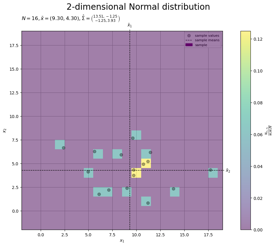
標本(2次元正規分布の乱数)の実現値を点、密度をヒートマップ、標本平均を直線(破線)で示します。
サンプルサイズ が十分に大きいと、標本
の2Dヒストグラムの形状が母分布
に近付きます。
2つの標本
2つの母集団から得られた標本 に関して、依存関係を考慮せずに、母集団ごとの標本
を1つの標本
として扱います。
標本 を集計します。
# 密度を集計
obs_dens_lt = [
    np.histogram(
        a=x_nd[:, d], bins=class_x_num, range=(bound_x_min, bound_x_max), density=True
    )[0] for d in range(2)
]
print(obs_dens_lt[0][:5])
[0. 0. 0. 0. 0.0625]
階級幅を として、
軸の範囲を階級幅
1つ分拡げて、標本
x_nd[:, d] に含まれる要素数(度数 )をカウントして、密度
を求めます。
リスト内包表記を使って、母集団ごとに標本を集計してリストに格納します。
標本のグラフを作成します。
・作図コード(クリックで展開)
# 配色を設定
cmap = plt.get_cmap('tab10') # カラーマップを指定
# 密度軸の範囲を設定
u = 0.05
pop_1d_dens_max = max(np.max(pop_dens_lt), np.max(obs_dens_lt))
pop_1d_dens_max = np.ceil(pop_1d_dens_max /u)*u # u単位で切り上げ

# 度数軸の範囲を設定
pop_1d_freq_max = pop_1d_dens_max * class_x_size*N
# 余白を設定
margin_ratio = 0.05

# 標本のラベルを作成
obs_param_lbl  = f'$N = {N}$\n'
obs_param_lbl += '$\\bar{x}_1 = '+f'{x_bar_d[0]:.2f}, '
obs_param_lbl += '\\hat{\\sigma}_1 = '+f'{sigma_hat_d[0]:.2f}$\n'
obs_param_lbl += '$\\bar{x}_2 = '+f'{x_bar_d[1]:.2f}, '
obs_param_lbl += '\\hat{\\sigma}_2 = '+f'{sigma_hat_d[1]:.2f}$'

# 標本を作図
fig, axes = plt.subplots(
    nrows=2, ncols=1,
    figsize=(9, 9), dpi=100, facecolor='white',
    constrained_layout=True
)
fig.suptitle('Normal distribution', fontsize=20)

# 標本の集計を描画
ax   = axes[0]
ax2x = ax.twiny() # 第2軸の設定用
ax2y = ax.twinx() # 第2軸の設定用

for d in range(2):
    ax.bar(
        x=center_x_vec, height=obs_dens_lt[d],
        width=class_x_size,
        color=cmap(d), alpha=0.5,
        label='sample' if d == 0 else None,
        zorder=10
    ) # 標本
    ax.scatter(
        x=x_nd[:, d], y=np.zeros(N),
        facecolor='none', edgecolor=cmap(d), s=50, clip_on=False,
        label='sample values' if d == 0 else None,
        zorder=11
    ) # 標本
    ax.axvline(
        x=x_bar_d[d],
        color='black', linewidth=1.0, linestyle='--',
        label='sample means' if d == 0 else None,
        zorder=12
    ) # 標本平均

ax.set_xlabel('$x$')
ax2x.set_xticks(
    ticks =x_bar_d,
    labels=['$\\bar{x}_1$', '$\\bar{x}_2$']
) # 統計量のラベル
ax.set_ylabel('$\\frac{N_x}{w N}$')
ax2y.set_ylabel('$\\frac{N_x}{N}$')
ax.set_title(obs_param_lbl, loc='left')
ax.legend(loc='upper right', prop={'size': 8})
ax.grid()
ax.set_xlim(xmin=x_min, xmax=x_max)   # (目盛の共通化用)
ax2x.set_xlim(xmin=x_min, xmax=x_max) # (目盛の共通化用)
ax.set_ylim(ymin=-margin_ratio*pop_1d_dens_max, ymax=pop_1d_dens_max)   # (目盛の共通化用), 余白を追加
dens_vals = ax.get_yticks()            # 密度を取得
freq_vals = dens_vals * class_x_size*N # 度数を計算
ax2y.set_yticks(ticks=freq_vals, labels=[f'{y:.1f}' for y in freq_vals]) # 度数軸目盛
ax2y.set_ylim(ymin=-margin_ratio*pop_1d_freq_max, ymax=pop_1d_freq_max) # (目盛の共通化用), 余白を追加

# 標本の対応を描画
ax = axes[1]

for d in range(2):
    ax.scatter(
        x=x_nd[:, d], y=np.arange(N)+1,
        facecolor='none', edgecolor=cmap(d), s=50,
        zorder=10
    ) # 標本
ax.hlines(
    y=np.arange(N)+1, xmin=x_nd[:, 0], xmax=x_nd[:, 1],
    color='black', linewidth=1.0, linestyle=':',
    label='sample difference',
    zorder=11
) # 対標本の差
for d in range(2):
    ax.axvline(
        x=x_bar_d[d],
        color='black', linewidth=1.0, linestyle='--',
        zorder=12
    ) # 標本平均

ax.set_xlabel('$x$')
ax.set_ylabel('$n$')
ax.legend(loc='upper right', prop={'size': 8})
ax.grid()
ax.set_xlim(xmin=x_min, xmax=x_max) # (目盛の共通化用)
ax.invert_yaxis() # 標本番号を昇順に表示

plt.show()
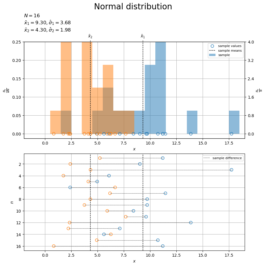
上図では、母集団ごとに色分けして、標本(1次元正規分布の乱数)の実現値を点(くり抜き)、密度・度数を棒グラフ(塗りつぶし)、標本平均を垂直線(破線)で示します。
下図では、対標本の差(符号付き距離)を線分(点線)で示します。
サンプルサイズ が十分に大きいと、標本
のヒストグラムの形状がそれぞれの母分布
に近付きます。
差の標本
2つの母集団から得られた標本 に関して、対標本の差
を1つの標本
として扱います。
差の標本 を作成します。
# 対標本の差を計算
d_n = x_nd[:, 0] - x_nd[:, 1]
#d_n = np.subtract(*x_nd.T)
print(d_n[:5])
[ 5.97920409 6.61755394 13.41666481 4.34065455 0.84463398]
対標本の差 を、次の式で計算します。
差の標本 を集計します。
# 階級幅を指定
class_d_size = 1.0

# 階級数を計算
class_d_num = ((d_max - d_min) // class_d_size).astype(dtype='int') + 1
print(class_d_num)

# 階級幅を再設定:(割り切れない場合)
class_d_size = (d_max - d_min) / (class_d_num-1)
print(class_d_size)

# 階級値を作成
center_d_vec = np.arange(start=d_min, stop=d_max+class_d_size, step=class_d_size)
print(center_d_vec[:5])

# 境界値の範囲を設定
bound_d_min = d_min - 0.5*class_d_size
bound_d_max = d_max + 0.5*class_d_size

# 境界値を作成
bound_d_vec = np.arange(start=bound_d_min, stop=bound_d_max+0.5*class_d_size, step=class_d_size)
print(bound_d_vec[:5])

# 密度を集計
obs_dens_vec, bound_d_vec = np.histogram(
    a=d_n, bins=class_d_num, range=(bound_d_min, bound_d_max), density=True
)
print(obs_dens_vec[:5])
22
1.0
[-6. -5. -4. -3. -2.]
[-6.5 -5.5 -4.5 -3.5 -2.5]
[0.     0.     0.0625 0.     0.    ]
「2つの標本」のときと同様にして、標本 d_n に含まれる要素数(度数 )をカウントして、密度
を求めます。
差の標本 の標本統計量
を計算します。
# 標本平均を計算
#d_bar = np.sum(d_n) / N
d_bar = np.mean(d_n)
print(d_bar)

# 不偏分散を計算
#sigma2_hat = np.sum((d_n - d_bar)**2) / (N-1)
sigma2_hat = np.var(d_n, ddof=1)
print(sigma2_hat)

# 不偏標準偏差を計算
sigma_hat = np.sqrt(sigma2_hat)
print(sigma_hat)
4.997991029616402
19.94886924429875
4.466415704376245
(標本 から求めた)標本
を用いて、標本平均
、不偏分散
、不偏標準偏差
を、次の式で計算します。
対標本の差 について、式を置き換えて整理すると、母集団ごとの標本統計量を用いた式が得られます。
同様に、差の標本平均 についても、式を置き換えて整理します。
母集団ごとの標本統計量の計算については、「2つの標本」を参照してください。
差の標本のグラフを作成します。
・作図コード(クリックで展開)
# 密度軸の範囲を設定
u = 0.05
diff_dens_max = max(diff_dens_vec.max(), obs_dens_vec.max())
diff_dens_max = np.ceil(diff_dens_max /u)*u # u単位で切り上げ

# 度数軸の範囲を設定
diff_freq_max = diff_dens_max * class_d_size*N
# 差の標本のラベルを作成
obs_param_lbl  = f'$N = {N}, '
obs_param_lbl += '\\bar{d} = '+f'{d_bar:.2f}, '
obs_param_lbl += '\\hat{\\sigma} = '+f'{sigma_hat:.2f}$'

# 差の標本を作図
fig, axes = plt.subplots(
    nrows=2, ncols=1,
    figsize=(9, 9), dpi=100, facecolor='white',
    constrained_layout=True
)
fig.suptitle('Normal distribution', fontsize=20)

# 標本の集計を描画
ax   = axes[0]
ax2x = ax.twiny() # 第2軸の設定用
ax2y = ax.twinx() # 第2軸の設定用

ax.bar(
    x=center_d_vec, height=obs_dens_vec,
    width=class_d_size,
    color='#00A968', alpha=0.5,
    label='sample',
    zorder=10
) # 差の標本
ax.scatter(
    x=d_n, y=np.zeros(N),
    facecolor='none', edgecolor='black', s=50, clip_on=False,
    label='sample values',
    zorder=11
) # 差の標本
ax.axvline(
    x=d_bar,
    color='black', linewidth=1.0, linestyle='--',
    label='sample difference mean',
    zorder=12
) # 差の標本平均

ax.set_xlabel('$d = x_1 - x_2$')
ax2x.set_xticks(
    ticks =[d_bar],
    labels=['$\\bar{d}$']
) # 統計量のラベル
ax.set_ylabel('$\\frac{N_d}{w N}$')
ax2y.set_ylabel('$\\frac{N_d}{N}$')
ax.set_title(obs_param_lbl, loc='left')
ax.legend(loc='upper right', prop={'size': 8})
ax.grid()
ax.set_xlim(xmin=d_min, xmax=d_max)   # (目盛の共通化用)
ax2x.set_xlim(xmin=d_min, xmax=d_max) # (目盛の共通化用)
ax.set_ylim(ymin=0.0, ymax=diff_dens_max)   # (目盛の共通化用)
dens_vals = ax.get_yticks()            # 密度を取得
freq_vals = dens_vals * class_d_size*N # 度数を計算
ax2y.set_yticks(ticks=freq_vals, labels=[f'{y:.1f}' for y in freq_vals]) # 度数軸目盛
ax2y.set_ylim(ymin=0.0, ymax=diff_freq_max) # (目盛の共通化用)

# 標本の対応を描画
ax = axes[1]

for d in range(2):
    tmp_d_n = x_nd[:, d] - x_nd[:, 1]
    ax.scatter(
        x=tmp_d_n, y=np.arange(N)+1,
        facecolor='none', edgecolor=cmap(d), s=50, clip_on=False,
        zorder=10
    ) # 差の標本
ax.hlines(
    y=np.arange(N)+1, xmin=0.0, xmax=d_n,
    color='black', linewidth=1.0, linestyle=':',
    label='sample difference',
    zorder=11
) # 対標本の差
ax.axvline(
    x=d_bar,
    color='black', linewidth=1.0, linestyle='--',
    zorder=12
) # 差の標本平均

ax.set_xlabel('$d = x_1 - x_2$')
ax.set_ylabel('$n$')
ax.legend(loc='upper right', prop={'size': 8})
ax.grid()
ax.set_xlim(xmin=d_min, xmax=d_max) # (目盛の共通化用)
ax.invert_yaxis() # 標本番号を昇順に表示

plt.show()
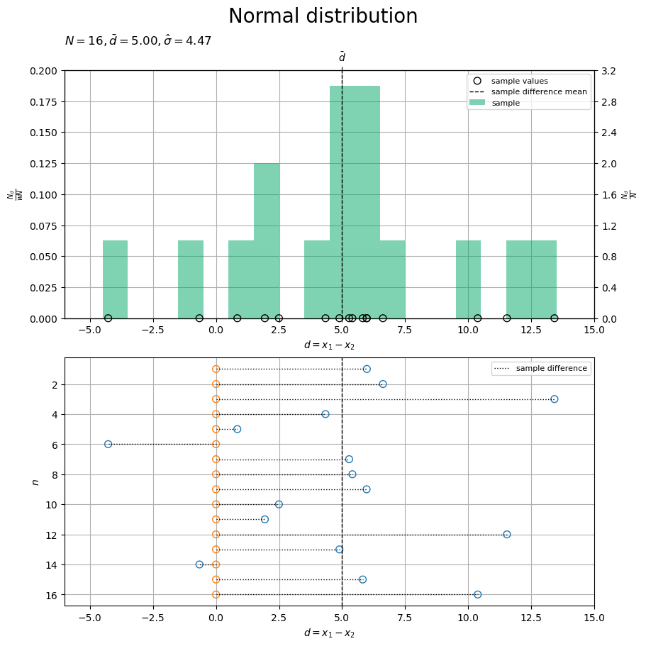
上図では、差の標本(1次元正規分布の乱数の差)の実現値を点(くり抜き)、密度・度数を棒グラフ(青緑色・塗りつぶし)、差の標本平均を垂直線(破線)で示します。
下図では、対標本の差(符号付き距離)を線分(点線)で示します。
「2つの標本」の散布図に関して、 軸(水平)方向に、各点
を負の方向に
並行移動した図と言えます。
の点(2つ目の母集団の標本・橙色の点)は
上の点になり、
の点(1つ目の母集団の標本・青色の点)は
の点(対標本の差)になるのが分かります。
サンプルサイズ が十分に大きいと、差の標本
のヒストグラムの形状が差の母分布
に近付きます。
2次元の散布図上でも対標本の差を確認します。
・作図コード(クリックで展開)
# 標本のラベルを作成
tmp_mu_str     = ', '.join([f'{mu:.2f}' for mu in mu_pop_d])
tmp_sgm2_1_str = ', '.join([f'{sgm2:.2f}' for sgm2 in sigma2_pop_dd[0, :]])
tmp_sgm2_2_str = ', '.join([f'{sgm2:.2f}' for sgm2 in sigma2_pop_dd[1, :]])
obs_param_lbl  = f'$\\mu_{{pop}} = ({tmp_mu_str}), '
obs_param_lbl += f'\\Sigma_{{pop}} = \\binom{{{tmp_sgm2_1_str}}}{{{tmp_sgm2_2_str}}}$\n'
tmp_x_str      = ', '.join([f'{x:.2f}' for x in x_bar_d])
tmp_sgm2_1_str = ', '.join([f'{sgm2:.2f}' for sgm2 in sigma2_hat_dd[0, :]])
tmp_sgm2_2_str = ', '.join([f'{sgm2:.2f}' for sgm2 in sigma2_hat_dd[1, :]])
obs_param_lbl += f'$N = {N}, '
obs_param_lbl += f'\\bar{{x}} = ({tmp_x_str}), '
obs_param_lbl += f'\\hat{{\\Sigma}} = \\binom{{{tmp_sgm2_1_str}}}{{{tmp_sgm2_2_str}}}$'

# 標本を作図
fig, ax = plt.subplots(
    figsize=(9, 8), dpi=100, facecolor='white',
    constrained_layout=True
)
fig.suptitle('2-dimensional Normal distribution', fontsize=20)
ax2x = ax.twiny() # 第2軸の設定用
ax2y = ax.twinx() # 第2軸の設定用

ax.plot(
    x_vec, x_vec,
    color='black', linewidth=1.0,
    label='identity function',
    zorder=9
) # 恒等関数
ax.plot(
    [], [],
    color='purple', linewidth=1.0,
    label='population distribution',
    zorder=10
) # (凡例表示用のダミー)
cs = ax.contour(
    x_1_grid, x_2_grid, pop_dens_vec.reshape(x_dims),
    linewidths=1.0,
    zorder=10
) # 母分布
ax.scatter(
    x=x_nd[:, 0], y=x_nd[:, 1],
    color='black', alpha=0.33, s=50,
    label='sample values',
    zorder=11
) # 標本
for idx, mu in enumerate([mu_pop_d[0], x_bar_d[0]]):
    ax.axvline(
        x=mu,
        color=['red', 'black'][idx], linewidth=1.0, linestyle='--',
        label=['population means', 'sample means'][idx],
        zorder=[11, 12][idx]
    ) # 母・標本平均
for idx, mu in enumerate([mu_pop_d[1], x_bar_d[1]]):
    ax.axhline(
        y=mu,
        color=['red', 'black'][idx], linewidth=1.0, linestyle='--',
        zorder=[11, 12][idx]
    ) # 母・標本平均
ax.hlines(
    y=x_nd[:, 1], xmin=x_nd[:, 1], xmax=x_nd[:, 1]+d_n,
    color='black', linewidth=1.0, linestyle=':',
    label='sample difference',
    zorder=13
) # 対標本の差

ax.set_xlabel('$x_1$')
ax2x.set_xticks(
    ticks =[mu_pop_d[0], x_bar_d[0]],
    labels=['$\\mu_1$', '$\\bar{x}_1$']
) # パラメータのラベル
ax.set_ylabel('$x_2$')
ax2y.set_yticks(
    ticks =[mu_pop_d[1], x_bar_d[1]],
    labels=['$\\mu_2$', '$\\bar{x}_2$']
) # パラメータのラベル
ax.set_title(obs_param_lbl, loc='left') # パラメータラベル
fig.colorbar(
    mappable=cs, ax=ax, shrink=1.0,
    label='$N(x \\mid \\mu_{pop}, \\Sigma_{pop})$'
) # 確率密度軸
ax.legend(loc='upper right', prop={'size': 8})
ax.grid()
ax.set_xlim(xmin=x_min, xmax=x_max)   # (目盛の共通化用)
ax2x.set_xlim(xmin=x_min, xmax=x_max) # (目盛の共通化用)
ax.set_ylim(ymin=x_min, ymax=x_max)   # (目盛の共通化用)
ax2y.set_ylim(ymin=x_min, ymax=x_max) # (目盛の共通化用)

plt.show()
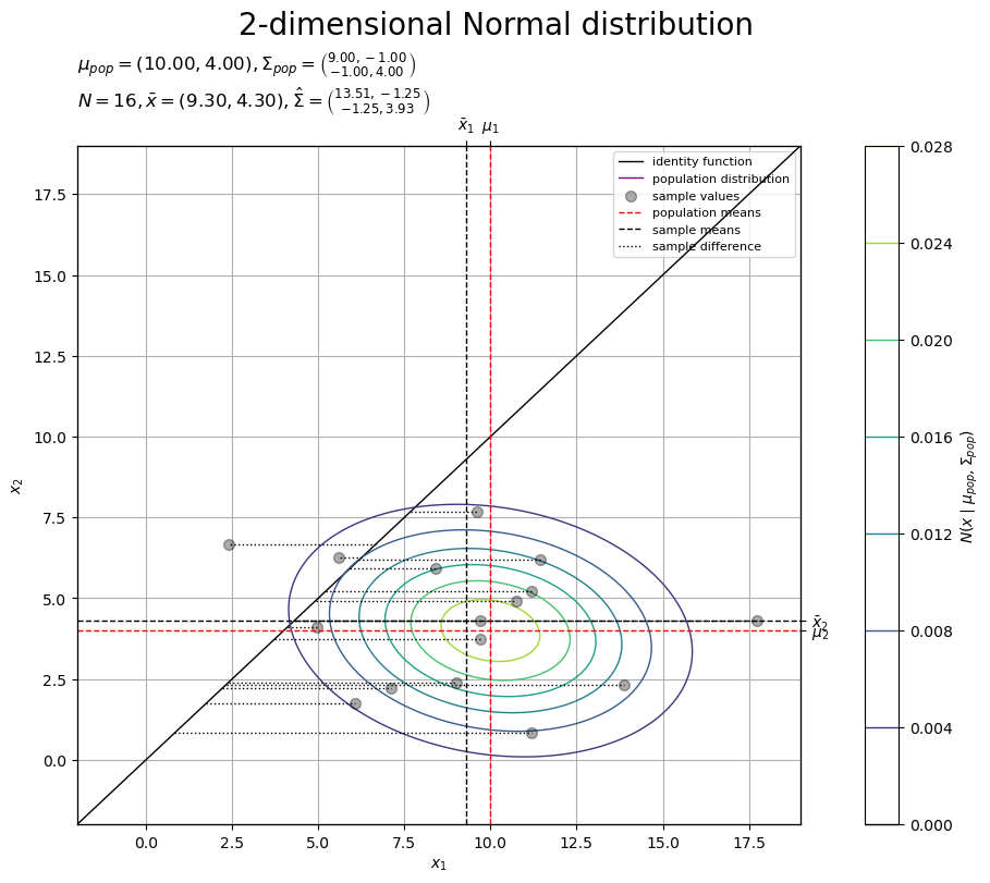
「対応のある母集団」の母分布(2次元正規分布)の図に、標本(2次元正規分布の乱数)の実現値を点を重ねています。さらに、恒等関数の直線を表示しています。また、対標本の差を線分(破線)で示します。
さらに、1つの対標本に注目して確認します。
・作図コード(クリックで展開)
# 標本番号を指定
n = 8
#n = 5

# 標本を抽出
x_d = x_nd[n]
# 線分の間隔を指定(重なる対策用)
offset = 0.5

# 標本のラベルを作成
tmp_x_str      = ', '.join([f'{x:.2f}' for x in x_d])
obs_param_lbl  = f'$n = {n}, '
obs_param_lbl += f'x_{{n,d}} = ({tmp_x_str}), '
obs_param_lbl += f'd_n = {d_n[n]:.2f}$'

# 標本を作図
fig, ax = plt.subplots(
    figsize=(9, 8), dpi=100, facecolor='white',
    constrained_layout=True
)
fig.suptitle('2-dimensional Normal distribution', fontsize=20)
ax2x = ax.twiny() # 第2軸の設定用
ax2y = ax.twinx() # 第2軸の設定用

ax.axhline(
    y=0.0,
    color='black', linewidth=2.0,
    zorder=9
) # x1軸
ax.axvline(
    x=0.0,
    color='black', linewidth=2.0,
    zorder=9
) # x2軸
ax.plot(
    x_vec, x_vec,
    color='black', linewidth=1.0,
    label='$f(x) = x$',
    zorder=9
) # 恒等関数
cs = ax.contour(
    x_1_grid, x_2_grid, pop_dens_vec.reshape(x_dims),
    linewidths=1.0,
    zorder=10
) # 母分布
ax.scatter(
    x=x_nd[:, 0], y=x_nd[:, 1],
    facecolor='none', edgecolor='black', s=50,
    zorder=11
) # 標本

ax.scatter(
    x=x_d[0], y=x_d[1],
    color='black', s=200,
    label='$(x_{n,1}, x_{n,2})$',
    zorder=20
) # 1標本
for x in x_d:
    ax.axvline(
        x=x,
        color='black', linewidth=1.0, linestyle='--',
        zorder=21
    ) # 1標本
    ax.axhline(
        y=x,
        color='black', linewidth=1.0, linestyle='--',
        zorder=21
    ) # 1標本
ax.hlines(
    y=x_d[1]+offset, xmin=0.0, xmax=x_d[0],
    color=cmap(0), linewidth=5.0,
    label='$x_{n,1}$',
    zorder=22
) # x1サイズ
ax.hlines(
    y=x_d[1], xmin=0.0, xmax=x_d[1],
    color=cmap(1), linewidth=5.0,
    label='$x_{n,2}$',
    zorder=22
) # x2サイズ
ax.vlines(
    x=x_d[1], ymin=0.0, ymax=x_d[1],
    color=cmap(1), linewidth=5.0,
    zorder=22
) # x2サイズ
ax.hlines(
    y=x_d[1]-offset, xmin=x_d[1], xmax=x_d[1]+d_n[n],
    color='#00A968', linewidth=5.0,
    label='$d_n = x_{n,1} - x_{n,2}$',
    zorder=22
) # dnサイズ

ax.set_xlabel('$x_1$')
ax2x.set_xticks(
    ticks =[0.0, x_d[0], x_d[1]],
    labels=['$0$', '$x_{n,1}$', '$x_{n,2}$']
) # 軸線のラベル
ax.set_ylabel('$x_2$')
ax2y.set_yticks(
    ticks =[0.0, x_d[0], x_d[1]],
    labels=['$0$', '$x_{n,1}$', '$x_{n,2}$']
) # 軸線のラベル
ax.set_title(obs_param_lbl, loc='left') # パラメータラベル
fig.colorbar(
    mappable=cs, ax=ax, shrink=1.0,
    label='$N(x \\mid \\mu_{pop}, \\Sigma_{pop})$'
) # 確率密度軸
ax.legend(loc='upper right', prop={'size': 8})
ax.grid(zorder=0)
ax.set_xlim(xmin=x_min, xmax=x_max)   # (目盛の共通化用)
ax2x.set_xlim(xmin=x_min, xmax=x_max) # (目盛の共通化用)
ax.set_ylim(ymin=x_min, ymax=x_max)   # (目盛の共通化用)
ax2y.set_ylim(ymin=x_min, ymax=x_max) # (目盛の共通化用)

plt.show()
・作図コード(クリックで展開)
# 線分の間隔を指定(重なる対策用)
offset = 0.5

# 標本のラベルを作成
tmp_x_str      = ', '.join([f'{x:.2f}' for x in x_d])
obs_param_lbl  = f'$n = {n}, '
obs_param_lbl += f'x_{{n,d}} = ({tmp_x_str}), '
obs_param_lbl += f'd_n = {d_n[n]:.2f}$'

# 標本を作図
fig, ax = plt.subplots(
    figsize=(9, 8), dpi=100, facecolor='white',
    constrained_layout=True
)
fig.suptitle('2-dimensional Normal distribution', fontsize=20)
ax2x = ax.twiny() # 第2軸の設定用
ax2y = ax.twinx() # 第2軸の設定用

ax.axhline(
    y=0.0,
    color='black', linewidth=2.0,
    zorder=9
) # x1軸
ax.axvline(
    x=0.0,
    color='black', linewidth=2.0,
    zorder=9
) # x2軸
ax.plot(
    x_vec, x_vec,
    color='black', linewidth=1.0,
    label='$f(x) = x$',
    zorder=9
) # 恒等関数
cs = ax.contour(
    x_1_grid, x_2_grid, pop_dens_vec.reshape(x_dims),
    linewidths=1.0,
    zorder=10
) # 母分布
ax.scatter(
    x=x_nd[:, 0], y=x_nd[:, 1],
    facecolor='none', edgecolor='black', s=50,
    zorder=11
) # 標本

ax.scatter(
    x=x_d[0], y=x_d[1],
    color='black', s=200,
    label='$(x_{n,1}, x_{n,2})$',
    zorder=20
) # 1標本
for x in x_d:
    ax.axvline(
        x=x,
        color='black', linewidth=1.0, linestyle='--',
        zorder=21
    ) # 1標本
    ax.axhline(
        y=x,
        color='black', linewidth=1.0, linestyle='--',
        zorder=21
    ) # 1標本
ax.hlines(
    y=x_d[0], xmin=0.0, xmax=x_d[0],
    color=cmap(0), linewidth=5.0,
    label='$x_{n,1}$',
    zorder=22
) # x1サイズ
ax.vlines(
    x=x_d[0], ymin=0.0, ymax=x_d[0],
    color=cmap(0), linewidth=5.0,
    zorder=22
) # x1サイズ
ax.vlines(
    x=x_d[0]+offset, ymin=0.0, ymax=x_d[1],
    color=cmap(1), linewidth=5.0,
    label='$x_{n,2}$',
    zorder=22
) # x2サイズ
ax.vlines(
    x=x_d[0]-offset, ymin=x_d[1], ymax=x_d[1]+d_n[n],
    color='#00A968', linewidth=5.0,
    label='$d_n = x_{n,1} - x_{n,2}$',
    zorder=22
) # dnサイズ

ax.set_xlabel('$x_1$')
ax2x.set_xticks(
    ticks =[0.0, x_d[0], x_d[1]],
    labels=['$0$', '$x_{n,1}$', '$x_{n,2}$']
) # 軸線のラベル
ax.set_ylabel('$x_2$')
ax2y.set_yticks(
    ticks =[0.0, x_d[0], x_d[1]],
    labels=['$0$', '$x_{n,1}$', '$x_{n,2}$']
) # 軸線のラベル
ax.set_title(obs_param_lbl, loc='left') # パラメータラベル
fig.colorbar(
    mappable=cs, ax=ax, shrink=1.0,
    label='$N(x \\mid \\mu_{pop}, \\Sigma_{pop})$'
) # 確率密度軸
ax.legend(loc='upper right', prop={'size': 8})
ax.grid(zorder=0)
ax.set_xlim(xmin=x_min, xmax=x_max)   # (目盛の共通化用)
ax2x.set_xlim(xmin=x_min, xmax=x_max) # (目盛の共通化用)
ax.set_ylim(ymin=x_min, ymax=x_max)   # (目盛の共通化用)
ax2y.set_ylim(ymin=x_min, ymax=x_max) # (目盛の共通化用)

plt.show()
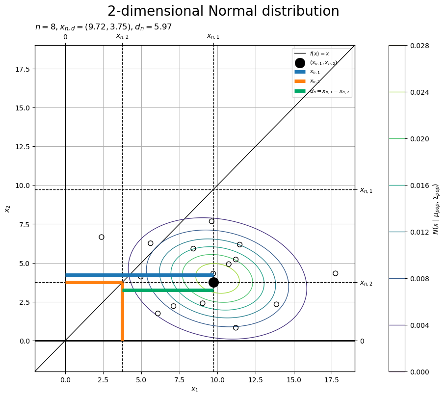
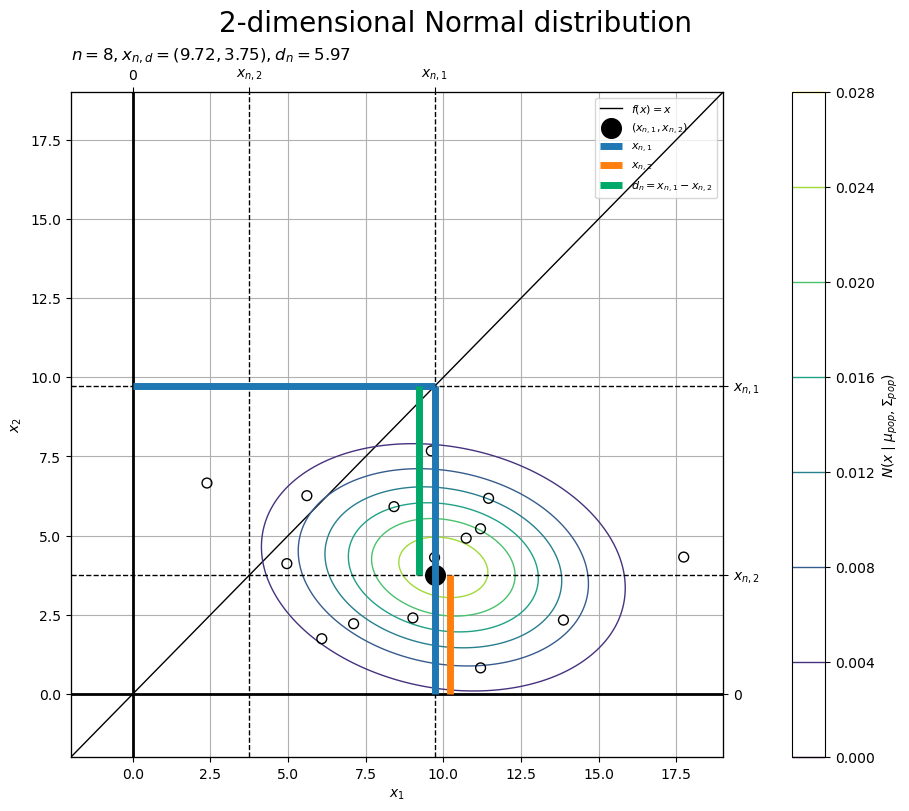
1つ目の母集団の標本の値(軸線との幅)を線分(青色)、2つ目の母集団の標本の値(軸線との幅)を線分(橙色)、対標本の差(2点の幅)を線分(青緑色)で示します。
恒等関数直線 上の点は
です。
標本の点 と関数直線上の点
を結ぶ線分(水平方向・垂直方向の符号付きの幅)が対標本の差
に対応するのが分かります。
標本分布の計算
差の標本平均(対標本の差の標本平均) を確率変数とする分布(標本分布・sampling distribution・正規分布)
の分散パラメータ
を求めます。平均パラメータ
は未知です。
標本分布のパラメータ を計算します。
# 標本分布の平均を計算
mu_smp = mu_diff
print(mu_smp)

# 標本分布の分散を計算
sigma2_smp = sigma2_hat / N
#sigma2_smp = sigma_smp**2
print(sigma2_smp)

# 標本分布の標準偏差を計算
sigma_smp = sigma_hat / np.sqrt(N)
#sigma_smp = np.sqrt(sigma2_smp)
print(sigma_smp)
6.0
1.2468043277686718
1.1166039260940612
母数 (から求めたパラメータ)と標本
(から求めた統計量)を用いて、標本分布の平均
、分散
、標準偏差
を、次の式で計算します。
(母平均 から求まる)差の母平均
は未知なので、
も未知の値です。そのため推定には使いませんが、作図(真の値の可視化)用に作成しておきます。
標本分布の確率密度を計算します。
# 標本分布の確率密度を計算
smp_dens_vec = norm.pdf(x=d_vec, loc=mu_smp, scale=sigma_smp)
print(smp_dens_vec[:5])
[2.97530932e-26 3.64110743e-26 4.45431833e-26 5.44722603e-26
 6.65910605e-26]
グラフ間で対応させるため、 軸の値を
軸の値として使います。
「母集団の設定」のときと同様にして、正規分布に従う確率密度 を計算します。
標本分布のグラフを作成します。
・作図コード(クリックで展開)
# 標本分布のラベルを作成
smp_param_lbl  = '$\\bar{d}_{obs} = '+f'{d_bar:.2f}, '
smp_param_lbl += '\\mu_{smp} = \\mu_{diff} = '+f'{mu_smp:.2f}, '
smp_param_lbl += '\\sigma_{smp} \\approx \\frac{\\hat{\\sigma}}{\\sqrt{N}} = '+f'{sigma_smp:.2f}$'

# 標本分布を作図
fig, ax = plt.subplots(
    figsize=(9, 6), dpi=100, facecolor='white',
    constrained_layout=True
)
fig.suptitle('Normal distribution', fontsize=20)
ax2x = ax.twiny() # 第2軸の設定用

ax.plot(
    d_vec, smp_dens_vec,
    color='black', linewidth=1.0,
    label='sampling distribution',
    zorder=10
) # 標本分布
ax.scatter(
    x=d_bar, y=0.0,
    color='#00A968', s=100,
    zorder=11
) # 差の標本平均
ax.axvline(
    x=d_bar,
    color='black', linewidth=1.0, linestyle='--',
    label='sample value',
    zorder=12
) # 差の標本平均

ax.set_xlabel('$\\bar{d} = \\frac{1}{n} \\sum_{i=1}^n d_i$')
ax2x.set_xticks(
    ticks =[d_bar],
    labels=['$\\bar{d}_{obs}$']
) # 標本のラベル
ax.set_ylabel('$N(\\bar{d} \\mid \\mu_{smp}, \\sigma_{smp}^2)$')
ax.set_title(smp_param_lbl, loc='left')
ax.legend(loc='upper right', prop={'size': 8})
ax.grid()
ax.set_xlim(xmin=d_min, xmax=d_max)   # (目盛の共通化用)
ax2x.set_xlim(xmin=d_min, xmax=d_max) # (目盛の共通化用)

plt.show()
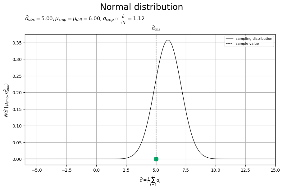
標本分布(正規分布)を曲線、差の標本平均(の標本)を点(青緑色)と垂直線(破線)で示します。
差の標本平均 の理論分布は、正規分布の性質により、平均
・分散
(標準偏差
)の正規分布
になります。ただし、(母分散共分散行列
から求まる)差の分散
が未知なので、代わりに差の不偏分散
を用いて、分散
(標準偏差
)として近似的に計算します。差の母平均
も未知なので、標本分布の平均も、本来は分からない値です(真の値の可視化にのみ使っています)。
サンプルサイズ が大きいほど、標本分布の分散
(標準偏差
)が小さくなります。標本分布の平均
は、
の影響を受けません。
サンプルサイズ が十分に大きいと、差の標本平均
が差の母平均(母平均の差)
に近付きます。
標準化統計量の分布の計算
差の標本平均(対標本の差の標本平均) を標準化した
を確率変数とする分布(標準化統計量の分布・distribution of a standardized statistic・標準t分布)
における中央領域
の下限・上限
を設定します。
t分布のグラフ作成については「【Python】1次元スチューデントのt分布の作図 - からっぽのしょこ」を参照してください。
差の標本平均(の標本) を標準化します。
# 標本統計量を標準化
t_obs = (d_bar - mu_smp) / sigma_smp
print(t_obs)
-0.8973718853816662
差の標本平均 を用いて、標準化した変数
を、次の式で計算します。
母平均の差 は未知なので、
も未知の値です。そのため推定には使いませんが、作図(真の値の可視化)用に作成しておきます。
有意水準 を設定します。
# 信頼係数を指定
gamma = 0.95

# 有意水準を計算
alpha = 1.0 - gamma
print(alpha)
0.050000000000000044
信頼係数(0から1の値) を指定して、有意水準(0から1の値)
を計算します。
中央領域の範囲 を計算します。
# 中央領域の範囲を計算
cr_bound_upper = t.ppf(q=1.0-0.5*alpha, df=N-1, loc=0.0, scale=1.0)
cr_bound_lower = -cr_bound_upper
print(cr_bound_lower, cr_bound_upper)
-2.131449545559323 2.131449545559323
t分布の分位点関数 sp.stats.t.ppd() のパーセンタイルの引数 q に 、自由度の引数
df に 、平均の引数
loc に 、標準偏差の引数
scale に を指定します。
パーセンタイル(百分位数)やクオンタイル(分位数)と分位点関数の関係については「母平均の信頼区間の実装」を参照してください。
標準化統計量の分布の確率変数 の作図範囲を設定します。
# t軸の範囲を設定
t_min = (d_min - d_bar) / sigma_smp
t_max = (d_max - d_bar) / sigma_smp
print(t_min, t_max)

# t軸の値を作成
t_vec = np.linspace(start=t_min, stop=t_max, num=1001)
print(t_vec[:5])
-9.849500590677616 8.957526242426129
[-9.84950059 -9.83069356 -9.81188654 -9.79307951 -9.77427248]
グラフ間で対応させるため(真の値 ではなく観測値
を使って)、
軸の範囲を標準化して、
軸の範囲を設定しています。
標準化統計量の分布の確率密度を計算します。
# 標準化分布の確率密度を計算
std_dens_vec = t.pdf(x=t_vec, df=N-1, loc=0.0, scale=1.0)
print(std_dens_vec[:5])
[4.05760985e-08 4.16648370e-08 4.27843745e-08 4.39356262e-08
 4.51195355e-08]
軸の値ごとに、t分布に従う確率密度
を計算します。
t分布の確率密度関数 sp.stats.t.pdf() の確率変数の引数 x に 、自由度の引数
df に 、位置パラメータの引数
loc に 、尺度パラメータの引数
scale に を指定します。
標準化統計量の分布のグラフを作成します。
・作図コード(クリックで展開)
# 中央領域を計算
cr_t_vec    = np.linspace(start=cr_bound_lower, stop=cr_bound_upper, num=501)
cr_dens_vec = t.pdf(x=cr_t_vec, df=N-1, loc=0.0, scale=1.0)

# 外側領域を計算
tail_t_vec    = np.hstack([
    np.linspace(start=t_min, stop=cr_bound_lower, num=251),
    np.nan, # (塗りつぶしの分割用)
    np.linspace(start=cr_bound_upper, stop=t_max, num=251)
])
tail_dens_vec = t.pdf(x=tail_t_vec, df=N-1, loc=0.0, scale=1.0)
# 標準化分布のラベルを作成
std_param_lbl  = '$t_{obs} = '+f'{t_obs:.2f}, '
std_param_lbl += '\\nu_{std} = N-1 = '+f'{N-1}, '
std_param_lbl += '\\mu_{std} = '+f'{0:.2f}, '
std_param_lbl += '\\sigma_{std} = '+f'{1:.2f}$\n'
std_param_lbl += f'$\\alpha = {alpha:.2f}, '
std_param_lbl += 't_{1-\\frac{\\alpha}{2}} = '+f'{cr_bound_lower:.2f}, '
std_param_lbl += 't_{\\frac{\\alpha}{2}} = '+f'{cr_bound_upper:.2f}$'

# 標準化分布を作図
fig, ax = plt.subplots(
    figsize=(9, 6), dpi=100, facecolor='white',
    constrained_layout=True
)
fig.suptitle('standard t distribution', fontsize=20)
ax2x = ax.twiny() # 第2軸の設定用

ax.plot(
    t_vec, std_dens_vec,
    color='black', linewidth=1.0,
    label='standardized statistic distribution',
    zorder=10
) # 標準化分布
ax.fill_between(
    x=cr_t_vec, y1=np.zeros_like(cr_t_vec), y2=cr_dens_vec,
    facecolor='purple', alpha=0.5,
    label='central region',
    zorder=11
) # 中央領域
ax.fill_between(
    x=tail_t_vec, y1=np.zeros_like(tail_t_vec), y2=tail_dens_vec,
    facecolor='blue', alpha=0.5,
    label='tail regions',
    zorder=12
) # 外側領域
ax.hlines(
    y=0.0, xmin=cr_bound_lower, xmax=cr_bound_upper,
    color='purple', linewidth=2.0,
    zorder=13
) # 中央領域
ax.axvline(
    x=t_obs,
    color='black', linewidth=1.0, linestyle='--',
    zorder=14
) # 標準化変数
for idx, t_val in enumerate([cr_bound_lower, cr_bound_upper]):
    ax.axvline(
        x=t_val,
        color='black', linewidth=1.0, linestyle='-.',
        label='central bounds' if idx == 0 else None,
        zorder=15
    ) # 中央領域の境界値

ax.set_xlabel('$t = \\frac{\\bar{d} - \\mu_{smp}}{\\sigma_{smp}}$')
ax2x.set_xticks(
    ticks =[t_obs, cr_bound_lower, cr_bound_upper],
    labels=['$t_{obs}$', '$t_{1-\\frac{\\alpha}{2}}$', '$t_{\\frac{\\alpha}{2}}$']
) # 中央領域のラベル
ax.set_ylabel('$t(t \\mid n-1, 0, 1)$')
ax.set_title(std_param_lbl, loc='left')
ax.legend(loc='upper right', prop={'size': 8})
ax.grid()
ax.set_xlim(xmin=t_min, xmax=t_max)   # (目盛の共通化用)
ax2x.set_xlim(xmin=t_min, xmax=t_max) # (目盛の共通化用)

plt.show()
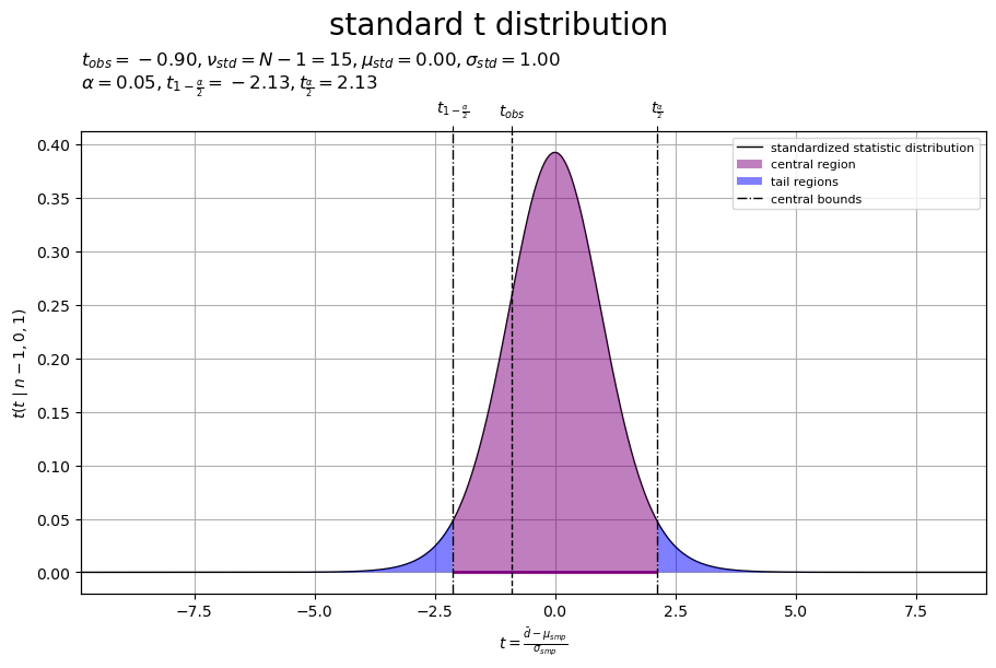
標準化統計量の分布(標準t分布)を曲線、標準化した差の標本平均(の標本)を垂直線(破線)、境界値を垂直線(鎖線)、中央領域(境界値の内側)を線分と塗りつぶし(紫色)、外側の領域(境界値の外側)を塗りつぶし(青色)で示します。
標準化変数 の理論分布は、標準化により、自由度
・位置パラメータ
・尺度パラメータ
のt分布(自由度
の標準t分布)
になります。
標準t分布は、中心が0で左右対称な形状なので、 であり、
です。
標本 から求めた差の標本平均
を標準化した確率変数(標本)
が中央領域(紫色の範囲)
に含まれる確率
が信頼係数
に対応します。言い換えると、外側の領域(青色の範囲)
に含まれる(中央領域に含まれない)確率
が有意水準
に対応します。
母平均の差 が未知なので、標準化後の値
は、本来は分からない値です(真の値の可視化にのみ使っています)。しかし、母数に関わらず、
が従う分布はパラメータが固定(自由度
の標準t分布)になるので、
が含まれる確率は分かります。
有意水準と中央領域や外側領域の関係については「母平均の信頼区間の実装」を参照してください。
差の標本平均 や標準化した変数
は確率変数(標本として得られる実現値)なので、それぞれ対応する分布(理論分布)に従って確率的に値が決まるとみなせます。一方、次に求める信頼区間は、標本として得られた実現値(与えられた値)
や
に基づいて確定的に値が決まり(一意に定まり)ます。
信頼区間の計算
母平均の差(差の母平均) の信頼区間
の下限・上限
を求めます。
信頼区間の範囲 を計算します。
# 信頼区間の範囲を計算
ci_bound_lower = d_bar - cr_bound_upper * sigma_smp
ci_bound_upper = d_bar + cr_bound_upper * sigma_smp
print(ci_bound_lower, ci_bound_upper)
2.618006098773459 7.377975960459344
信頼区間の境界値 を、次の式で計算します。
信頼区間のグラフを作成します。
・作図コード(クリックで展開)
# 信頼区間のラベルを作成
ci_param_lbl  = f'$\\alpha = {alpha:.2f}, '
ci_param_lbl += 'L = \\bar{d} + t_{1-\\frac{\\alpha}{2}} \\sigma_{smp} = '+f'{ci_bound_lower:.2f}, '
ci_param_lbl += 'U = \\bar{d} + t_{\\frac{\\alpha}{2}} \\sigma_{smp} = '+f'{ci_bound_upper:.2f}$'

# 信頼区間を作図
fig, ax = plt.subplots(
    figsize=(9, 6), dpi=100, facecolor='white',
    constrained_layout=True
)
fig.suptitle('Population Mean Difference Confidence Interval', fontsize=20)
ax2x = ax.twiny() # 第2軸の設定用

ax.axvline(
    x=delta_pop,
    color='red', linewidth=1.0, linestyle='--',
    label='population mean difference',
    zorder=10
) # 母平均の差
ax.hlines(
    y=0.0, xmin=ci_bound_lower, xmax=ci_bound_upper,
    color='purple', linewidth=2.0,
    label='confidence interval',
    zorder=11
) # 信頼区間
for idx, delta in enumerate([ci_bound_lower, ci_bound_upper]):
    ax.axvline(
        x=delta,
        color='black', linewidth=1.0, linestyle='-.',
        label='confidence bounds' if idx == 0 else None,
        zorder=12
    ) # 信頼区間の境界値

ax.set_xlabel('$\\delta = \\mu_1 - \\mu_2$')
ax2x.set_xticks(
    ticks =[delta_pop, ci_bound_lower, ci_bound_upper],
    labels=['$\\delta_{pop}$', '$L$', '$U$']
) # 信頼区間のラベル
ax.set_yticks(ticks=[0.0], labels=['']) # (目盛の非表示化用)
ax.set_title(ci_param_lbl, loc='left')
ax.legend(loc='upper right', prop={'size': 8})
ax.grid()
ax.set_xlim(xmin=d_min, xmax=d_max)   # (目盛の共通化用)
ax2x.set_xlim(xmin=d_min, xmax=d_max) # (目盛の共通化用)

plt.show()
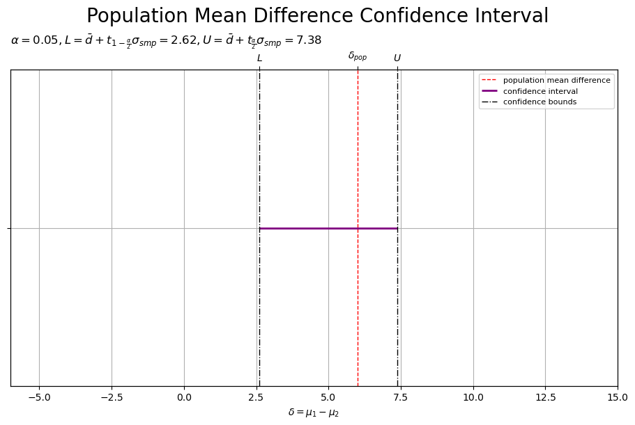
母平均の差を垂直線(赤色・破線)、信頼区間の下限・上限を垂直線(鎖線)、信頼区間を線分(紫色)で示します。
母平均の差 の信頼区間は、差の標本平均
を中心に
の範囲です。
は、確率変数
の標準偏差
の
個分のサイズを表します。
サンプルサイズ が大きいほど、標本分布の標準偏差
が小さくなり、信頼区間の範囲(幅)
が小さくなります。
以上で、母分散が未知で相関のある正規分布の母平均の差の信頼区間の計算を実装しました。
スポンサードリンク
母集団と信頼区間の対応関係
次は、母集団やパラメータ・統計量と信頼区間の対応関係を図で確認します。
母平均の差の信頼区間の計算のグラフを作成します。
・作図コード(クリックで展開)
# 密度軸の範囲を設定
u = 0.005
pop_2d_dens_max = max(pop_dens_vec.max(), obs_dens_grid.max())
pop_2d_dens_max = np.ceil(pop_2d_dens_max /u)*u # u単位で切り上げ
# 余白を設定
margin_ratio = 0.05

# ラベルを作成
pop_2d_param_lbl  = f'$N = {N}$\n'
tmp_mu_str        = ', '.join([f'{mu:.2f}' for mu in mu_pop_d])
tmp_sgm2_1_str    = ', '.join([f'{sgm2:.2f}' for sgm2 in sigma2_pop_dd[0, :]])
tmp_sgm2_2_str    = ', '.join([f'{sgm2:.2f}' for sgm2 in sigma2_pop_dd[1, :]])
pop_2d_param_lbl += f'$\\mu_{{pop}} = ({tmp_mu_str}), '
pop_2d_param_lbl += f'\\Sigma_{{pop}} = \\binom{{{tmp_sgm2_1_str}}}{{{tmp_sgm2_2_str}}}$\n'
tmp_x_str      = ', '.join([f'{x:.2f}' for x in x_bar_d])
tmp_sgm2_1_str = ', '.join([f'{sgm2:.2f}' for sgm2 in sigma2_hat_dd[0, :]])
tmp_sgm2_2_str = ', '.join([f'{sgm2:.2f}' for sgm2 in sigma2_hat_dd[1, :]])
pop_2d_param_lbl += f'$\\bar{{x}} = ({tmp_x_str}), '
pop_2d_param_lbl += f'\\hat{{\\Sigma}} = \\binom{{{tmp_sgm2_1_str}}}{{{tmp_sgm2_2_str}}}$'
pop_1d_param_lbl  = f'$\\mu_1 = {mu_pop_d[0]:.2f}, '
pop_1d_param_lbl += f'\\sigma_1 = {np.sqrt(sigma2_pop_dd[0, 0]):.2f}, '
pop_1d_param_lbl += '\\bar{x}_1 = '+f'{x_bar_d[0]:.2f}, '
pop_1d_param_lbl += '\\hat{\\sigma}_1 = '+f'{sigma_hat_d[0]:.2f}$\n'
pop_1d_param_lbl += f'$\\mu_2 = {mu_pop_d[1]:.2f}, '
pop_1d_param_lbl += f'\\sigma_2 = {np.sqrt(sigma2_pop_dd[1, 1]):.2f}, '
pop_1d_param_lbl += '\\bar{x}_2 = '+f'{x_bar_d[1]:.2f}, '
pop_1d_param_lbl += '\\hat{\\sigma}_2 = '+f'{sigma_hat_d[1]:.2f}$'
diff_param_lbl    = '$\\delta_{pop} = '+f'{delta_pop:.2f}$\n'
diff_param_lbl   += '$\\mu_{diff} = \\mu_1 - \\mu_2 = '+f'{mu_diff:.2f}, '
diff_param_lbl   += '\\sigma_{diff} = \\sigma_1^2 + \\sigma_2^2 - 2 \\sigma_{1,2} = '+f'{sigma_diff:.2f}$\n'
diff_param_lbl   += '$L = \\bar{d} - t_{\\frac{\\alpha}{2}} \\sigma_{smp} = '+f'{ci_bound_lower:.2f}, '
diff_param_lbl   += 'U = \\bar{d} + t_{\\frac{\\alpha}{2}} \\sigma_{smp} = '+f'{ci_bound_upper:.2f}$'
smp_param_lbl     = '$\\bar{d} = '+f'{d_bar:.2f}, '
smp_param_lbl    += '\\hat{\\sigma} = '+f'{sigma_hat:.2f}$\n'
smp_param_lbl    += '$\\mu_{smp} = \\mu_1 - \\mu_2 = '+f'{mu_smp:.2f}, '
smp_param_lbl    += '\\sigma_{smp} \\approx \\frac{\\hat{\\sigma}}{\\sqrt{N}} = '+f'{sigma_smp:.2f}$'
std_param_lbl     = f'$t = {t_obs:.2f}$\n'
std_param_lbl    += f'$\\alpha = {alpha:.2f}, '
std_param_lbl    += 't_{1-\\frac{\\alpha}{2}} = '+f'{cr_bound_lower:.2f}, '
std_param_lbl    += 't_{\\frac{\\alpha}{2}} = '+f'{cr_bound_upper:.2f}$'

# 母平均の差の信頼区間の計算を作図
fig, axes = plt.subplots(
    nrows=3, ncols=2,
    figsize=(12, 12), dpi=100, facecolor='white',
    constrained_layout=True
)
fig.suptitle(
    'Population Mean Difference Confidence Interval\n(paired samples, unknown variance)',
    fontsize=20
)

##### 母分布の作図:2次元 -----

# 母分布を描画
ax   = axes[0, 0]
ax2x = ax.twiny() # 第2軸の設定用
ax2y = ax.twinx() # 第2軸の設定用

ax.pcolormesh(
    center_x_vec, center_x_vec, obs_dens_grid.T,
    shading='nearest',
    cmap='viridis', vmin=0.0, vmax=pop_2d_dens_max, alpha=0.5,
    zorder=8
) # 標本
ax.scatter(
    x=x_nd[:, 0], y=x_nd[:, 1],
    color='black', alpha=0.33, s=25,
    zorder=9
) # 標本
ax.plot(
    [], [],
    color='purple', linewidth=1.0,
    label='population distribution',
    zorder=10
) # (凡例表示用のダミー)
ax.contour(
    x_1_grid, x_2_grid, pop_dens_vec.reshape(x_dims),
    cmap='viridis', vmin=0.0, vmax=pop_2d_dens_max,
    linewidths=1.0,
    zorder=10
) # 母分布
for idx, mu in enumerate([mu_pop_d[0], x_bar_d[0]]):
    ax.axvline(
        x=mu,
        color=['red', 'black'][idx], linewidth=1.0, linestyle='--',
        label=['population means', 'sample means'][idx],
        zorder=[20, 21][idx]
    ) # 母・標本平均
for idx, mu in enumerate([mu_pop_d[1], x_bar_d[1]]):
    ax.axhline(
        y=mu,
        color=['red', 'black'][idx], linewidth=1.0, linestyle='--',
        zorder=[20, 21][idx]
    ) # 母・標本平均
ax.plot(
    x_vec, x_vec,
    color='black', linewidth=1.0,
    zorder=30
) # 恒等関数

ax.set_xlabel('$x_1$')
ax2x.set_xticks(
    ticks =[mu_pop_d[0], x_bar_d[0]],
    labels=['$\\mu_1$', '$\\bar{x}_1$']
) # パラメータのラベル
ax.set_ylabel('$x_2$')
ax2y.set_yticks(
    ticks =[mu_pop_d[1], x_bar_d[1]],
    labels=['$\\mu_2$', '$\\bar{x}_2$']
) # パラメータのラベル
ax.set_title(pop_2d_param_lbl, loc='left')
ax.legend(loc='upper right', prop={'size': 8})
ax.grid()
ax.set_xlim(xmin=x_min, xmax=x_max)   # (目盛の共通化用)
ax2x.set_xlim(xmin=x_min, xmax=x_max) # (目盛の共通化用)
ax.set_ylim(ymin=x_min, ymax=x_max)   # (目盛の共通化用)
ax2y.set_ylim(ymin=x_min, ymax=x_max) # (目盛の共通化用)

##### 母分布の作図:1次元 -----

# 母分布を描画
ax   = axes[1, 0]
ax2x = ax.twiny() # 第2軸の設定用

for d in range(2):
    ax.bar(
        x=center_x_vec, height=obs_dens_lt[d],
        width=class_x_size,
        color=cmap(d), alpha=0.5,
        zorder=8
    ) # 標本
    ax.scatter(
        x=x_nd[:, d], y=np.zeros(N),
        facecolor='none', edgecolor=cmap(d), s=25, #clip_on=False,
        zorder=9
    ) # 標本
for d in range(2):
    ax.plot(
        x_vec, pop_dens_lt[d],
        color='black', linewidth=1.0,
        label='population distribution' if d == 0 else None,
        zorder=10
    ) # 母分布
    for idx, mu in enumerate([mu_pop_d[d], x_bar_d[d]]):
        ax.axvline(
            x=mu,
            color=['red', 'black'][idx], linewidth=1.0, linestyle='--',
            zorder=[20, 21][idx]
        ) # 母・標本平均
ax.hlines(
    y=0.0, xmin=mu_pop_d[0], xmax=mu_pop_d[1],
    color='red', linewidth=2.0, #clip_on=False,
    label='population mean difference',
    zorder=12
) # 母平均の差

ax.set_xlabel('$x$')
ax2x.set_xticks(
    ticks =[*mu_pop_d, *x_bar_d],
    labels=['$\\mu_1$', '$\\mu_2$', '$\\bar{x}_1$', '$\\bar{x}_2$']
) # パラメータのラベル
ax.set_ylabel('$N(x \\mid \\mu_{pop}, \\sigma_{pop}^2)$')
ax.set_title(pop_1d_param_lbl, loc='left')
ax.legend(loc='upper right', prop={'size': 8})
ax.grid()
ax.set_xlim(xmin=x_min, xmax=x_max)   # (目盛の共通化用)
ax2x.set_xlim(xmin=x_min, xmax=x_max) # (目盛の共通化用)
ax.set_ylim(
    ymin=-margin_ratio*pop_1d_dens_max,
    ymax=(1.0+margin_ratio)*pop_1d_dens_max
) # 余白を追加

##### 対標本の作図 -----

# 標本の対応を描画
ax = axes[2, 0]

for d in range(2):
    ax.scatter(
        x=x_nd[:, d], y=np.arange(N)+1,
        facecolor='none', edgecolor=cmap(d), s=25,
        zorder=10
    ) # 標本
ax.hlines(
    y=np.arange(N)+1, xmin=x_nd[:, 0], xmax=x_nd[:, 1],
    color='black', linewidth=1.0, linestyle=':',
    label='sample difference',
    zorder=11
) # 対標本の差
for d in range(2):
    for idx, mu in enumerate([mu_pop_d[d], x_bar_d[d]]):
        ax.axvline(
            x=mu,
            color=['red', 'black'][idx], linewidth=1.0, linestyle='--',
            zorder=[20, 21][idx]
        ) # 母・標本平均

ax.set_xlabel('$x$')
ax.set_ylabel('$n$')
ax.legend(loc='upper right', prop={'size': 8})
ax.grid()
ax.set_xlim(xmin=x_min, xmax=x_max)
ax.invert_yaxis() # 標本番号を昇順に表示

##### 差の母分布の作図 -----

# 差の母分布を描画
ax   = axes[0, 1]
ax2x = ax.twiny()

ax.bar(
    x=center_d_vec, height=obs_dens_vec,
    width=class_d_size,
    color='#00A968', alpha=0.5,
    label='sample',
    zorder=8
) # 差の標本
ax.scatter(
    x=d_n, y=np.zeros(N),
    facecolor='none', edgecolor='black', s=25, #clip_on=False,
    zorder=9
) # 差の標本
ax.plot(
    d_vec, diff_dens_vec,
    color='black', linewidth=1.0,
    label='population distribution',
    zorder=10
) # 差の母分布
for idx, delta in enumerate([delta_pop, d_bar]):
    ax.axvline(
        x=delta,
        color=['red', 'black'][idx], linewidth=1.0, linestyle='--',
        label=['population mean difference', None][idx],
        zorder=[20, 21][idx]
    ) # 母平均の差・差の標本平均
for idx, delta in enumerate([ci_bound_lower, ci_bound_upper]):
    ax.axvline(
        x=delta,
        color='black', linewidth=1.0, linestyle='-.',
        label='confidence bounds' if idx == 0 else None,
        zorder=22
    ) # 信頼区間の境界値
ax.hlines(
    y=0.0, xmin=ci_bound_lower, xmax=ci_bound_upper,
    color='purple', linewidth=2.0, #clip_on=False,
    label='confidence interval',
    zorder=30
) # 信頼区間

ax.set_xlabel('$\\delta = \\mu_1 - \\mu_2, d = x_1 - x_2$')
ax2x.set_xticks(
    ticks =[delta_pop, ci_bound_lower, ci_bound_upper],
    labels=['$\\delta_{pop}$', '$L$', '$U$']
) # 信頼区間のラベル
ax.set_ylabel('$N(d \\mid \\mu_{diff}, \\sigma_{diff}^2)$')
ax.set_title(diff_param_lbl, loc='left')
ax.legend(loc='upper left', prop={'size': 8})
ax.grid()
ax.set_xlim(xmin=d_min, xmax=d_max)   # (目盛の共通化用)
ax2x.set_xlim(xmin=d_min, xmax=d_max) # (目盛の共通化用)
ax.set_ylim(
    ymin=-margin_ratio*diff_dens_max,
    ymax=(1.0+margin_ratio)*diff_dens_max
) # 余白を追加

##### 標本分布の作図 -----

# 標本分布を描画
ax   = axes[1, 1]
ax2x = ax.twiny()

ax.scatter(
    x=d_bar, y=0.0,
    color='#00A968', s=100, #clip_on=False,
    zorder=9
) # 差の標本平均
ax.plot(
    d_vec, smp_dens_vec,
    color='black', linewidth=1.0,
    label='sampling distribution',
    zorder=10
) # 標本分布
for idx, delta in enumerate([delta_pop, d_bar]):
    ax.axvline(
        x=delta,
        color=['red', 'black'][idx], linewidth=1.0, linestyle='--',
        label=[None, 'saple mean difference'][idx],
        zorder=[20, 21][idx]
    ) # 母平均の差・差の標本平均
for delta in [ci_bound_lower, ci_bound_upper]:
    ax.axvline(
        x=delta,
        color='black', linewidth=1.0, linestyle='-.',
        zorder=22
    ) # 信頼区間の境界値

ax.set_xlabel('$\\bar{d} = \\frac{1}{n} \\sum_{i=1}^n d_i$')
ax2x.set_xticks(
    ticks =[d_bar, ci_bound_lower, ci_bound_upper],
    labels=[
        '$\\bar{d}_{obs}$',
        '$\\bar{d}_{obs} - t_{\\frac{\\alpha}{2}} \\sigma_{smp}$',
        '$\\bar{d}_{obs} + t_{\\frac{\\alpha}{2}} \\sigma_{smp}$'
    ]
) # 信頼区間のラベル
ax.set_ylabel('$N(\\bar{d} \\mid \\mu_{smp}, \\sigma_{smp}^2)$')
ax.set_title(smp_param_lbl, loc='left')
ax.legend(loc='upper left', prop={'size': 8})
ax.grid()
ax.set_xlim(xmin=d_min, xmax=d_max)   # (目盛の共通化用)
ax2x.set_xlim(xmin=d_min, xmax=d_max) # (目盛の共通化用)

# ラベルの装飾を調整(重なる対策用)
halignments = ['center', 'right', 'left'] # 表示位置を指定
labels      = ax2x.get_xticklabels() # 軸情報を取得
for label, ha in zip(labels, halignments):
    label.set_ha(ha)

##### 標準化分布の作図 -----

# 標準化分布を描画
ax   = axes[2, 1]
ax2x = ax.twiny()

ax.fill_between(
    x=cr_t_vec, y1=np.zeros_like(cr_t_vec), y2=cr_dens_vec,
    facecolor='purple', alpha=0.5,
    label='central region',
    zorder=9
) # 中央領域
ax.plot(
    t_vec, std_dens_vec,
    color='black', linewidth=1.0,
    label='standardized statistic distribution',
    zorder=10
) # 標準化分布
for idx, delta in enumerate([delta_pop, d_bar]):
    t_val = (delta - mu_smp) / sigma_smp # 標準化
    ax.axvline(
        x=t_val,
        color=['red', 'black'][idx], linewidth=1.0, linestyle='--',
        zorder=[20, 21][idx]
    ) # 母平均の差・差の標本平均
for idx, t_val in enumerate([cr_bound_lower, cr_bound_upper]):
    ax.axvline(
        x=t_val,
        color='black', linewidth=1.0, linestyle='-.',
        label='central bounds' if idx == 0 else None,
        zorder=22
    ) # 中央領域の境界値
ax.hlines(
    y=0.0, xmin=cr_bound_lower, xmax=cr_bound_upper,
    color='purple', linewidth=2.0, #clip_on=False,
    zorder=30
) # 中央領域

ax.set_xlabel('$t = \\frac{\\bar{d} - \\mu_{smp}}{\\sigma_{smp}}$')
ax2x.set_xticks(
    ticks =[t_obs, cr_bound_lower, cr_bound_upper],
    labels=['$t_{obs}$', '$t_{1-\\frac{\\alpha}{2}}$', '$t_{\\frac{\\alpha}{2}}$']
) # 中央領域のラベル
ax.set_ylabel('$t(t \\mid n-1, 0, 1)$')
ax.set_title(std_param_lbl, loc='left')
#ax.legend(loc='upper left', prop={'size': 8})
ax.grid()
ax.set_xlim(xmin=t_min, xmax=t_max)   # (目盛の共通化用)
ax2x.set_xlim(xmin=t_min, xmax=t_max) # (目盛の共通化用)

# ラベルの装飾を調整(表示順の変更用)
order = [1, 2, 0] # 表示順を指定
handles, labels = ax.get_legend_handles_labels() # 凡例情報を取得
ax.legend(
    handles=[handles[i] for i in order],
    labels =[labels[i] for i in order],
    loc='upper left', prop={'size': 8}
)

plt.show()
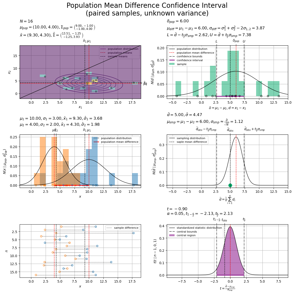
標本分布(中段右図)と標準化統計量の分布(中段下図)とで、それぞれの標準偏差で横軸のスケールを調整して、信頼区間の境界値(鎖線)と中央領域の境界値(鎖線)を対応させています(そのため形状の違いが分かりにくくなっています)。また、母平均の差(赤色・破線)と標準化した差の標本平均(黒色・破線)の位置が対応するように、横軸をスライドしています(そのため母平均の差と標準化した母平均の差や、差の標本平均と標準化した差の標本平均の位置が対応していません)。
標準t分布における 中央領域(中央
領域)の境界値
と、母平均の差
の
信頼区間の境界値
が、対応するのを確認できます。
2つの母平均 と標本平均
の位置関係、また母平均の差
と差の標本平均
の位置関係や、
の標準偏差
の大きさ、上側確率が
(下側確率が
)となる分位点
の大きさなどが、母平均の差
と信頼区間
の位置関係に影響するのが分かります。
以上で、母分散が未知で相関のある正規分布の母平均の差の信頼区間の計算における3つの分布の対応関係を確認しました。
スポンサードリンク
シミュレーション設定の影響
最後は、正規分布と信頼区間の対応関係について、設定を変更したときの信頼区間の変化をアニメーションで確認します。
作図コードについては「Toukei-Kentei/code/confidence_interval/estimate_mean_difference_paired_samples.py at main · anemptyarchive/Toukei-Kentei · GitHub」を参照してください。
サンプルサイズと信頼区間の関係
サンプルサイズ を変化させたときの信頼区間の変化をアニメーションにします。
サンプルサイズ が大きくなるのに応じて、標本分布の標準偏差パラメータ
が小さくなり、母平均の差
の信頼区間の範囲が小さくなっていくのを確認できます。
試行回数と信頼区間の関係
サンプリングと推定を複数回行った各結果をアニメーションにします。
2つの母集団に関して、平均(ベクトル) ・分散(共分散行列)
の2次元正規分布
から
回(複数回)サンプリングを行い、各試行の標本を用いて(試行ごとに)信頼区間を推定することを考えます。
左中図は、 回目(各試行)の推定の様子を表したグラフです。フレームごとに推定結果を切り替えています。
右図は、 回(全試行)の推定の結果(
個の信頼区間)を並べたグラフです。フレームごとに推定結果を追加しています。
回目のサンプリングで得られた
個の実現値をまとめて標本
とします。
回目の標本
から求めた標本平均を
、対標本の差の標本平均を
、確率変数
を標準化した確率変数を
、信頼区間を
で表します。
が従う分布(理論分布)は、正規分布の性質により、平均
・分散
の正規分布
になるため、サンプルサイズ
が一定であれば試行ごとに変わりません。ただし実際には、母分散
と母共分散
が未知のため対標本の差の不偏分散
で代用して近似分布
として扱っているので、試行ごとに(標本によって)変わります。
は確率変数なので、試行ごとに(標本によって)実現値は変わります。
さらに、 が従う分布(理論分布)も、標準化により、自由度
・平均
・分散
のt分布
になるため、試行ごとに変わりません。
の値によってグラフの表示範囲や表示位置が変わっていますが、
軸に対する確率密度(分布の形状)や中央領域は固定です。
も確率変数なので、試行ごとに(標本によって)実現値は変わります。
左中図では、パラメータ を固定した2次元正規分布から標本(実現値の集合)を100個生成(100回サンプリング)して、有意水準
を固定して各試行の標本を用いて区間推定を行っています。右図では、100個の信頼区間(100回分の推定結果)を並べています。
の場合、95%信頼区間なので、95個程度の区間(95回程度の推定結果)で
を捉えられている。言い換えると、5個程度の区間(5回程度の推定結果)で
を捉えられていないのを確認できます。
母平均の差 の
信頼区間とは、同じ母集団から得られた多数の標本に対してそれぞれ区間推定を行ったとき、
の頻度(割合)で区間に真の値
が含まれるように設計された手順によって得られる区間です。
同じ手順(設定)で繰り返し試行したとき、真の値が区間に含まれない頻度(割合)をどの程度許容するかは、 によって決まります。パラメータなどの設定を固定した場合、同じ標本からは同じ区間が求まり(一意に定まり)ます。
1回の試行において、真の値が区間に含まれる確率が と解釈することはできません。
この記事では、正規分布の母平均の差に関する信頼区間を扱いました。次の記事では、母分散の比に関する信頼区間を扱います。
参考文献

おわりに
対標本の作り方からして分からない状態から始めましたが、2次元正規分布で表現(仮定)すればいいと分かってからは、これまでの流れと相違ないですね。
ただ本では、この節だけでなく全体を通して、多変量正規分布は登場しなかったと思うので、解説としてどうなんでしょうか。このブログでは、多次元ガウス分布(多変量正規分布)についていくつも記事を書いているので、寄り道して読んでください。
解説の途中でいくつか式変形が登場してしました。他のシリーズであれば式変形については別記事で解説するのですが、このシリーズでは数式読解は扱っていないので(いつか書きたいとは思っていますが)実装の解説の中で扱うことになりました。
始めと終わりの2つの式を確認して、「標本を用いた式(目的の統計量の定義式)」を「他の統計量を用いた式(既に求めた値による計算式)」で表現(計算)できるのが分かれば、「何から何が求められるのか」やここでの「操作(計算)の意図」を理解する助けになると思います。
2026年5月24日は、ukkaラストライブの開催日です。
私は生配信で観ました。最後まで楽しいコンサートでした。
10年を超える活動期間の内、私が追えたのはほんのわずかな期間ではありましたが、楽しい日々をありがとうございました!!!!!!!
【次節の内容】
つづく
