はじめに
gganimateパッケージについて理解したいシリーズです。
この記事では、transition_states()関数の機能を深掘りします。
【他の内容】
【目次】
transition_states
gganimateパッケージの関数transition_states()について解説します。transition_states()は、アニメーション(gif画像)のフレーム切り替えを制御します。
利用するパッケージを読み込みます。
# 利用するパッケージ
library(ggplot2)
library(gganimate)
基本的にパッケージ名::関数名()の記法で書きます。ただし作図コードに関してはごちゃごちゃしてしまうので、ggplot2パッケージの関数は関数名のみで、gganimateパッケージの関数はパッケージ名を明示して書きます。
データフレームの作成
まずは、作図に利用するデータフレームを作成します。
# データフレームを作成
df <- tibble::tibble(
  x = 0:5,
  y = 0:5,
  state = 0:5
)
df
## # A tibble: 6 x 3
##       x     y state
##   <int> <int> <int>
## 1     0     0     0
## 2     1     1     1
## 3     2     2     2
## 4     3     3     3
## 5     4     4     4
## 6     5     5     5
分かりやすい値を作成しておきます。tibble::tibble()を使ってデータフレームを作成していますが、data.frame()を使っても問題ありません。
transition_states()の状態(データ)の引数states(第1引数)に、フレームの順序を示す列を指定します。この例では、state列が対応します。
このデータを用いた散布図と棒グラフのアニメーションを通じて、transition_states()の機能を確認していきます。
散布図の場合
散布図に対してtransition_states()を利用します。
全てのデータを散布図で確認しておきます。
# 散布図を作成
ggplot(df, aes(x = x, y = y)) +
  geom_point(size = 5, color = "hotpink") + # 散布図
  scale_x_continuous(breaks = df[["x"]], minor_breaks = FALSE) + # x軸目盛
  scale_y_continuous(breaks = df[["y"]], minor_breaks = FALSE) + # y軸目盛
  coord_fixed(ratio = 1) + # アスペクト比
  labs(title = "geom_point()")

点について、
から
までの6個の点が実際のデータであり、この点を辿るようにグラフが変化します。
ラベル変数
transition_states()で使える4つのラベル変数(previous_state・closest_state・next_state・transitioning)を確認します。
ラベル変数名を{}で挟んだ文字列をlabs()などに指定します。
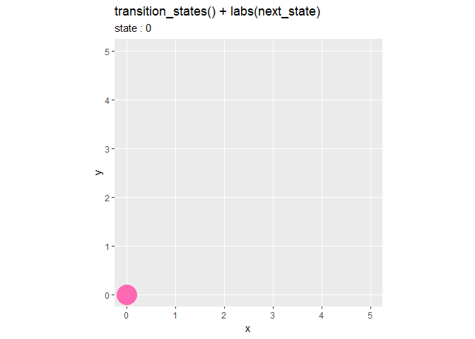
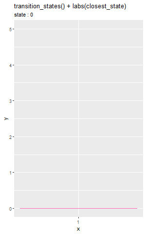
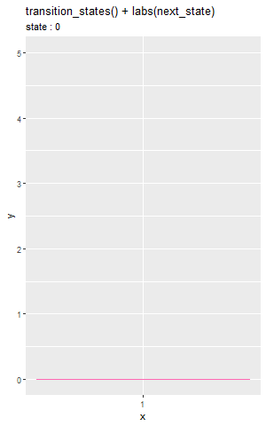
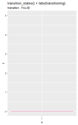
# ラベル変数を指定
lv <- "previous_state" # 前のデータの値
#lv <- "closest_state"  # 近いデータの値
#lv <- "next_state"     # 次のデータの値
#lv <- "transitioning"  # 遷移中かどうか

# ラベル変数の設定
anim <- ggplot(df, aes(x = x, y = y)) +
  geom_point(size = 10, color = "hotpink") + # 散布図
  gganimate::transition_states(states = state) + # フレーム
  scale_x_continuous(breaks = df[["x"]], minor_breaks = FALSE) + # x軸目盛
  scale_y_continuous(breaks = df[["y"]], minor_breaks = FALSE) + # y軸目盛
  coord_fixed(ratio = 1) + # アスペクト比
  labs(title = paste0("transition_states() + labs(", lv, ")"),
       subtitle = paste0("state : {", lv, "}"))

# gif画像を作成
gganimate::animate(plot = anim, nframes = 60, fps = 6)


"{previous_state}"は、前のデータ(状態)の値に置き換わります。ピンク色の点が次のデータ(状態)に辿り着いたタイミングで値が変わるのが分かります。
"{closest_state}"は、近いデータの値になります。前後のデータの中心で値が変わるのが分かります。
"{next_state}"は、次のデータの値になります。点が現在のデータから動き出したタイミングで値が変わるのが分かります。
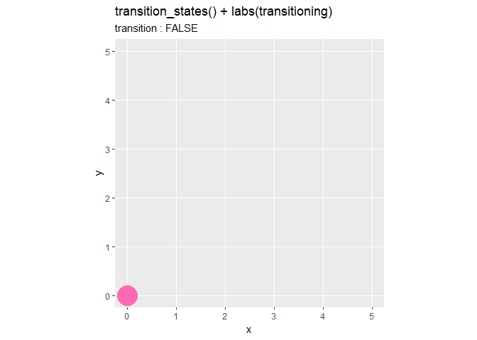
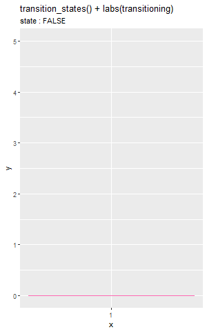
"{transitioning}"は、遷移中かどうかを論理値で表します。データ間を遷移中であればTRUE、データ上の点であればFALSEになります。(transitioningのグラフについてはサブタイトルのコードを書き替えました。)
解説用に複雑な作図コードになっていますが、title = "{closest_state}"のように指定してください。
引数
続いて、transition_states()で利用できる3つの引数(transition_length・transition_length・wrap)を確認します。
transition_length引数は、データ間の遷移の相対的な長さを数値で指定します。「相対的」については後で確認します。
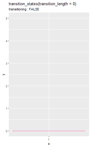
# 値を指定:(デフォルト:1)
tl <- 0

# transition_length(データ間の遷移)の設定
anim <- ggplot(df, aes(x = x, y = y)) +
  geom_point(size = 10, color = "hotpink") + # 散布図
  gganimate::transition_states(states = state, transition_length = tl, wrap = FALSE) + # フレーム
  scale_x_continuous(breaks = df[["x"]], minor_breaks = FALSE) + # x軸目盛
  scale_y_continuous(breaks = df[["y"]], minor_breaks = FALSE) + # y軸目盛
  coord_fixed(ratio = 1) + # アスペクト比
  labs(title = paste0("transition_states(transition_length = ", tl, ")"),
       subtitle = "transitioning : {transitioning}")

# gif画像を作成
gganimate::animate(plot = anim, nframes = 60, fps = 6)
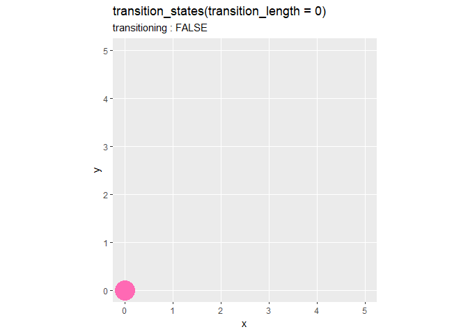
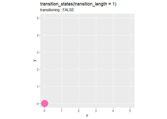
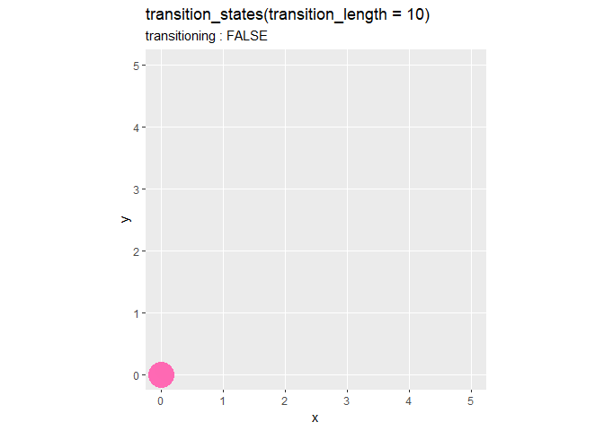
デフォルトは1です。値が大きいほど遷移時間が長くなり、データ間を細かく補完します。値が大きい(遷移時間が長い)と、データ点上での停止時間が短くなり、全体の時間(フレーム数)は変わりません。0のとき、途中経過を描画せずにデータ点上を移っているのが分かります。
複数の値をベクトルで指定することで、データごとに設定できます。
# 値を指定:(デフォルト:1)
tl <- 0:5

# transition_length(データ間の遷移)の設定
anim <- ggplot(df, aes(x = x, y = y)) +
  geom_point(size = 10, color = "hotpink") + # 散布図
  gganimate::transition_states(states = state, transition_length = tl, wrap = FALSE) + # フレーム
  scale_x_continuous(breaks = df[["x"]], minor_breaks = FALSE) + # x軸目盛
  scale_y_continuous(breaks = df[["y"]], minor_breaks = FALSE) + # y軸目盛
  coord_fixed(ratio = 1) + # アスペクト比
  labs(title = paste0("transition_states(transition_length = c(", paste0(tl, collapse = ", "), "))"),
       subtitle = "transitioning : {transitioning}")

# gif画像を作成
gganimate::animate(plot = anim, nframes = 60, fps = 6)
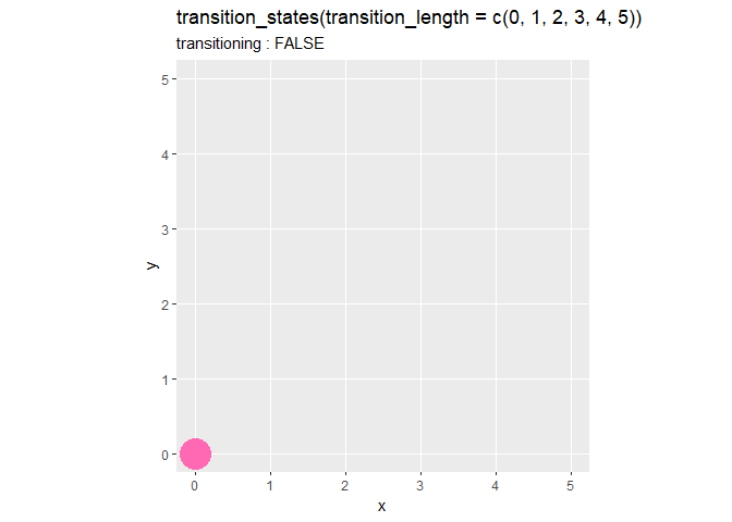
遷移の度に値が大きくなるように指定しました。よって、データが移るごとに途中経過が細かく(遷移時間が長く)なっているのが分かります。
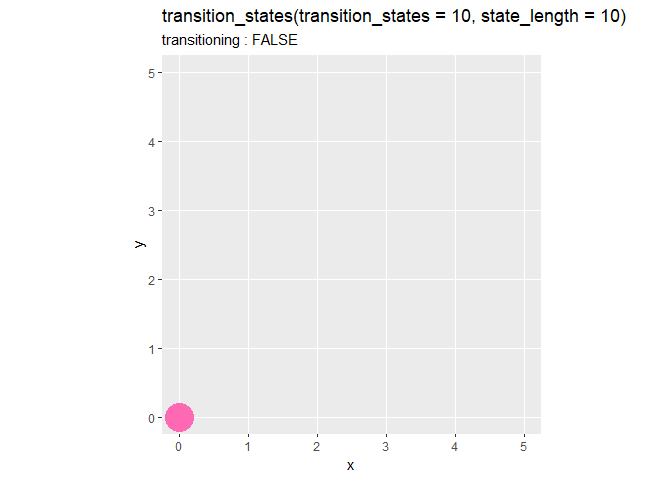
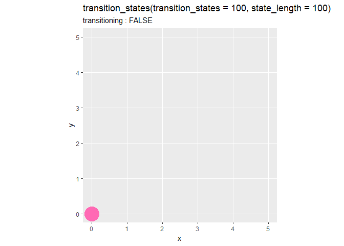
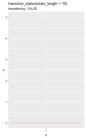
state_length引数は、データ点における停止時間の相対的な長さを数値で指定します。
# 値を指定:(デフォルト:1)
sl <- 0

# state_length(データ点での一時停止)の設定
anim <- ggplot(df, aes(x = x, y = y)) +
  geom_point(size = 10, color = "hotpink") + # 散布図
  gganimate::transition_states(states = state, state_length = sl, wrap = FALSE) + # フレーム
  scale_x_continuous(breaks = df[["x"]], minor_breaks = FALSE) + # x軸目盛
  scale_y_continuous(breaks = df[["y"]], minor_breaks = FALSE) + # y軸目盛
  coord_fixed(ratio = 1) + # アスペクト比
  labs(title = paste0("transition_states(state_length = ", sl, ")"),
       subtitle = "transitioning : {transitioning}")

# gif画像を作成
gganimate::animate(plot = anim, nframes = 60, fps = 6)
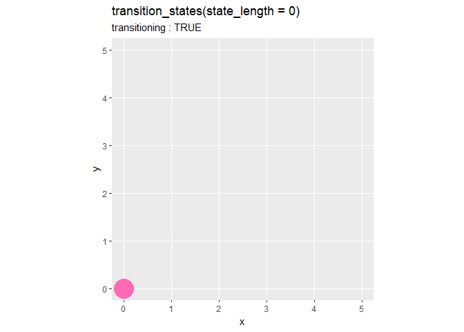


デフォルトは1です。値が大きいほど一時停止の時間が長くなります。値が大きい(停止時間が長い)と、データ間の遷移時間が短く(補完が粗く)なり、全体の時間(フレーム数)は変わりません。0のとき、一時停止せずに同じスピードで変化しているのが分かります。
こちらも、ベクトルで指定できます。
# 値を指定:(デフォルト:1)
sl <- 0:5

# state_length(データ点での一時停止)の設定
anim <- ggplot(df, aes(x = x, y = y)) +
  geom_point(size = 10, color = "hotpink") + # 散布図
  gganimate::transition_states(states = state, state_length = sl, wrap = FALSE) + # フレーム
  scale_x_continuous(breaks = df[["x"]], minor_breaks = FALSE) + # x軸目盛
  scale_y_continuous(breaks = df[["y"]], minor_breaks = FALSE) + # y軸目盛
  coord_fixed(ratio = 1) + # アスペクト比
  labs(title = paste0("transition_states(state_length = c(", paste0(sl, collapse = ", "), "))"),
       subtitle = "transitioning : {transitioning}")

# gif画像を作成
gganimate::animate(plot = anim, nframes = 60, fps = 6)
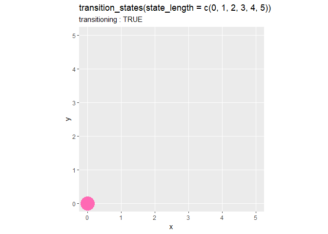
遷移の度に値が大きくなるように指定しました。よって、データが移るごとに停止時間が長くなっているのが分かります。
2つの引数の関係を確認します。
# 値を指定:(デフォルト:1)
tl <- 10
sl <- 10

# state_length(データ点での一時停止)の設定
anim <- ggplot(df, aes(x = x, y = y)) +
  geom_point(size = 10, color = "hotpink") + # 散布図
  gganimate::transition_states(states = state, transition_length = tl, state_length = sl, wrap = FALSE) + # フレーム
  scale_x_continuous(breaks = df[["x"]], minor_breaks = FALSE) + # x軸目盛
  scale_y_continuous(breaks = df[["y"]], minor_breaks = FALSE) + # y軸目盛
  coord_fixed(ratio = 1) + # アスペクト比
  labs(title = paste0("transition_states(transition_states = ", tl, ", state_length = ", sl, ")"),
       subtitle = "transitioning : {transitioning}")

# gif画像を作成
gganimate::animate(plot = anim, nframes = 60, fps = 6)
transition_lengthとstate_lengthは、それぞれ遷移と停止の時間を設定しますが、互いの値の大きさに影響します。2つの引数が同じ値であれば、値の大小が影響していないのが分かります。それぞれの値の比率に応じて、フレーム数が割り当てられます。
アニメーション全体のフレーム数は、gif画像のレンダリング関数animate()のフレーム数の引数nframesで指定できます。デフォルト100です。
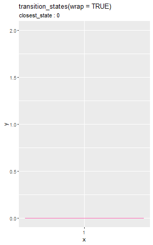
wrap引数は、最後のデータと最初のデータの間で遷移するかを論理値で指定します。
# 論理値を指定:(デフォルト:TRUE)
b <- TRUE
#b <- FALSE

# wrap(最後のデータと最初のデータの遷移)の設定
anim <- ggplot(head(df, 3), aes(x = x, y = y)) +
  geom_point(size = 10, color = "hotpink") + # 散布図
  gganimate::transition_states(states = state, wrap = b) + # フレーム
  scale_x_continuous(breaks = df[["x"]], minor_breaks = FALSE) + # x軸目盛
  scale_y_continuous(breaks = df[["y"]], minor_breaks = FALSE) + # y軸目盛
  coord_fixed(ratio = 1) + # アスペクト比
  labs(title = paste0("transition_states(wrap = ", b, ")"),
       subtitle = "closest_state : {closest_state}")

# gif画像を作成
gganimate::animate(plot = anim, nframes = 30, fps = 10)
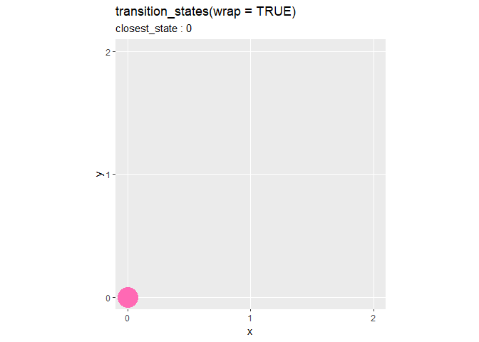

デフォルトはTRUEで、最後のデータから最初のデータへ遷移(データ間を補完するグラフを描画)します。FALSEを指定すると、最後のデータに辿り着くとグラフの描画が終わり、gif画像のループによって最初のデータのグラフに戻ります。
点から点
にピンク色の点が戻る際に、間が補完されて描画されているのが分かります。
棒グラフの場合
次は、棒グラフに対してtransition_states()を利用します。
全てのデータを棒グラフで確認しておきます。
# 棒グラフを作成
ggplot(df, aes(x = 1, y = y, group = y)) +
  geom_bar(stat = "identity", position = "dodge", fill = "hotpink", color = "hotpink") + # 棒グラフ
  scale_x_continuous(breaks = 1, minor_breaks = FALSE) + # x軸目盛
  labs(title = "geom_bar()",
       fill = "y", color = "y")

x軸の値を1で固定して、y軸の変化をアニメーションで可視化します。
ラベル変数
散布図のときと同様に、4つのラベル変数を使ってみます。
# ラベル変数を指定
lv <- "previous_state" # 前のデータの値
lv <- "closest_state"  # 近いデータの値
lv <- "next_state"     # 次のデータの値
lv <- "transitioning"  # 遷移中かどうか

# ラベル変数の設定
anim <- ggplot(df, aes(x = 1, y = y)) +
  geom_bar(stat = "identity", fill = "hotpink", color = "hotpink") + # 棒グラフ
  gganimate::transition_states(states = state) + # フレーム
  scale_x_continuous(breaks = 1, minor_breaks = FALSE) + # x軸目盛
  labs(title = paste0("transition_states() + labs(", lv, ")"),
       subtitle = paste0("state : {", lv, "}"))

# gif画像を作成
gganimate::animate(plot = anim, nframes = 120, fps = 12, width = 300)
ラベル変数は、グラフによらず機能します。
引数
transition_length引数を使って、遷移時間を設定します。
# 値を指定:(デフォルト:1)
tl <- 0

# transition_length(データ間の遷移)の設定
anim <- ggplot(df, aes(x = 1, y = y)) +
  geom_bar(stat = "identity", fill = "hotpink", color = "hotpink") + # 棒グラフ
  gganimate::transition_states(states = state, transition_length = tl, wrap = FALSE) + # フレーム
  scale_x_continuous(breaks = 1, minor_breaks = FALSE) + # x軸目盛
  labs(title = paste0("transition_states(transition_length = ", tl, ")"),
       subtitle = "transitioning : {transitioning}")

# gif画像を作成
gganimate::animate(plot = anim, nframes = 120, fps = 12, width = 300)

デフォルトの設定はラベル変数のときと同じなので省略します。値が大きいほど遷移時間が長く、データ間を細かく補完し、データ上での停止時間が短くなります。
state_length引数を使って、一時停止時間を設定します。
# 値を指定:(デフォルト:1)
sl <- 0

# state_length(データ点での一時停止)の設定
anim <- ggplot(df, aes(x = 1, y = y)) +
  geom_bar(stat = "identity", fill = "hotpink", color = "hotpink") + # 棒グラフ
  gganimate::transition_states(states = state, state_length = sl, wrap = FALSE) + # フレーム
  scale_x_continuous(breaks = 1, minor_breaks = FALSE) + # x軸目盛
  labs(title = paste0("transition_states(state_length = ", sl, ")"),
       subtitle = "transitioning : {transitioning}")

# gif画像を作成
gganimate::animate(plot = anim, nframes = 120, fps = 12, width = 300)

デフォルトの設定はラベル変数のときと同じなので省略します。値が大きいほどデータ点での一時停止が長く、データ間の補完が粗くなります。
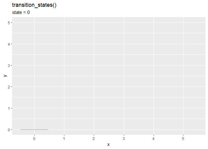
wrap引数を使って、ループの繋ぎ方を設定します。
# 論理値を指定:(デフォルト:TRUE)
b <- TRUE
#b <- FALSE

# wrap(最後のデータと最初のデータの遷移)の設定
anim <- ggplot(head(df, 3), aes(x = 1, y = y)) +
  geom_bar(stat = "identity", fill = "hotpink", color = "hotpink") + # 棒グラフ
  gganimate::transition_states(states = state, wrap = b) +  # フレーム
  scale_x_continuous(breaks = 1, minor_breaks = FALSE) + # x軸目盛
  labs(title = paste0("transition_states(wrap = ", b, ")"),
       subtitle = "closest_state : {closest_state}")

# gif画像を作成
gganimate::animate(plot = anim, nframes = 60, fps = 20, width = 300)

デフォルトまたはTRUEだと、バーが巻き戻るように最初の値になるのが分かります。
ここまではx軸を1で固定していました。x軸にx列を指定します。
# 2軸方向への変化
anim <- ggplot(df, aes(x = x, y = y)) +
  geom_bar(stat = "identity", fill = "hotpink", color = "hotpink") + # 棒グラフ
  gganimate::transition_states(states = state) + # フレーム
  scale_x_continuous(breaks = df[["x"]], minor_breaks = FALSE) + # x軸目盛
  labs(title = paste0("transition_states()"),
       subtitle = "state = {closest_state}")

# gif画像を作成
gganimate::animate(plot = anim, nframes = 120, fps = 12)
state列とx列の値に従って、x軸も移動します。
以上で、ラベル変数と引数の機能を確認できました。次は、実用を想定してグラフを作成します。
利用例:サイコロ
gganimateパッケージの使用例として、サイコロの出目の頻度を2つのグラフで可視化します。
利用するパッケージを読み込みます。
# 利用するパッケージ
library(tidyverse)
library(gganimate)
データの生成
まずは、利用するデータを作成します。
# 試行回数を指定
N <- 30

# 面の数を指定
V <- 6

# サイコロを振る
result_mat <- rmultinom(n = N, size = 1, prob = rep(1 / V, times = V)) %>%
  t()
result_mat[1:5, ]
##      [,1] [,2] [,3] [,4] [,5] [,6]
## [1,]    0    0    0    1    0    0
## [2,]    0    0    0    1    0    0
## [3,]    0    0    0    0    0    1
## [4,]    0    0    1    0    0    0
## [5,]    0    0    0    1    0    0
サイコロを振った結果は、多項分布の乱数生成関数rmultinom()で再現できます。
試行回数の引数nにN、1試行当たりのサイコロの数の引数sizeに1を指定します。サイコロの各面の確率の引数probは、デフォルトで一様になるので指定する必要はありませんが、1 / Vの確率であることを明示的に書いています。
rmultinom()の出力をt()で転置しておきます。行が各試行、列が各面に対応しており、値が1の列番号が出た目を表します。
出目の値を抽出します。
# 出目を抽出
result_vec <- which(t(result_mat) == 1, arr.ind = TRUE)[, "row"]
result_vec[1:5]
## [1] 4 4 6 3 4
result_matに対して、値が1の列番号を抽出します。
which()は、条件に合う要素の行番号と列番号を返します。result_matを転置して渡す必要があります。転置するので、行番号("row"列)を取り出します。
サイコロを振った結果が得られたので、アニメーションで可視化していきます。
棒グラフによる可視化
各出目の出現回数を棒グラフ、各試行の出目を散布図で可視化します。
試行回数と出た目の値をデータフレームに格納します。
# 結果を格納
result_df <- tibble::tibble(
  v = c(NA_integer_, result_vec),
  n = 0:N
)
head(result_df)
## # A tibble: 6 x 2
##       v     n
##   <int> <int>
## 1    NA     0
## 2     4     1
## 3     4     2
## 4     6     3
## 5     3     4
## 6     4     5
グラフの変化を分かりやすくするために、0回目の結果に相当する行を追加します。出目はないので(整数型の)欠損値NA_integer_を使います。
各試行までに出た目の数をそれぞれカウントします。
# 出目を集計
count_df <- result_mat %>%
  tibble::as_tibble() %>% # データフレームに変換
  cumsum() %>% # 試行ごとに集計
  dplyr::mutate(n = 1:N) %>% # 試行回数列を追加
  tidyr::pivot_longer(
    cols = -n,
    names_to = "v",
    names_prefix = "V",
    names_ptypes = list(v = factor()),
    values_to = "count"
  ) %>% # 縦型のデータフレームに変換
  rbind(
    tibble::tibble(
      n = rep(0, times = V),
      v = factor(1:V),
      count = rep(0, times = V)
    ),
    .
  ) # 0回目の結果を追加

# 1回から3回目時点の結果
count_df %>%
  dplyr::filter(n >= 1, n <= 3)
## # A tibble: 18 x 3
##        n v     count
##    <dbl> <fct> <dbl>
##  1     1 1         0
##  2     1 2         0
##  3     1 3         0
##  4     1 4         1
##  5     1 5         0
##  6     1 6         0
##  7     2 1         0
##  8     2 2         0
##  9     2 3         0
## 10     2 4         2
## 11     2 5         0
## 12     2 6         0
## 13     3 1         0
## 14     3 2         0
## 15     3 3         0
## 16     3 4         2
## 17     3 5         0
## 18     3 6         1
cumsum()で累積和(1行目からn行目までの和)を計算します。
最後にこちらも、0回目の結果に相当する行(V行のデータフレーム)を追加します。
n列が3の6行を見ると、1回目と2回目の結果が反映されているのが分かります。
棒グラフと散布図を重ねて描画します。
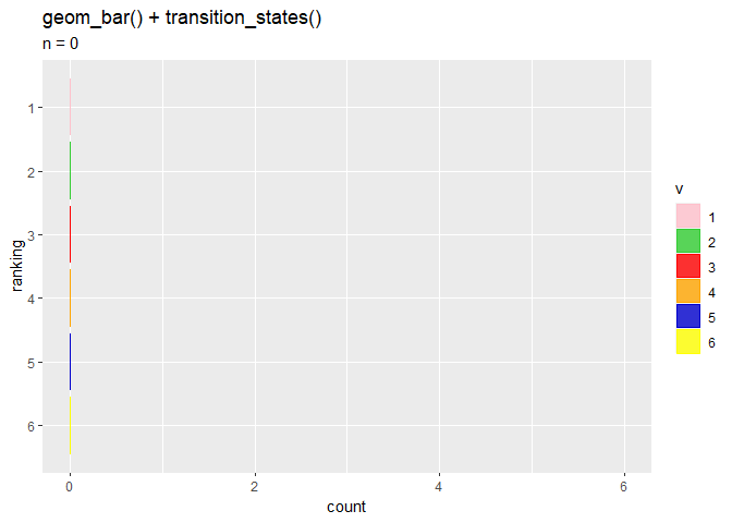
# 遷移の数を指定
d <- 10

# 棒グラフを作成
anim <- ggplot() +
  geom_bar(data = count_df, mapping = aes(x = v, y = count, fill = v, color = v),
           stat = "identity") + # 棒グラフ
  geom_point(data = result_df, mapping = aes(x = v, y = 0),
             color = "hotpink", size = 5) + # 散布図
  gganimate::transition_states(states = n, transition_length = d) +
  scale_fill_manual(values = c("pink", "limegreen", "red", "orange", "mediumblue", "yellow")) + # バーの色:(不必要)
  scale_color_manual(values = c("pink", "limegreen", "red", "orange", "mediumblue", "yellow")) + # 枠線の色:(不必要)
  labs(title = "geom_bar() + geom_point() + transition_states()",
       subtitle = "n = {closest_state}")

# gif画像を作成
gganimate::animate(plot = anim, nframes = N*d, fps = d)

transition_states()の第1引数に試行回数n列を指定して、試行ごとにグラフを描画します。
バーチャートレースによる可視化
続いて、出現回数が多い順にバーが入れ替わるバーチャートレース(Bar Chart Race)を作成します。
各試行における出目の合計の順位を追加します。
# ランク付け
rank_df <- count_df %>%
  dplyr::group_by(n) %>% # グループ化
  dplyr::mutate(ranking = dplyr::row_number(-count)) %>% # ランキング列を追加
  dplyr::ungroup() # グループ化の解除

# 10回目時点の結果
rank_df %>%
  dplyr::filter(n >= 10)
## # A tibble: 126 x 4
##        n v     count ranking
##    <dbl> <fct> <dbl>   <int>
##  1    10 1         1       4
##  2    10 2         0       5
##  3    10 3         3       2
##  4    10 4         4       1
##  5    10 5         0       6
##  6    10 6         2       3
##  7    11 1         1       4
##  8    11 2         0       6
##  9    11 3         3       2
## 10    11 4         4       1
## # ... with 116 more rows
row_number()で、昇順に整数を割り当てられます。ここでは、試行ごとに割り当てたいのでn列でグループ化して、出現回数count列が多い順に割り当てたいのでマイナス-を付けて大小関係を入れ変えています。
棒グラフを描画します。
# バーチャートレースを作成
anim <- ggplot(rank_df, aes(x = ranking, y = count, fill = v, color = v)) +
  geom_bar(stat = "identity", width = 0.9, alpha = 0.8) + # 棒グラフ
  gganimate::transition_states(states = n, transition_length = d) + # フレーム
  coord_flip() + # 軸の入れ変え
  scale_x_reverse(breaks = 1:V, minor_breaks = FALSE) + # x軸を反転
  scale_fill_manual(values = c("pink", "limegreen", "red", "orange", "mediumblue", "yellow")) + # バーの色:(不必要)
  scale_color_manual(values = c("pink", "limegreen", "red", "orange", "mediumblue", "yellow")) + # 枠線の色:(不必要)
  labs(title = "geom_bar() + transition_states()",
       subtitle = "n = {closest_state}")

# gif画像を作成
gganimate::animate(plot = anim, nframes = N*d, fps = d)
x軸(軸を入れ変えているので縦軸)に出現回数の順位ranking列を指定して、順位に応じてバーを入れ替えます。
ヒートマップを描画する関数geom_tile()でも作成できます。
geom_tile()を使った棒グラフの作図について確認しておきます。
# 引数の確認
ggplot(df, aes(x = x, y = y)) +
  geom_tile(aes(height = 1, fill = as.factor(x), color = as.factor(x)),
            width = 0.9) + # 棒グラフの代用
  geom_point(size = 5, color = "hotpink") + # 散布図
  coord_flip() + # 軸の入れ変え
  scale_x_continuous(breaks = df[["x"]], minor_breaks = FALSE) + # x軸目盛
  labs(title = "geom_tile()",
       y = "y", fill = "x", color = "x")

y軸の引数yに指定した値を中心に、高さの引数heightに指定したサイズのバーが描画されます。軸を入れ替えているので高さは横方向の長さのことです。
この図ではheigth = 1としたので、各データのy軸の値(ピンク色の点)を中心に、左右に0.5ずつ伸びてバーのサイズが1になっているのを確認できます。
そこで、指定したい値の半分(y / 2)をy引数に指定して、実際の値(y)をheight引数に指定することで、0からyまでのバーを描画できます。
# 棒グラフの代用を作成
ggplot(df, aes(x = x)) +
  geom_tile(aes(y = y / 2, height = y, fill = as.factor(x), color = as.factor(x)),
            width = 0.9) + # 棒グラフの代用
  geom_point(aes(y = y), size = 5, color = "hotpink") + # 散布図
  coord_flip() + # 軸の入れ変え
  scale_x_continuous(breaks = df[["x"]], minor_breaks = FALSE) + # x軸目盛
  labs(title = "geom_tile()",
       y = "y", fill = "x", color = "x")

各データのy軸の値(ピンク色の点)までの棒グラフを描画できました。
バーチャートレースを作成します。
# バーチャートレースを作成
anim <- ggplot(rank_df, aes(x = ranking, y = count / 2, height = count, fill = v, color = v)) +
  geom_tile(width = 0.9, alpha = 0.8) + # 棒グラフの代用
  gganimate::transition_states(states = n, transition_length = d) + # フレーム
  coord_flip() + # 軸の入れ変え
  scale_x_reverse(breaks = 1:V, minor_breaks = FALSE) + # x軸を反転
  scale_fill_manual(values = c("pink", "limegreen", "red", "orange", "mediumblue", "yellow")) + # バーの色:(不必要)
  scale_color_manual(values = c("pink", "limegreen", "red", "orange", "mediumblue", "yellow")) + # 枠線の色:(不必要)
  labs(title = "geom_tile() + transition_states()",
       subtitle = "n = {closest_state}",
       y = "count")

# gif画像を作成
gganimate::animate(plot = anim, nframes = N*d, fps = d)
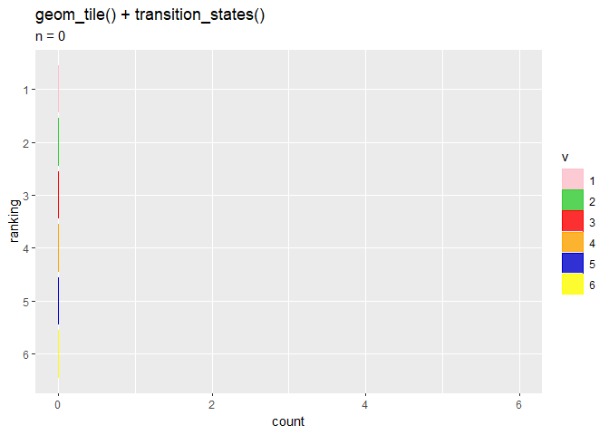
(geom_tile()を使っているのをいくつか見たのでやってみましたが、geom_bar()を使うよりどんな嬉しさがあるのでしょうか?)
以上で、transition_states()について確認しました。
おわりに
これまで雰囲気でお世話になっていたgganimateを本格的に理解しようと始めました。当面の目標はバーチャートレースを装飾も含めて完成させることです。