はじめに
R言語で三角関数の定義や公式を可視化しようシリーズのスピンオフです。
この記事では、双曲線のグラフを作成します。
【他の記事一覧】
【この記事の内容】
双曲線の作図
横向きの双曲線(hyperbola)のグラフを作成します。
利用するパッケージを読み込みます。
# 利用パッケージ
library(tidyverse)
この記事では、基本的にパッケージ名::関数名()の記法を使うので、パッケージを読み込む必要はありません。ただし、作図コードがごちゃごちゃしないようにパッケージ名を省略しているためggplot2を読み込む必要があります。
また、ネイティブパイプ演算子|>を使っています。magrittrパッケージのパイプ演算子%>%に置き換えても処理できますが、その場合はmagrittrも読み込む必要があります。
定義式の確認
まずは、双曲線の定義式を確認します。
双曲線
双曲線は、次の式で定義されます。
座標(x軸とy軸の値)は、それぞれ次の式で計算できます。
$\sinh \theta$はハイパボリックサイン関数、$\cosh \theta$はハイパボリックコサイン関数です。
双曲線の漸近線は、次の式です。
この式を$y$について解くと、次の式になります。
単位双曲線
また、単位双曲線は、次の式で定義されます。
$a = 1, b = 1$のときの双曲線の式です。
座標は、それぞれ次の式で計算できます。
単位双曲線の漸近線は、次の式です。
この式を$y$について解くと、次の式になります。
これらの式を使ってグラフを作成します。
単位双曲線の作図
次は、単位双曲線のグラフを作成します。
線ごとに描画
・コード(クリックで展開)
双曲線を描画するためのデータフレームを作成します。
# 双曲線の描画用
hyperbola_df <- tibble::tibble(
  theta = seq(from = -2, to = 2, by = 0.002), # 範囲を指定
  x = cosh(theta),
  y = sinh(theta)
)
hyperbola_df
## # A tibble: 2,001 × 3
##    theta     x     y
##    <dbl> <dbl> <dbl>
##  1 -2     3.76 -3.63
##  2 -2.00  3.75 -3.62
##  3 -2.00  3.75 -3.61
##  4 -1.99  3.74 -3.60
##  5 -1.99  3.73 -3.60
##  6 -1.99  3.73 -3.59
##  7 -1.99  3.72 -3.58
##  8 -1.99  3.71 -3.57
##  9 -1.98  3.70 -3.57
## 10 -1.98  3.70 -3.56
## # … with 1,991 more rows
変数$\theta$として用いる値をtheta列として作成して、x軸の値としてcosh関数$\cosh \theta$、y軸の値としてsinh関数$\sinh \theta$を計算します。
グラフサイズ用の値を作成します。
# 軸の最大値を設定
axis_max <- max(hyperbola_df[["x"]])
axis_max
## [1] 3.762196
$\cosh \theta$の最大値をaxis_maxとします。
漸近線を描画するためのデータフレームを作成します。
# 漸近線の描画用
asymptote_df <- tibble::tibble(
  x = seq(from = -axis_max, to = axis_max, length.out = 100),
  y = x
)
asymptote_df
## # A tibble: 100 × 2
##        x     y
##    <dbl> <dbl>
##  1 -3.76 -3.76
##  2 -3.69 -3.69
##  3 -3.61 -3.61
##  4 -3.53 -3.53
##  5 -3.46 -3.46
##  6 -3.38 -3.38
##  7 -3.31 -3.31
##  8 -3.23 -3.23
##  9 -3.15 -3.15
## 10 -3.08 -3.08
## # … with 90 more rows
-axis_maxからaxis_maxの範囲を$x$として、$y = x$とあわせて格納します。
双曲線の間の領域を描画するためのデータフレームを作成します。
# 正方形グリッドの描画用
square_df <- tibble::tibble(
  x = c(1, 1, -1, -1, 1),
  y = c(1, -1, -1, 1, 1)
)
square_df
## # A tibble: 5 × 2
##       x     y
##   <dbl> <dbl>
## 1     1     1
## 2     1    -1
## 3    -1    -1
## 4    -1     1
## 5     1     1
$x = \pm 1$と$y = \pm 1$の直線の4つの交点の座標を格納します。
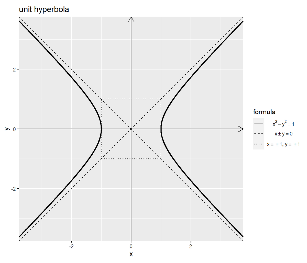
単位双曲線のグラフを作成します。
# 単位双曲線を作図
ggplot() +
  geom_segment(mapping = aes(x = -axis_max, y = 0, xend = axis_max, yend = 0),
               arrow = arrow(length = unit(10, units = "pt"))) + # x軸線
  geom_segment(mapping = aes(x = 0, y = -axis_max, xend = 0, yend = axis_max),
               arrow = arrow(length = unit(10, units = "pt"))) + # y軸線
  geom_path(data = square_df,
            mapping = aes(x = x, y = y, linetype = "grid")) + # 正方形グリッド
  geom_line(data = asymptote_df,
            mapping = aes(x = x, y = y, linetype = "asymptote")) + # 漸近線(正の傾き)
  geom_line(data = asymptote_df,
            mapping = aes(x = x, y = -y, linetype = "asymptote")) + # 漸近線(負の傾き)
  geom_path(data = hyperbola_df,
            mapping = aes(x = x, y = y, linetype = "hyperbola"),
            size = 1) + # 双曲線(第1,2象限)
  geom_path(data = hyperbola_df,
            mapping = aes(x = -x, y = y, linetype = "hyperbola"),
            size = 1) + # 双曲線(第3,4象限)
  scale_linetype_manual(breaks = c("hyperbola", "asymptote", "grid"),
                        values = c("solid", "dashed", "dotted"),
                        labels = c(expression(x^2 - y^2 == 1),
                                   expression(x %+-% y == 0),
                                   expression(list(x == {} %+-% 1, y == {} %+-% 1))),
                        name = "formula") + # 線の種類:(凡例表示用)
  guides(linetype = guide_legend(override.aes = list(size = c(0.5, 0.5, 0.5),
                                                     linetype = c("solid", "dashed", "dotted")))) + # 凡例の体裁:(凡例表示用)
  theme(legend.text.align = 0.5) + # 凡例の体裁:(凡例表示用)
  coord_fixed(ratio = 1,
              xlim = c(-axis_max, axis_max), ylim = c(-axis_max, axis_max), expand = FALSE) + # 表示範囲
  labs(title = "unit hyperbola",
       x = "x", y = "y")
横軸を$\cosh \theta$と$-\cosh \theta$、縦軸を$\sinh \theta$として、(geom_line()ではなく)geom_path()で双曲線を描画します。綺麗な双曲線を描画するにはcoord_***()のアスペクト比の引数ratioに1を指定します。
横軸を$x$、縦軸を$y$と$-y$として、geom_line()またはgeom_path()で漸近線を描画します。
x軸とy軸をgeom_segment()で描画します。線分の始点の座標の引数x, y、終点の座標の引数xend, yendにそれぞれグラフサイズaxis_maxを使って指定します。
まとめて描画
先ほどは、線ごとにgeom_***()を使って作図しました。次は、双曲線と漸近線について、それぞれ2つの線の値をデータフレームに格納しておき、1つの関数で作図します。
・コード(クリックで展開)
双曲線を描画するためのデータフレームを作成します。
# 作図用の変数の値を指定
theta_vec <- seq(from = -2, to = 2, by = 0.002)

# 双曲線の描画用
hyperbola_df <- tibble::tibble(
  t = theta_vec,
  sinh_t = sinh(theta_vec),
  cosh_t_plus = cosh(theta_vec),  # 第1,2象限
  cosh_t_minus = -cosh(theta_vec) # 第3,4象限
) |>
  tidyr::pivot_longer(
    cols = c(cosh_t_plus, cosh_t_minus),
    names_to = "sign", # 符号
    names_prefix = "cosh_t_",
    values_to = "cosh_t"
  ) # 列をまとめる
hyperbola_df
## # A tibble: 4,002 × 4
##        t sinh_t sign  cosh_t
##    <dbl>  <dbl> <chr>  <dbl>
##  1 -2     -3.63 plus    3.76
##  2 -2     -3.63 minus  -3.76
##  3 -2.00  -3.62 plus    3.75
##  4 -2.00  -3.62 minus  -3.75
##  5 -2.00  -3.61 plus    3.75
##  6 -2.00  -3.61 minus  -3.75
##  7 -1.99  -3.60 plus    3.74
##  8 -1.99  -3.60 minus  -3.74
##  9 -1.99  -3.60 plus    3.73
## 10 -1.99  -3.60 minus  -3.73
## # … with 3,992 more rows
$- \cos \theta$と$\cos \theta$を別の列として作成し、pivot_longer()で1列にまとめます。
あるいは、それぞれ複製して格納します。
# 双曲線の描画用
hyperbola_df <- tibble::tibble(
  t = c(theta_vec, theta_vec),
  sinh_t = c(sinh(theta_vec), sinh(theta_vec)),
  cosh_t = c(cosh(theta_vec), -cosh(theta_vec)),
  sign = rep(c("plus", "minus"), each = length(theta_vec))# 符号
)
hyperbola_df
## # A tibble: 4,002 × 4
##        t sinh_t cosh_t sign
##    <dbl>  <dbl>  <dbl> <chr>
##  1 -2     -3.63   3.76 plus
##  2 -2.00  -3.62   3.75 plus
##  3 -2.00  -3.61   3.75 plus
##  4 -1.99  -3.60   3.74 plus
##  5 -1.99  -3.60   3.73 plus
##  6 -1.99  -3.59   3.73 plus
##  7 -1.99  -3.58   3.72 plus
##  8 -1.99  -3.57   3.71 plus
##  9 -1.98  -3.57   3.70 plus
## 10 -1.98  -3.56   3.70 plus
## # … with 3,992 more rows
2つの曲線を区別するための符号列signを作成します。
グラフサイズ用の値を作成します。
# 軸の最大値を設定
axis_max <- hyperbola_df[["cosh_t"]] |>
  max() |>
  ceiling()
axis_max
## [1] 4
漸近線の描画用のデータフレームを作成します。
# 漸近線の描画用
asymptote_df <- tibble::tibble(
  x = seq(from = -axis_max, to = axis_max, length.out = 100),
  y_plus = x,  # 正の傾き
  y_minus = -x # 負の傾き
) |>
  tidyr::pivot_longer(
    cols = c(y_plus, y_minus),
    names_to = "slope", # 符号
    names_prefix = "y_",
    values_to = "y"
  ) # 列をまとめる
asymptote_df
## # A tibble: 200 × 3
##        x slope     y
##    <dbl> <chr> <dbl>
##  1 -4    plus  -4
##  2 -4    minus  4
##  3 -3.92 plus  -3.92
##  4 -3.92 minus  3.92
##  5 -3.84 plus  -3.84
##  6 -3.84 minus  3.84
##  7 -3.76 plus  -3.76
##  8 -3.76 minus  3.76
##  9 -3.68 plus  -3.68
## 10 -3.68 minus  3.68
## # … with 190 more rows
$y = x$と$y = -x$を別の列として作成して1列にまとめます。
あるいは、それぞれ複製して格納します。
# 漸近線の描画用
asymptote_df <- tibble::tibble(
  x = seq(from = -axis_max, to = axis_max, length.out = 100) |>
    rep(times = 2),
  y = rep(c(1, -1), each = 100) * x,
  slope = rep(c("plus", "minus"), each = 100) # 符号
)
asymptote_df
## # A tibble: 200 × 3
##        x     y slope
##    <dbl> <dbl> <chr>
##  1 -4    -4    plus
##  2 -3.92 -3.92 plus
##  3 -3.84 -3.84 plus
##  4 -3.76 -3.76 plus
##  5 -3.68 -3.68 plus
##  6 -3.60 -3.60 plus
##  7 -3.52 -3.52 plus
##  8 -3.43 -3.43 plus
##  9 -3.35 -3.35 plus
## 10 -3.27 -3.27 plus
## # … with 190 more rows
2つの直線を区別するための傾きの符号列slopeを作成します。
x軸とy軸を描画するためのデータフレームを作成します。
# 軸線の描画用
axis_df <- tibble::tibble(
  x_from = c(-axis_max, 0),
  y_from = c(0, -axis_max),
  x_to = c(axis_max, 0),
  y_to = c(0, axis_max),
  axis = c("x", "y") # 軸
)
axis_df
## # A tibble: 2 × 5
##   x_from y_from  x_to  y_to axis
##    <dbl>  <dbl> <dbl> <dbl> <chr>
## 1     -4      0     4     0 x
## 2      0     -4     0     4 y
始点の座標をx_from, y_from列、終点の座標をx_to, y_to列として格納します。
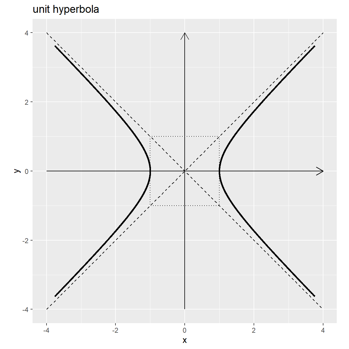
単位双曲線のグラフを作成します。
# 単位双曲線を作図
ggplot() +
  geom_segment(data = axis_df,
               mapping = aes(x = x_from, y = y_from, xend = x_to, yend = y_to, group = "axis"),
               arrow = arrow(length = unit(10, units = "pt"))) + # 軸線
  geom_path(data = square_df,
            mapping = aes(x = x, y = y),
            linetype = "dotted") + # 正方形グリッド
  geom_line(data = asymptote_df,
            mapping = aes(x = x, y = y, group = slope),
            linetype = "dashed") + # 漸近線
  geom_path(data = hyperbola_df,
            mapping = aes(x = cosh_t, y = sinh_t, group = sign),
            size = 1) + # 双曲線
  theme(legend.text.align = 0.5) + # 凡例の体裁:(凡例表示用)
  coord_fixed(ratio = 1,
              xlim = c(-axis_max, axis_max), ylim = c(-axis_max, axis_max)) + # 表示範囲
  labs(title = "unit hyperbola",
       x = "x", y = "y")
双曲線と漸近線、軸線について、2つの線を別々に描画するためにgroup引数に2つの線を区別するための列を指定します。
こちらの処理方法を別記事の双曲線関数の可視化で利用します。
双曲線の作図
最後に、(一般化した)双曲線のグラフを作成します。
・コード(クリックで展開)
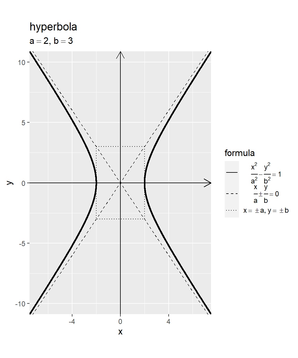
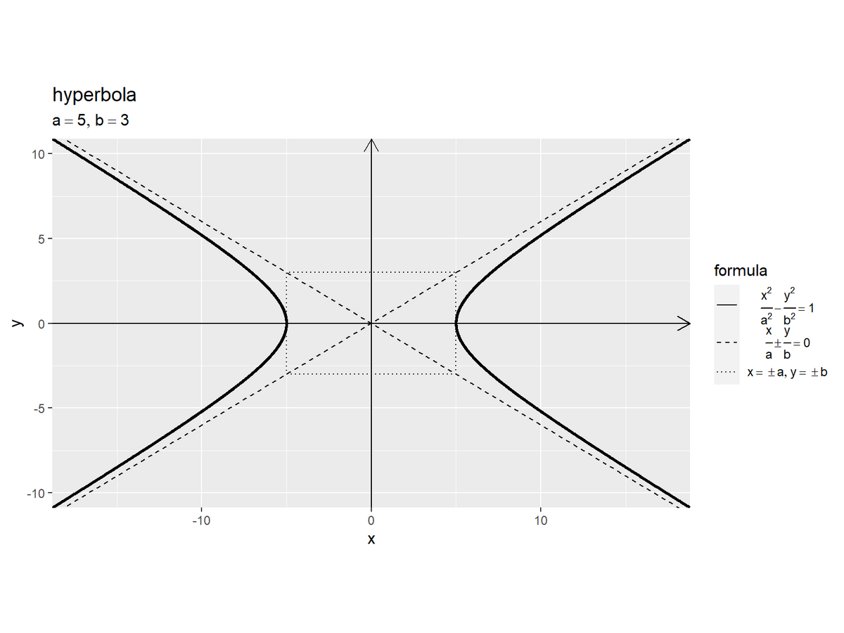
定数を指定して、双曲線を描画するためのデータフレームを作成します。
# 定数を指定
a <- 2
b <- 3

# 双曲線の描画用
hyperbola_df <- tibble::tibble(
  theta = seq(from = -2, to = 2, by = 0.002), # 範囲を指定
  x = a * cosh(theta),
  y = b * sinh(theta)
)
hyperbola_df
## # A tibble: 2,001 × 3
##    theta     x     y
##    <dbl> <dbl> <dbl>
##  1 -2     7.52 -10.9
##  2 -2.00  7.51 -10.9
##  3 -2.00  7.50 -10.8
##  4 -1.99  7.48 -10.8
##  5 -1.99  7.47 -10.8
##  6 -1.99  7.45 -10.8
##  7 -1.99  7.44 -10.7
##  8 -1.99  7.42 -10.7
##  9 -1.98  7.41 -10.7
## 10 -1.98  7.40 -10.7
## # … with 1,991 more rows
変数$\theta$として用いる値をtheta列として作成して、x軸の値$a \cosh \theta$、y軸の値$b \sinh \theta$を計算します。
グラフサイズ用の値を作成します。
# 軸の最大値を設定
x_max <- max(hyperbola_df[["x"]])
y_max <- max(hyperbola_df[["y"]])
x_max; y_max
## [1] 7.524391
## [1] 10.88058
$a \cosh \theta$の最大値をx_max、$b \sinh \theta$の最大値をy_maxとします。
漸近線を描画するためのデータフレームを作成します。
# 漸近線の描画用
asymptote_df <- tibble::tibble(
  x = seq(from = -x_max, to = x_max, length.out = 100),
  y = b * x / a
)
asymptote_df
## # A tibble: 100 × 2
##        x      y
##    <dbl>  <dbl>
##  1 -7.52 -11.3
##  2 -7.37 -11.1
##  3 -7.22 -10.8
##  4 -7.07 -10.6
##  5 -6.92 -10.4
##  6 -6.76 -10.1
##  7 -6.61  -9.92
##  8 -6.46  -9.69
##  9 -6.31  -9.46
## 10 -6.16  -9.23
## # … with 90 more rows
-axis_maxからaxis_maxの範囲を$x$として、$y = \frac{b}{a} x$を計算します。
双曲線の間の領域を描画するためのデータフレームを作成します。
# 長方形グリッドの描画用
square_df <- tibble::tibble(
  x = c(a, a, -a, -a, a),
  y = c(b, -b, -b, b, b)
)
square_df
## # A tibble: 5 × 2
##       x     y
##   <dbl> <dbl>
## 1     2     3
## 2     2    -3
## 3    -2    -3
## 4    -2     3
## 5     2     3
$x = \pm a$と$y = \pm b$の直線の4つの交点の座標を格納します。
双極性のグラフを作成します。
# 双曲線を作図
ggplot() +
  geom_segment(mapping = aes(x = -x_max, y = 0, xend = x_max, yend = 0),
               arrow = arrow(length = unit(10, units = "pt"))) + # x軸線
  geom_segment(mapping = aes(x = 0, y = -y_max, xend = 0, yend = y_max),
               arrow = arrow(length = unit(10, units = "pt"))) + # y軸線
  geom_path(data = square_df,
            mapping = aes(x = x, y = y, linetype = "grid")) + # 長方形グリッド
  geom_line(data = asymptote_df,
            mapping = aes(x = x, y = y, linetype = "asymptote")) + # 漸近線(正の傾き)
  geom_line(data = asymptote_df,
            mapping = aes(x = x, y = -y, linetype = "asymptote")) + # 漸近線(負の傾き)
  geom_path(data = hyperbola_df,
            mapping = aes(x = x, y = y, linetype = "hyperbola"),
            size = 1) + # 双曲線(第1,2象限)
  geom_path(data = hyperbola_df,
            mapping = aes(x = -x, y = y, linetype = "hyperbola"),
            size = 1) + # 双曲線(第3,4象限)
  scale_linetype_manual(breaks = c("hyperbola", "asymptote", "grid"),
                        values = c("solid", "dashed", "dotted"),
                        labels = c(expression(frac(x^2, a^2) - frac(y^2, b^2) == 1),
                                   expression(frac(x, a) %+-% frac(y, b) == 0),
                                   expression(list(x == {} %+-% a, y == {} %+-% b))),
                        name = "formula") + # 線の種類:(凡例表示用)
  guides(linetype = guide_legend(override.aes = list(size = c(0.5, 0.5, 0.5),
                                                     linetype = c("solid", "dashed", "dotted")))) + # 凡例の体裁:(凡例表示用)
  theme(legend.text.align = 0.5) + # 凡例の体裁:(凡例表示用)
  coord_fixed(ratio = 1,
              xlim = c(-x_max, x_max), ylim = c(-y_max, y_max), expand = FALSE) + # 表示範囲
  labs(title = "hyperbola",
       subtitle = parse(text = paste0("list(a==", a, ", b==", b, ")")),
       x = "x", y = "y")
「単位双曲線」のときと同様に処理します。(まとめて描画については、私に使う予定がないので省略します。)
この記事では、双曲線を可視化しました。次の記事では、双曲線関数を可視化していきます。
おわりに
三角関数編の途中ですが(飽き気味なので)双曲線関数編を始めました。
ところで、双曲線に対応する関数が双曲線関数なら、円に対応する関数は円関数ですよね。三角関数を円関数と呼んでいたらもう少し早く仲良くなれた気がします(個人の感想です)。
【次の内容】